Chennai’s HyperBridge Digital Unveils 32-Platform AI Ecosystem Serving Sony, Samsung, Tata Motors, TVS, DJI, and 200+ Global Clients


HyperBridge Digital Unveils 32-Platform AI Ecosystem

Chennai (Tamil Nadu) [India], March 24: HyperBridge Digital (hyperbridge.digital), an enterprise technology and digital growth advisory firm with offices in Chennai, Hyderabad, Bangalore, and Dubai, today announced its complete group portfolio — a 32-platform ecosystem powered by a unified AI backbone serving over 200 clients including Sony, Samsung, Pioneer, Nikon, Tata Motors, Mahindra, Sigma, DJI, CavinKare, GRT, TVS, Velammal, and Agaram Foundation across consumer electronics, automotive, imaging & drones, FMCG, jewellery, education, and media verticals worldwide.

Founded by CEO KR — widely recognised as the father of Indian live chat operations, having pioneered chat-to-revenue engines in 2010 before Flipkart and other major e-commerce players adopted live chat — alongside CTO CS, CFO Raja Prabhu CA, and COO Indra Bala, HyperBridge operates a Fractional CMO/CTO/CFO/COO advisory model paired with proprietary AI infrastructure. The group’s intelligence layer, Kynetra AI, runs 175+ autonomous agents across 50+ business domains through what the company calls the Kynetra Cognitive Grid Engine.

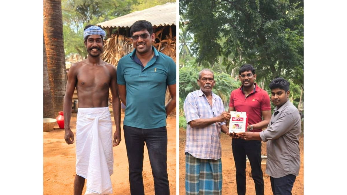
KR’s background is unusually diverse for a technology CEO. Beyond pioneering conversational commerce in India, he has worked personally with senior law enforcement officers — including top cops at the state and central level — to help solve critical criminal cases, leading directly to IntelWeave, the group’s crime tracking intelligence platform. He is also a hands-on content producer — a Creative Director who has personally overseen reels, short films, and commercial video productions from concept to final cut — which drove the creation of The Reel Factory (now serving Sony, Samsung, and DJI) and ContentBridge, the creator collaboration SaaS platform. His direct witness of India’s agrarian crisis led to HOPE108, a registered Public Welfare Trust serving farmer issues at scale through GreenGrid and PalmGuard. And his deep personal engagement with spiritual practice and contemplative traditions led to HOPE108 Life Sciences, the group’s spiritual transformation ecosystem powered by ATMAN AI — a venture born from KR’s conviction that ancient wisdom deserves modern technology infrastructure.

“Every platform in this group started because I personally hit a wall that no existing tool could solve,” said KR. “I built a chat engine in 2010, IntelWeave from real crime investigations, The Reel Factory from real sets, HOPE108 from real farmer struggles, and HOPE108 Life Sciences from real spiritual practice. That’s not a product strategy — that’s a life.”

CFO Raja Prabhu CA is the brain behind HyperBridge’s entire finance layer — designing the compliance and regulatory architecture that powers LexOS India (the group’s AI-powered legal and compliance operating system targeting India’s ₹70,000 Crore compliance market), ComplianceOS, and the financial governance frameworks embedded across the portfolio.

The 32-platforms are organised across ten pillars: AI Infrastructure (Kynetra AI, Quantum OS, AIGrid SDK), Enterprise SaaS (Kynetra, AdCortex, LexOS India, ComplianceOS, InfraVault OS, 

LearnOS, CROS, iPaaS, IntelWeave, PlateLogic, GovernanceOS, TransportOS, Axon CRM), Commerce & Retail (PC Builder Commerce OS, NanoPixels, Metal Marvel, The Value Store), Content & Media (The Reel Factory, ContentBridge), Heritage & Culture (Charminar Mehfil), Public Welfare (HOPE108 Trust, GreenGrid, PalmGuard), Spiritual Transformation (HOPE108 Life Sciences), Global Ventures (PNPC Global, TravelX, InvestX), Venture Building (Spinex), and Advisory Services.

Every platform ships under the unified Kynetra Design System and shares the same enterprise-grade architecture — enabling a lean team to deliver across verticals that would typically require separate companies.

The group is currently pursuing Kynetra AI general availability, LexOS India launch with a ₹150 Cr ARR target, HOPE108 Trust’s national farmer welfare expansion, HOPE108 Life Sciences dual-market launch, and with 100+ ventures in the incubation pipeline — including an 8-app SaaS suite (RideOS AI, CyclePay, VoltGuard, GridMesh, PedalHealth, CycleVerse, FleetPulse, CarbonLedger) being developed with JBC (30+ stores, ₹36 Cr turnover).

ABOUT HYPERBRIDGE DIGITAL

HyperBridge Digital (hyperbridge.digital) is a Chennai-based enterprise technology group with offices in Chennai, Hyderabad, Bangalore, and Dubai operating 32 AI-powered platforms across ten pillars, serving 200+ clients globally including Sony, Samsung, Tata Motors, Mahindra, Sigma, DJI, CavinKare, GRT, TVS, Velammal, and Agaram Foundation. HOPE108 operates as a Public Welfare Trust for farmer empowerment; HOPE108 Life Sciences is the spiritual transformation arm. Founded by CEO KR, CTO CS, CFO Raja Prabhu CA, and COO Indra Bala.

Website: https://hyperbridge.digital | Contact:kr@hyperbridge.digital

If you object to the content of this press release, please notify us at pr.error.rectification@gmail.com. We will respond and rectify the situation within 24 hours.


Source link

Leave a Reply

Subscribe to Our Newsletter

Get our latest articles delivered straight to your inbox. No spam, we promise.

Recent Reviews


What is Power BI Visualization

Regularly our business produces more data on sales, the performance of marketing, interactions of customers, inventory levels, metrics production, levels of staffing, KPIs, costs, etc. Still, there is a problem with massive amounts of data shifting as it is tough to understand the content’s theme. It helps us convert our entire complex data as simple to understand and visually useful compelling information for business, present-day visualization tools, and permits us to maintain our KPIs as more simple and straightforward. It helps combine the data and use AI analytics to display relationships between the market, KPIs, and the world. When we observe the format of our presented data, connections, patterns and insights, it gives life to data to make us experts in the storytelling of hidden insights in our data; these visualizations help users develop business insights effectively with high speed.

Become a Power BI Certified professional by learning this HKR Power BI Online Training !

Why is Power BI visualizations

It is a powerful tool of data sharing and communicating, and it may be helpful in performance demonstration, trends communication, latest strategies impact and more. Its representations work like a practical collaboration tool and contacts and get more value for reports, apps, and journalism. With the help of the best insights, we can make decisions with confidence, and it empowers us to have the arms and knowledge with tools for the right decisions at the proper time. We need to decide to gather the information like the types of data we require and the insights we need.

Power BI Training

  • Master Your Craft
  • Lifetime LMS & Faculty Access
  • 24/7 online expert support
  • Real-world & Project Based Learning

Power BI visualizations types

Visualizations are nothing but the pictorial representation of our data; some general examples are maps, radial gauges, scatter charts, column charts, etc. The given below are some essential types of Power BI visualizations. 

1.Area charts:

These charts have support from online maps along with the area between line and axis. They highlight the change of magnitude and gains attention to the entire value. 

2.Bar and column charts:

These charts are known for the particular value in various categories.

3.Cards:

Cards expose the single fact and data point. It is essential to track our reports and dashboards of power BI like market share, total sale, and opportunities.

4.Combo charts:

These charts help to combine the line charts and column charts into one. It permits us to compare the data quickly. They can maintain two Y axes to look close. For correlation illustration between two measures, these combo charts are the best choice.

Unleash your data potential with Power BI Training in Hyderabad!

5.Decomposition tree:

The visuals of this tree allow us to expose our data across various dimensions. It generates the data automatically and drills it as our dimensions in the required order.

6.Doughnut charts:

They are like pie charts and display the parts’ relationship to the whole, but the main difference is it has space at the centre used for labels or icons.

7.Funnel charts:

They help the visualization process; it includes various items and stages randomly from one location to another.

8.Gauge charts:

They have the circular arc and expose the single value, which calculates the aim’s development. Its purpose is by line through shading, and the value represents the progress displayed as bold in the arc.

9.Key influencers chart:

This chart exposes the essential contributors to choose the value. It is an excellent selection to help us understand the factors that may affect the key metrics. It is like what attracts the users to put a second order and why sales are high in previous times.

10.KPIs:

It is a visual key that communicates the part of progress for measurable aim. The given below are two reasons to prove that KPIs are great.

  • They use it for progress measurements.
  • They are helpful for distance measurement towards the goal.

Top 50 frequently asked Power BI Interview Questions !

11.Line charts: They are used to emphasize the entire shape of the overall series of values.

12.Basic maps: These basic maps associate the quantitative data and category with the spatial location.

14.ArcGIS maps: It is an available choice for themes, locations types, symbol styles, base maps, and reference layers to design the informative map’s visuals. And it is the combination of data layers on a plan to display the deep knowledge of the information in our visual.

15.Choropleth: These charts are patterns used to expose how value varies in proportion in the region. It displays the differences through shading from dark to light. 

Business Intelligence & Analytics, power-bi-visualization-description-0, Business Intelligence & Analytics, power-bi-visualization-description-1

Subscribe to our YouTube channel to get new updates..!

16.Shape maps: they are used to compare the map regions through colour and shape, as shape maps cant display the precise data locations on the map. Its main aim is to display the parts Comparison on the map through various kinds of coding.

17.Matrix: it is a kind of table visual which gives support to a stepped layout; its report creators contain matrices in dashboards to provide users to choose multiple elements in a matrix on the report page.

18.Pie charts: it permits the users to display the relationship of the parts to the whole. It is used for report designers to design a Power App and turn it into the report of Power BI.

19.Q&A visual: they are similar to the experience of Q&A of dashboards. They permit us to ask questions regarding our information through natural language.

20.Ribbon charts: it displays the data according to ranking. They are very effective in rank, showing rank changes through the highest range on top of every period.

21.Scatter and dot plot charts: it always includes two axes’ values to display one numerical group of data, along with another numerical value, vertical axis, and horizontal axis. They show the intersecting points of x and y numerically. It units those two values as a single point. They may explore unevenly or evenly in the horizontal axis based on the data. The dot plot is similar to the scatter chart, but it can categorize the information with the x-axis.

22.Scatter high density: it permits users to design the visuals with high speed, helping for interactions. Its sampling uses an algorithm that removes the overlapping points and makes sure that the complete data set points to expose the visuals. 

Want to know more about Power BI,visit here Power BI Tutorial !

23.Slicers: these charts are standalone, which may be for other visuals filtering on the page. They are available in various formats and designed to permit to choose the single one or many as per the requirement. 

24.Innovative narrative: It is helpful to add the data to reports for the point out trend and essential takeaways and previous explanations. The data help customers to get an idea of data and recognize the crucial findings at high speed.

25.Standalone images: it is a kind of graphics that add to the dashboards.

26.Tables: it is a kind of grid map which includes the related information of logical series in rows and columns; it also maintains the headers along with table rows. They use quantitative comparison, which helps to look at various values in a single category, and the table exposes five multiple values for a single variety.

27.Treemaps: these are a kind of colour charts with rectangular shapes where the values display by size, the rectangles set in the central rectangles. Every rectangles space is allowed measured value and arranged in size from left to right.

28.Waterfall charts: they display the running of absolute added values. It helps understand how important the matter is through the changes that take place.

Power BI Training

Weekday / Weekend Batches

Conclusion: 

The visuals are the best guide for the Power BI; they are based on the data we require to expose. First, we need to understand that visuals’ vocabulary supports the graphics team of financial teams through Power BI. They are used to facilitate the graph’s selection to display the information. Visual language does not need prescribed graphs, but graphs required to  create to experience its benefits for choices to utilize them with data. Another issue with the graphical data representation with which the organizations create dashboards, they are not experts to display the complex data with a non-professional audience.

Related Article:


Source link