NASA’s Artemis II crew readies for Monday’s lunar flyby. Here’s what you need to know


A photo of NASA's Orion space capsule taken by a remote camera mounted on one of its solar arrays as it sped towards the moon. The four astronauts will loop around the moon on Monday and also venture farther into space than any humans before.
A photo of NASA's Orion space capsule taken by a remote camera mounted on one of its solar arrays as it sped toward the moon. The four astronauts will loop around the moon on Monday and also venture farther into space than any humans before.
NASA via Getty Images

The crew of NASA's Artemis II will make its closest approach to the moon Monday afternoon after launching from Kennedy Space Center last week.

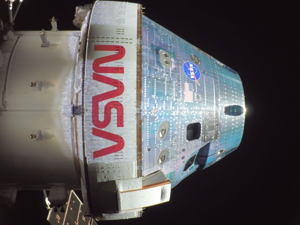
It marks a critical milestone of the agency’s Orion space capsule, sending humans on a mission to the moon for the first time in more than 50 years. As the capsule loops around the moon, the astronauts will reach farther into space than humans have ever ventured.

The Orion spacecraft is now in the lunar sphere of influence, meaning the moon's gravity has more pull on the vehicle than the Earth. At 1:46 p.m. ET, the crew will surpass the record for the farthest distance traveled from Earth by humans, which was set by the Apollo 13 mission at 248,655 statute miles from Earth. At 2:45 p.m., the crew will begin making observations of the surface of the moon during the flyby.

As the vehicle circles the far side of the moon, communication back to Earth is expected to be blocked for about 40 minutes. At 7:02 p.m., the crew is expected to have reached the mission's maximum distance from Earth at 252,760 statute miles.

The flyby is scheduled to conclude at 9:20 p.m., and then the crew will be on its way home, with a planned splashdown in the Pacific Ocean off San Diego, Calif., on Friday at 8:07 p.m.

During the Artemis II flyby, the crew will pass over two previous human lunar landing sites — Apollo 12 and 14.

Lunar science observations

During the lunar flyby, the closest Orion will come to the surface of the moon is 4,070 miles. From that distance, the crew will have a unique vantage point of the moon as a full disc — and the ability to take observations never before seen by human eyes.

NASA scientists have identified about 35 geological features for the crew to observe. Working in pairs, they will take photos of the sites and describe them in real time to scientists at Mission Control at the Johnson Space Center in Houston.

"They're going to be absolutely buzzing," said Artemis II lunar science lead Kelsey Young on Sunday. The team will monitor the observations and provide guidance to the crew.

"The science team will get to work right away, kind of synthesizing those [observations], and then we'll actually downlink the rest of the descriptions overnight, in advance of a crew conference we'll have the following morning to continue the science discussion."

Artemis II has 10 science objectives for the flyby. One is to observe color variations on the lunar surface. Changes in color can indicate the composition of the minerals on the surface. These changes are hard to detect with satellite images.

"This is something that human eyes are just incredibly good at teasing out nuances about," said Young.

Satellites like the Lunar Reconnaissance Orbiter, which launched in 2009, have given scientists a better understanding of the lunar surface. The Artemis II crew's observations will build on that knowledge.

"We understand, you know, what it's made out of. We understand the topography, but we don't know what the crew are going to see in these specific illumination conditions from a scientific perspective," said Young. "And that's exciting."

NASA astronaut and Artemis II mission specialist Christina Koch peers out of one of the Orion spacecraft's main cabin windows, looking back at Earth, as the crew traveled towards the Moon on Sunday.
NASA astronaut and Artemis II mission specialist Christina Koch peers out of one of the Orion spacecraft's main cabin windows, looking back at Earth on Saturday, as the crew traveled toward the moon.
NASA | Getty Images

The observations will help future landing missions. One target site is a potential future landing area for an uncrewed payload mission. The crew will also get a small glimpse of the lunar south pole — where humans might land as early as 2028.

The mission so far

Artemis II is more than halfway through its slingshot mission around the moon and back. This is a test flight of the Orion space capsule, carrying a human crew for the first time.

"Our mission continues to go incredibly well," said Lori Glaze, who leads NASA's Artemis program.

Tests include manual control of the Orion spacecraft. Mission pilot Victor Glover practiced the maneuverability of the capsule for future rendezvous with lunar landing vehicles.

The crew tested the spacecraft's life support systems, like the carbon dioxide scrubbers, and donned their spacesuits midflight — which future astronauts might have to do in an emergency.

The Artemis II mission is also testing the first deep-space toilet. NASA's Universal Waste Management System is stowed in the floor of Orion and allows the crew to use the bathroom in private. So far, the hardware has had a few hiccups (not having enough water in the bowl and, at a different point, not being able to dump the waste overboard due to a frozen line), but those seem to be resolved.

"We're continuing to proceed with the mission and the use of the toilet nominally," said Artemis II flight director Rick Henfling, meaning the crew is allowed to use the onboard lavatory.

Copyright 2026, NPR


Source link

Leave a Reply

Subscribe to Our Newsletter

Get our latest articles delivered straight to your inbox. No spam, we promise.

Recent Reviews


What is Power BI Visualization

Regularly our business produces more data on sales, the performance of marketing, interactions of customers, inventory levels, metrics production, levels of staffing, KPIs, costs, etc. Still, there is a problem with massive amounts of data shifting as it is tough to understand the content’s theme. It helps us convert our entire complex data as simple to understand and visually useful compelling information for business, present-day visualization tools, and permits us to maintain our KPIs as more simple and straightforward. It helps combine the data and use AI analytics to display relationships between the market, KPIs, and the world. When we observe the format of our presented data, connections, patterns and insights, it gives life to data to make us experts in the storytelling of hidden insights in our data; these visualizations help users develop business insights effectively with high speed.

Become a Power BI Certified professional by learning this HKR Power BI Online Training !

Why is Power BI visualizations

It is a powerful tool of data sharing and communicating, and it may be helpful in performance demonstration, trends communication, latest strategies impact and more. Its representations work like a practical collaboration tool and contacts and get more value for reports, apps, and journalism. With the help of the best insights, we can make decisions with confidence, and it empowers us to have the arms and knowledge with tools for the right decisions at the proper time. We need to decide to gather the information like the types of data we require and the insights we need.

Power BI Training

  • Master Your Craft
  • Lifetime LMS & Faculty Access
  • 24/7 online expert support
  • Real-world & Project Based Learning

Power BI visualizations types

Visualizations are nothing but the pictorial representation of our data; some general examples are maps, radial gauges, scatter charts, column charts, etc. The given below are some essential types of Power BI visualizations. 

1.Area charts:

These charts have support from online maps along with the area between line and axis. They highlight the change of magnitude and gains attention to the entire value. 

2.Bar and column charts:

These charts are known for the particular value in various categories.

3.Cards:

Cards expose the single fact and data point. It is essential to track our reports and dashboards of power BI like market share, total sale, and opportunities.

4.Combo charts:

These charts help to combine the line charts and column charts into one. It permits us to compare the data quickly. They can maintain two Y axes to look close. For correlation illustration between two measures, these combo charts are the best choice.

Unleash your data potential with Power BI Training in Hyderabad!

5.Decomposition tree:

The visuals of this tree allow us to expose our data across various dimensions. It generates the data automatically and drills it as our dimensions in the required order.

6.Doughnut charts:

They are like pie charts and display the parts’ relationship to the whole, but the main difference is it has space at the centre used for labels or icons.

7.Funnel charts:

They help the visualization process; it includes various items and stages randomly from one location to another.

8.Gauge charts:

They have the circular arc and expose the single value, which calculates the aim’s development. Its purpose is by line through shading, and the value represents the progress displayed as bold in the arc.

9.Key influencers chart:

This chart exposes the essential contributors to choose the value. It is an excellent selection to help us understand the factors that may affect the key metrics. It is like what attracts the users to put a second order and why sales are high in previous times.

10.KPIs:

It is a visual key that communicates the part of progress for measurable aim. The given below are two reasons to prove that KPIs are great.

  • They use it for progress measurements.
  • They are helpful for distance measurement towards the goal.

Top 50 frequently asked Power BI Interview Questions !

11.Line charts: They are used to emphasize the entire shape of the overall series of values.

12.Basic maps: These basic maps associate the quantitative data and category with the spatial location.

14.ArcGIS maps: It is an available choice for themes, locations types, symbol styles, base maps, and reference layers to design the informative map’s visuals. And it is the combination of data layers on a plan to display the deep knowledge of the information in our visual.

15.Choropleth: These charts are patterns used to expose how value varies in proportion in the region. It displays the differences through shading from dark to light. 

Business Intelligence & Analytics, power-bi-visualization-description-0, Business Intelligence & Analytics, power-bi-visualization-description-1

Subscribe to our YouTube channel to get new updates..!

16.Shape maps: they are used to compare the map regions through colour and shape, as shape maps cant display the precise data locations on the map. Its main aim is to display the parts Comparison on the map through various kinds of coding.

17.Matrix: it is a kind of table visual which gives support to a stepped layout; its report creators contain matrices in dashboards to provide users to choose multiple elements in a matrix on the report page.

18.Pie charts: it permits the users to display the relationship of the parts to the whole. It is used for report designers to design a Power App and turn it into the report of Power BI.

19.Q&A visual: they are similar to the experience of Q&A of dashboards. They permit us to ask questions regarding our information through natural language.

20.Ribbon charts: it displays the data according to ranking. They are very effective in rank, showing rank changes through the highest range on top of every period.

21.Scatter and dot plot charts: it always includes two axes’ values to display one numerical group of data, along with another numerical value, vertical axis, and horizontal axis. They show the intersecting points of x and y numerically. It units those two values as a single point. They may explore unevenly or evenly in the horizontal axis based on the data. The dot plot is similar to the scatter chart, but it can categorize the information with the x-axis.

22.Scatter high density: it permits users to design the visuals with high speed, helping for interactions. Its sampling uses an algorithm that removes the overlapping points and makes sure that the complete data set points to expose the visuals. 

Want to know more about Power BI,visit here Power BI Tutorial !

23.Slicers: these charts are standalone, which may be for other visuals filtering on the page. They are available in various formats and designed to permit to choose the single one or many as per the requirement. 

24.Innovative narrative: It is helpful to add the data to reports for the point out trend and essential takeaways and previous explanations. The data help customers to get an idea of data and recognize the crucial findings at high speed.

25.Standalone images: it is a kind of graphics that add to the dashboards.

26.Tables: it is a kind of grid map which includes the related information of logical series in rows and columns; it also maintains the headers along with table rows. They use quantitative comparison, which helps to look at various values in a single category, and the table exposes five multiple values for a single variety.

27.Treemaps: these are a kind of colour charts with rectangular shapes where the values display by size, the rectangles set in the central rectangles. Every rectangles space is allowed measured value and arranged in size from left to right.

28.Waterfall charts: they display the running of absolute added values. It helps understand how important the matter is through the changes that take place.

Power BI Training

Weekday / Weekend Batches

Conclusion: 

The visuals are the best guide for the Power BI; they are based on the data we require to expose. First, we need to understand that visuals’ vocabulary supports the graphics team of financial teams through Power BI. They are used to facilitate the graph’s selection to display the information. Visual language does not need prescribed graphs, but graphs required to  create to experience its benefits for choices to utilize them with data. Another issue with the graphical data representation with which the organizations create dashboards, they are not experts to display the complex data with a non-professional audience.

Related Article:


Source link