A budget PC gamer’s new best friend


The price of nearly every type of gaming gadget has skyrocketed recently. RAMageddon has caused the cost of memory to double or triple in the last six months, with companies like HP saying that RAM now accounts for more than a third of a new PC’s bill of materials. Meanwhile, the Xbox Series S/X and the PS5 have gotten price hikes, and a similar bump for the Switch 2 is starting to look “inevitable.” Even mobile devices are not immune, with Samsung jacking up the cost of the Galaxy Z Fold 7 nine months after release. But with the $350 27-inch QD-OLED (AW2726DM), Alienware hasn’t just created a gaming display that’s an excellent value, it’s made a beacon of hope for anyone looking to upgrade their setup without emptying their bank account.

Image for the large product module

Dell / Engadget

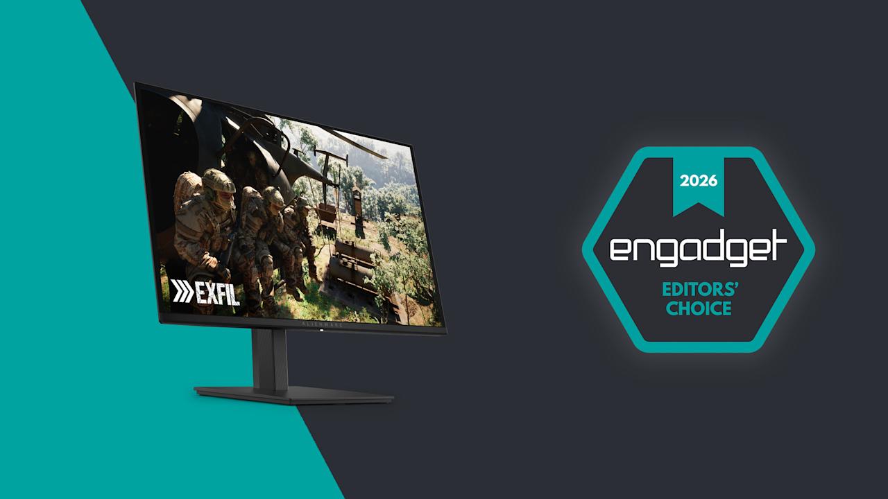
In a world where every piece of gaming gear seems to be getting more expensive, Alienware’s  $350 AW2726DM 27-inch QD-OLED monitor feels like a gift to gamers on a budget.

Pros

  • Stupendously affordable
  • Three-year warranty with burn-in protection
  • Simple, straightforward design
  • QHD resolution with 240Hz VRR
  • Rich colors
Cons

  • Mediocre brightness
  • Not a ton of ports
  • No native G-Sync support

Design

Unlike some of Alienware’s more expensive displays, the AW2726DM’s design couldn’t be simpler. It sits on a square 8.75-inch base that supports tilt, pivot and height adjustments. Though it does require a little assembly, everything you need comes in the box. Alienware’s monitor arm attaches via a captured thumb tab, while the monitor relies on four screws and a VESA mount that can be connected using the bundled Philips wrench. (Though if you have a proper screwdriver, that would be even better.) Setup only took me a few minutes and after arranging it properly on my desk, the monitor felt quite solid. The only potential drawback is that if you have limited desk space or you’re the kind of gamer that likes jamming your keyboard as close to your monitor as possible, Alienware’s stand might get in the way.

The back of the monitor has an easy-to-use joystick for controlling its on-screen settings menu.

The back of the monitor has an easy-to-use joystick for controlling its on-screen settings menu. (Sam Rutherford)

At around 4mm thick, the AW2726DM’s panel is exceedingly sleek, though naturally that expands a bit on the lower portion of the monitor where its ports are located. This brings us to one of the biggest differences between Alienware’s budget display and more premium options: limited connectivity. All you get here is two HDMI 2.1 jacks, one DisplayPort 1.4 slot and a 3.5mm plug for audio out. There’s no support for data transfer, power sharing or anything else. Heck, there isn’t even any RGB lighting, which feels weird on a product from Alienware. But given its price, I’m not upset. In fact, it’s actually kind of refreshing. Finally, there’s a handy control stick on the back of the display for navigating its on-screen menu.

As long as it's not to sunny or bright, the AW2726DM delivers excellent visuals for the money.

As long as it’s not too sunny or bright, the AW2726DM delivers excellent visuals for the money. (Sam Rutherford for Engadget)

The AW2726DM features a QD-OLED panel supplied by Samsung that comes with a QHD resolution (2,560 x 1,440) and up to a 240Hz refresh rate. Alienware supports VRR via AMD FreeSync Premium and VESA AdaptiveSync, though sadly there’s no native option for NVIDIA G-Sync. That means if you have a GPU from Team Green and want to take full advantage of the monitor’s potential, you’ll want to rely on that DisplayPort for optimal compatibility.

Regardless, for a $350 gaming display, the AW2726DM checks all the most important boxes and it looks fantastic. Alienware’s budget monitor showcases the strengths of OLED panels versus LCD, even when compared to Sony’s Inzone M9, which was a much more expensive monitor when it debuted back in 2022. Alienware offers richer colors (it covers 99 percent of DCI-P3), and thanks to its deep inky blacks, contrast is significantly better as well.

Here's a direct comparison between the AW2726DM and the Sony Inzone M9, the latter of which cost $900 when it came out in 2022.

Here’s a direct comparison between the AW2726DM and the Sony Inzone M9, the latter of which cost $900 when it came out in 2022. (Sam Rutherford for Engadget)

The one big drawback is that, with a typical brightness of 200 nits, the AW2726DM is dimmer than more expensive rivals. That means the monitor doesn’t have fancy certifications for stuff like VESA True Black and instead relies heavily on general HDR10. Furthermore, Alienware chose a glossy (and quite reflective) finish that makes colors look even more saturated while improving perceived brightness. The one thing you need to watch out for is glare, especially if your PC or console lives in a room that gets a lot of sunlight. But if you’re like a lot of gamers that prefer to frag at night or in the dark, this may not be an issue.

Outside of gaming, there’s another shortcoming of the AW2726DM. Between its QHD resolution and the arrangement of Samsung’s QD-OLED subpixels, folks with good eyesight may notice a little fringing, especially when compared to higher-res 4K displays. This means some Word docs and web pages may not look quite as sharp as you’d like, but that’s a small price to pay for some of the best visuals you can get on a gaming monitor in this price range.

Warranty and care

The stand for the AW2726DM supports tilt, height adjustment and even pivoting all the way into portrait mode.

The stand for the AW2726DM supports tilt, height adjustment and even pivoting all the way into portrait mode. (Sam Rutherford for Engadget)

One of the major concerns about OLED displays when they first hit the market was the potential for burn-in, resulting in permanent damage to the panel from things like static UI elements staying on the screen too long. Thankfully, the AW2726DM comes with a three-year warranty that includes a clause covering burn-in, along with a free panel replacement in case there’s even a single bright pixel. Furthermore, Alienware uses a graphite film heatsink and an AI algorithm to prevent any sort of ghosting from appearing in the first place.

Wrap-up

Alienware also conveniently includes both HDMI and DisplayPort cables in the box, along with the required screws for mounting the panel to the stand.

Alienware also conveniently includes both HDMI and DisplayPort cables in the box, along with the required screws for mounting the panel to the stand. (Sam Rutherford for Engadget)

The AW2726DM might not have all the fancy features you get on more expensive monitors, but it’s an excellent example of a no frills gadget done right. You get just enough ports, a straightforward design and a beautiful QD-OLED panel with a solid resolution and refresh rate — all for just $350. It would certainly be nice if it was a little brighter or if text looked a touch sharper, but those shortcomings are pretty easy to live with. For anyone looking to upgrade what might be arguably the second most important part of your gaming setup (your screen is your window into new worlds after all), this display is budget gold.


Source link

Leave a Reply

Subscribe to Our Newsletter

Get our latest articles delivered straight to your inbox. No spam, we promise.

Recent Reviews


What is big data visualization?

Big Data Visualisation is one of the most essential aspects of communicating with a range of Big Data Analytics solutions. Once the stream of raw data is portrayed with pictures, the decision-making process becomes so much simpler.

Big Data Visualization includes the presence of about any sort of data in a graph form that refers to a process and evaluate. But it means going well beyond standard government charts, bar graphs and powerpoint presentations to more complex representations such as heat maps and fever charts, allowing business leaders to discover sets of data to recognise commonalities or unanticipated trends.

Scaling is the key characteristic of Big Data visualization. Today’s businesses are collecting and storing huge amounts of data which would take many years for a living thing to read, nor even realize. However, studies have found that the human retina can send signals to the nervous system at a rate of about 10 megabits per second. Big Data Visualization focuses on potent computer systems to consume raw corporate data and analyze it to create graphical representations that allow individuals to capture and recognize vast amounts of data in seconds.

[ Related Article: VMware VCloud Director Training ]

Big data visualization tools:

You should use the proper tools for data visualization and know how to switch the knowledge and practical information generated from Big Data into the benefits of quicker response.In order to meet or exceed the demand of the consumers, a set of features should be provided by the Big Data visualization tools such as ability to process multiple data coming from different sources, applying various filters to achieve good results, able to interact with large data sets, providing collaboration options for the customers and able to connect with other softwares, etc.

Regardless of the fact there are a ton of special hardware for Big Data visualization, both open-source and customizable, there is a collection of them which exists out a little slightly as they provide all and many of the other functionalities noted above.

Big Data Hadoop Training

  • Master Your Craft
  • Lifetime LMS & Faculty Access
  • 24/7 online expert support
  • Real-world & Project Based Learning

Challenges posed by big data visualization:

Big Data visualization can be an enormously potent company ability, but some key changes must be made before an organization can take full advantage of it. This included the following:

  • Availability of big data visualization specialists or experts.
  • Managing the quality data, ensuring the accuracy is important before storing it for the organizational use.
  • Visualization of hardware resources to make good decisions in a timely manner.

In this blog post we are going to discuss the top big data visualizations tools in the current market. You can select the ebay one based on your requirements.

Top big data visualizations tools:

In this section, we will discuss the best big data visualizations tools. A brief review of the market system of Big Data tools indicated the existence of famous players, such as Microsoft, SAP, IBM and SAS. And there are a number of specialized software companies providing largest big data visualization tools, including Tableau Software, Qlik and TIBCO Software. Leading tools of big data visualization includes the following list.They are:

  • Tibco Spotfire
  • Qlikview
  • Watson analytics
  • Fusion charts
  • Tableau
  • Sisense
  • Data wrapper
  • Infogram
  • Plot.ly

More info, Visit Openstack Administration Training

Tableau:

Tableau is among the largest software on the data visualization market that allows the production of different types of graphics, charts, dashboards, stories, maps and other components without programming.

It contains additional operations of descriptive statistics and inferential statistics with the creation of analytical charts. Enables collaboration of other techniques, such as Excel, SQL, SAP, Amazon, and others.

Plot.ly:

Plot.ly is a place to share online codes and visuals to assist users and developers.Graphics are made accessible to the community, that also enhances and enhances learning.The visual appeal of well-designed visuals with high-resolution graphics is a strong point.Although much more configured for Python, Plot.ly supplies R, Shiny and JavaScript libraries with the generation of distributed panels.

Qlikview:

QlikView is a component of Qlik, a software company based in Radnor, Pennsylvania, USA. QlikView is among the quickest business intelligence and data visualization tools that is convenient to use. It provides an Associative Search that makes decision-making uncomplicated. Its Associative Experience allows you to focus on the most relevant information, whenever and wherever you need it. It offers significant coordination with co-workers and partner organisations, a relative analysis of data, allows you to incorporate your relevant information into a data app and ensures that the right employees in the company have access to data through its dependable safety features.

Tibco spotfire:

Tibco Spotfire is a data analytics technology that offers you specific insights into your data. It’s accessible in Desktop, Cloud and Platform Editions. It has an Intelligence recommender system that significantly shortens visual analytics time. Its data chasing feature lets you better spot data outliers, discrepancies, and inadequacies. During the 2010 World Cup, FIFA used the apps to provide audiences with data analysis of previous achievements by country teams. Power users of Spotfire include Procter and Gamble, Cisco, NetApp, Shell.

Join our IOTA Training today and enhance your skills to new heights!

Cloud Computings, big-data-visualization-tools-description-0, Cloud Computings, big-data-visualization-tools-description-1

Subscribe to our YouTube channel to get new updates..!

Watson Analytics:

Watson Analytics is an IBM cloud-based analytics service that helps you easily find insights into your data. When you transfer your data to Watson Analytics, it will demonstrate the questions that will help you reply and then provide immediately focused data visualizations. You can also start exploring your data through natural language processing. Other key features involve computerized predictive analytics, one-click assessment, intelligent data discovery, streamlined analysis, available advanced analytics, self-service dashboards. Watson analytics also allows computer vision, which in turn provides more informative information from the data.

Sisense:

The easy-to-use configuration empirically derived trouble-free operation to non-techists. It performs an ad-hoc implementation of various data and empowers you to collect data from all your systems into a single and available repository, making it a single platform that manages the entire business intelligence workforce. It can also evaluate data in real time. For instance, during the peak season, sales trends have to be observed, they can provide a great insight into the vast amount of data that can be traced as quickly as possible. Popular customers include eBay, Merck, NASA, ESPN and SONY.

Data Wrapper:

Datawrapper is a simple platform for making visualizations such as infographics, maps, data tables and responsive charts such as line, bar, stacked bar, donut, etc. It is popular among publishers and journalists. Popular users include The Washington Post, The Guardian, Buzzfeed and The Wall Street Journal. It’s very easy to use and there’s no need for a coder to use.

Microsoft Power BI:

Microsoft Power BI is a business analytical tool that makes it easy for businesspeople to conceptually evaluate their data and develop strategies based on it. It gives access to on-site and in-cloud data. It has two pricing plans, one of which can be purchased free of charge. The free one comes with a 1GB data limit, which allows you to create, create and share dashboards and reports. Power BI Pro has all the power BI features, can consume live data with full interactivity, share data queries through the Data Catalog, and more.

Empowering Your Success: On Job Support Services for Seamless Performance.

Infogram:

Infogram is a data visualization and infographic company founded in 2012 by Uldis Leiterts, Raimonds Kaže and Alise Semjonova. It allows you to choose from more than 1 million images to make infographics. It makes it easy to access data by allowing you to edit the data in the editor and connect to your desired cloud service. Some of the customers are Deloitte, Nielsen, Skyscanner, and MSN. Easy-to-use steps find it easier for educators, journalists and business professionals to envision their data. It has produced over 4.8 million infographics, which are viewed by more than 500 people a month.

Fusion Charts:

FusionCharts is a component of InfoSoft Global, a systems integrator of data analysis products. It is used by more than 80% of Fortune 500 companies. The idea of FusionCharts came from 16-year-old Pallav Nadhani in 2001, who found himself unsatisfied with Microsoft Excel charting abilities while finishing his school assignment.

Big Data Hadoop Training

Weekday / Weekend Batches

 Conclusion:

Visualizing Big Data can help the company gain new knowledge and make strategies that can bring revenues and make them realize their clients.Both data visualizations and visualizations turn data into images that anybody can probably recognize as extremely valuable tools to explain the importance of digits to people who are more visually oriented. All the tools mentioned above helps the organizations in getting good and profitable results for the business.

Related Article:

Hpe Synergy Training

Facets Interview Questions


Source link