
Risks and disasters are inevitable in business processes. Experts find that almost 100% organizations experience minor or major downtime every year, leading to significant revenue losses. Shockingly, only 54% of organizations have adopted a disaster recovery plan. As a result, companies are experiencing significant operational disruptions, and many small and mid-sized firms are unable to recover.
Under such circumstances, adopting a disaster recovery plan has become more crucial than ever. Such an approach not only helps organizations stay prepared for unwanted incidents but also helps them retrieve operations quickly. Understanding the 4C’s in disaster recovery, which are communication, coordination, continuity, and collaboration, is crucial in this regard.
In this blog, we’ll understand the 4C’s in disaster recovery thoroughly and learn about their importance. First, let’s explore what disaster recovery is and why businesses require a disaster recovery plan.
What is Disaster Recovery?
In simple terms, disaster recovery (DR) is the ability to successfully recover from risky situations. From the perspective of businesses, disaster recovery defines an organization’s capability to restore its functionality and operations after experiencing a disastrous event, be it caused by natural circumstances or human error.
DR ensures business continuity even in adverse situations such as cyberattacks, product failure, technological breakdown, natural disasters, or similar. Such events commonly interrupt businesses while creating great challenges for system security and overall operational cost.
There are three major types of disaster recovery plans:
- Preventive
- Detective
- Corrective
While preventive recovery stops disasters from taking place, detective recovery helps in detecting and discovering disasters. Conversely, corrective recovery allows businesses to understand what measures to undertake to reduce the impact of real incidents. Businesses can create DR plans according to their needs, but incorporating the 4C’s in disaster recovery is crucial in every plan.
Why Do Businesses Need a Robust Disaster Recovery Plan?
Having a robust DR plan is indispensable for businesses in contemporary times. Firstly, it helps prevent unwanted incidents. Furthermore, it guides the next steps after an incident takes place. Disaster recovery aims at sustaining business continuity even in sensitive situations.
Additionally, DR not only protects business operations but also secures data and organizational resources in tough times. Here are the reasons why businesses require a disaster recovery plan:
- Assures business continuity, overcoming disruptions.
- Secures data and resources, ensuring quick recovery.
- Reduces financial impacts and revenue losses.
- Protects businesses from reputational damage.
- Helps stay compliant and adhere to data protection guidelines.
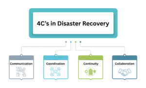
Assessing 4C’s in Disaster Recovery

1. Communication:
Strong communication is an indication of successful businesses in any way. In disaster recovery, it is the first of the four C’s, which emphasizes that maintaining transparent communication across internal and external stakeholders during the time of a disaster is important. For a business, stakeholders include employees, clients, suppliers, and the public.
Organizations often hesitate to share information while an incident is underway. However, maintaining timely and accurate communication can help in addressing confusion and also meet specified expectations. Communication also limits the spread of misinformation. Hence, it is important for organizations to update their stakeholders with timely communication during a crisis.
2. Coordination:
Recovery involves multiple steps, executing which require appropriate skills and resources. The process includes structure planning, role assignment, and coordination across teams in an organization. Successful recovery is a coordinated process of experienced professionals and necessary resources.
Hence, it is important for organizations to gather and coordinate every element before starting the recovery process. In this regard, communication ensures effective coordination and collaboration across resources, professionals, and teams.
3. Continuity:
Continuity defines the capability of an organization to continue operating without disruption during a time of crisis. It also indicates that even if the systems and processes get impacted, how quickly businesses restore their operations. While building a recovery plan, it is important to understand how effectively it can reduce downtime without imposing a significant financial impact.
Business continuity denotes how resilient a recovery plan is while reducing operational and financial damages.
4. Collaboration:
Disaster recovery is not the responsibility of a specific team, but a collaborative process. Apart from internal teams, businesses may require support from external agencies as well, such as government institutions, emergency solutions, and others. Effective collaboration makes recovery more significant and helps in overcoming the crisis successfully.
Recovery can be time-consuming, and unwanted challenges can take place in the process. Collaboration can be advantageous while tackling these challenges and streamlining the recovery process.
Importance of 4C’s in Disaster Recovery
4C’s in disaster recovery are nothing but core principles that enable businesses to develop and adopt a resilient DR plan. While experiencing a crisis, it is crucial to preserve uninterrupted communication, coordination, and collaboration in the process of maintaining business continuity.
Whether it is a technical crisis or an unwanted situation caused by human error, communicating the same to internal and external people. Such an approach offers opportunities for better coordination and collaboration. All these elements contribute to effective disaster recovery and business continuity.
Embracing Robust Disaster Recovery!
Developing and integrating a disaster recovery plan has become an essential step for businesses today. However, it is also important to consider the four key elements of disaster recovery: communication, coordination, continuity, and collaboration. These aspects together ensure how effective your DR plan is and allow you to retrieve services without significant operational and financial impacts of a disaster.
Read our other informative blogs to stay informed and ahead in the tech-driven world.
FAQs:
1. What is a disaster recovery plan?
Answer: A disaster recovery plan is a documented roadmap that allows businesses to follow a structured approach to recover from unplanned incidents.
2. What are the 5 P’s of disaster?
Answer: Planning, participation, protection, preparedness, and practice are the 5 P’s of disasters.
3. What are the 4 risk pillars?
Answer: Risk identification, assessment, mitigation, and monitoring are the four risk pillars.
Also Read:

Stephan is the sports journalist for the Maple Grove Report.