Minnesotans made 9M visits to food shelves in 2025


Demand for assistance putting food on Minnesotans’ tables is at a record high level, as the state’s residents made more than 9 million visits to food shelves last year, according to The Food Group, a Twin Cities-based nonprofit that works with food shelves statewide to alleviate hunger and meet residents’ nutritional needs.

That’s 2.5 times more food shelf visits than in 2019, and 2025 was the fourth consecutive year of record demand for food assistance.

The Food Group released data this week showing that rising grocery prices and other costs are making it more difficult for many Minnesotans to be able to afford to stock their refrigerators and pantries on their own, said Rachel Holmes, director of advocacy and community engagement, who helped gather data for the report.

“Food is far more expensive than it was just five years ago, and even 3 percent more expensive than it was last year,” Holmes said. “And now we’re seeing a pretty steady increase in gas prices, rent costs. Life in general is becoming more unaffordable.”

Packages of dry beans and vegetable oil sit in plastic crates.
Bins of food at ECHO Food Shelf in Mankato, Minn., on Feb. 17.
Hannah Yang | MPR News

Holmes and other hunger relief advocates say demand for assistance from food shelves is expected to continue to soar this year, as the massive tax and spending bill pushed through Congress by Republicans last summer slashed funding for SNAP, the Supplemental Nutritional Assistance Program, and imposed stricter eligibility requirements.

“It’s the new normal that we’re at right now, and our food shelf partners are at capacity,” Holmes said. “They’re doing all they can, and 9 million visits isn’t just a one year big spike. What we’re seeing now is that this is likely going to be kind of the new normal.”

But Holmes said the higher number of visits is not just due to increased demand, but it is also a sign that food shelves are doing a better job of responding to Minnesotans in need. The data showed that visits hovered around 3.5 million per year in 2019, 2020 and 2021, during the early part of the COVID-19 pandemic, but a significant investment of federal COVID relief funding then helped food shelves make changes to the ways they provide food assistance to people in need. 

Milk sitting in a cart
A cart filled with milk and other grocery items is lined up inside of ECHO Food Shelf in Mankato, Minn.
Hannah Yang | MPR News

It allowed food shelves to develop ways to deliver food to families at home and also forge new community partnerships with churches, schools, tribal councils and other organizations to help reach more people. 

“I believe that a heavy investment in the emergency food system allowed us to pivot to do more distribution, to be open more hours, to have different and new models that reflect [the] kind of the modern shopping patterns of families in our state,” Holmes said. “I believe that’s why we saw such a stark difference between the decade of 3 million visits and where we’re at now.”

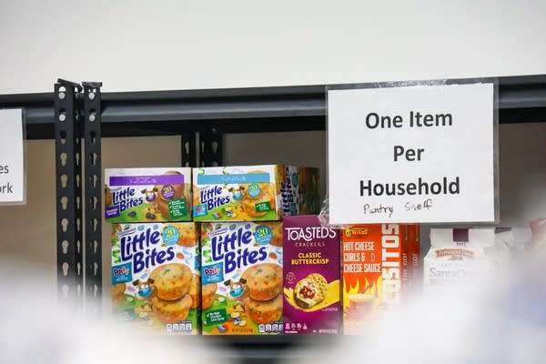
The Food Group’s annual Food Shelf Visits report shows that many Minnesotans now rely on food shelves for more of their meals. The report indicates that 83 percent of monthly food shelf users now visit more than once a month, and 57 percent of them rely on their food shelves for at least half of half or more of their groceries each month.

Boxes of snacks sit on a shelf with the sign, "One item per household."
Food items at the ECHO Food Shelf in Mankato, Minn., on Feb. 17.
Hannah Yang | MPR News

“Our food shelf has become something that [families] need to rely on every week to be able to have fresh produce and milk and other essentials for their family, whereas maybe a year or two years ago, we were something that they would only use in case of emergency or during tight times,” said Jessica Francis, executive director of Open Cupboard, which operates food shelves in the Twin Cities suburbs of Oakdale and Maplewood.

In 2025, Open Cupboard saw more than 1.18 million visits to its various programs, and the nonprofit distributed about 6.7 million pounds of food. During the federal government shutdown in October and November, when SNAP benefits were frozen, more than 1,300 households that had never used the food shelf before turned to Open Cupboard to help feed their families.

Francis said the continuation of rising costs for basic necessities, along with skyrocketing gas prices due to the war in Iran, will squeeze family budgets even more. Francis said the vast majority of their clients are working but are increasingly unable to make ends meet, so the food shelf is preparing for even more demand.

A woman packs a bag
"For us to be able to keep serving our community, we just realized that the system that we had used during COVID would just stay in place until our numbers drop," said Deisy de Leon Esqueda, ECHO Food Shelf manager. She packs meat products into a box and stores them in freezers on Feb. 24, 2025.
Hannah Yang | MPR News

“We have to be thinking about what’s coming next and making sure that we have everything we need in place, and so that’s what’s really keeping me up at night, is making sure that we are building systems that can be responsive,” Francis said. “Because we know that things can change overnight and they can change within a week.”

Earlier this week, about 300 hunger relief advocates met with state lawmakers to discuss legislative priorities. They’re pushing for increased state funding in the Minnesota Food Shelf Program, and support for a new regional food bank grant that’ll allow food banks to purchase and distribute more food to food shelf partners.

Other priorities include having the state step in to help keep people enrolled in SNAP, the federal food assistance program, and providing prepared meals tailored to the medical needs for seniors and the nutritional needs of families across the state. 


Source link

Leave a Reply

Subscribe to Our Newsletter

Get our latest articles delivered straight to your inbox. No spam, we promise.

Recent Reviews


What is Power BI Visualization

Regularly our business produces more data on sales, the performance of marketing, interactions of customers, inventory levels, metrics production, levels of staffing, KPIs, costs, etc. Still, there is a problem with massive amounts of data shifting as it is tough to understand the content’s theme. It helps us convert our entire complex data as simple to understand and visually useful compelling information for business, present-day visualization tools, and permits us to maintain our KPIs as more simple and straightforward. It helps combine the data and use AI analytics to display relationships between the market, KPIs, and the world. When we observe the format of our presented data, connections, patterns and insights, it gives life to data to make us experts in the storytelling of hidden insights in our data; these visualizations help users develop business insights effectively with high speed.

Become a Power BI Certified professional by learning this HKR Power BI Online Training !

Why is Power BI visualizations

It is a powerful tool of data sharing and communicating, and it may be helpful in performance demonstration, trends communication, latest strategies impact and more. Its representations work like a practical collaboration tool and contacts and get more value for reports, apps, and journalism. With the help of the best insights, we can make decisions with confidence, and it empowers us to have the arms and knowledge with tools for the right decisions at the proper time. We need to decide to gather the information like the types of data we require and the insights we need.

Power BI Training

  • Master Your Craft
  • Lifetime LMS & Faculty Access
  • 24/7 online expert support
  • Real-world & Project Based Learning

Power BI visualizations types

Visualizations are nothing but the pictorial representation of our data; some general examples are maps, radial gauges, scatter charts, column charts, etc. The given below are some essential types of Power BI visualizations. 

1.Area charts:

These charts have support from online maps along with the area between line and axis. They highlight the change of magnitude and gains attention to the entire value. 

2.Bar and column charts:

These charts are known for the particular value in various categories.

3.Cards:

Cards expose the single fact and data point. It is essential to track our reports and dashboards of power BI like market share, total sale, and opportunities.

4.Combo charts:

These charts help to combine the line charts and column charts into one. It permits us to compare the data quickly. They can maintain two Y axes to look close. For correlation illustration between two measures, these combo charts are the best choice.

Unleash your data potential with Power BI Training in Hyderabad!

5.Decomposition tree:

The visuals of this tree allow us to expose our data across various dimensions. It generates the data automatically and drills it as our dimensions in the required order.

6.Doughnut charts:

They are like pie charts and display the parts’ relationship to the whole, but the main difference is it has space at the centre used for labels or icons.

7.Funnel charts:

They help the visualization process; it includes various items and stages randomly from one location to another.

8.Gauge charts:

They have the circular arc and expose the single value, which calculates the aim’s development. Its purpose is by line through shading, and the value represents the progress displayed as bold in the arc.

9.Key influencers chart:

This chart exposes the essential contributors to choose the value. It is an excellent selection to help us understand the factors that may affect the key metrics. It is like what attracts the users to put a second order and why sales are high in previous times.

10.KPIs:

It is a visual key that communicates the part of progress for measurable aim. The given below are two reasons to prove that KPIs are great.

  • They use it for progress measurements.
  • They are helpful for distance measurement towards the goal.

Top 50 frequently asked Power BI Interview Questions !

11.Line charts: They are used to emphasize the entire shape of the overall series of values.

12.Basic maps: These basic maps associate the quantitative data and category with the spatial location.

14.ArcGIS maps: It is an available choice for themes, locations types, symbol styles, base maps, and reference layers to design the informative map’s visuals. And it is the combination of data layers on a plan to display the deep knowledge of the information in our visual.

15.Choropleth: These charts are patterns used to expose how value varies in proportion in the region. It displays the differences through shading from dark to light. 

Business Intelligence & Analytics, power-bi-visualization-description-0, Business Intelligence & Analytics, power-bi-visualization-description-1

Subscribe to our YouTube channel to get new updates..!

16.Shape maps: they are used to compare the map regions through colour and shape, as shape maps cant display the precise data locations on the map. Its main aim is to display the parts Comparison on the map through various kinds of coding.

17.Matrix: it is a kind of table visual which gives support to a stepped layout; its report creators contain matrices in dashboards to provide users to choose multiple elements in a matrix on the report page.

18.Pie charts: it permits the users to display the relationship of the parts to the whole. It is used for report designers to design a Power App and turn it into the report of Power BI.

19.Q&A visual: they are similar to the experience of Q&A of dashboards. They permit us to ask questions regarding our information through natural language.

20.Ribbon charts: it displays the data according to ranking. They are very effective in rank, showing rank changes through the highest range on top of every period.

21.Scatter and dot plot charts: it always includes two axes’ values to display one numerical group of data, along with another numerical value, vertical axis, and horizontal axis. They show the intersecting points of x and y numerically. It units those two values as a single point. They may explore unevenly or evenly in the horizontal axis based on the data. The dot plot is similar to the scatter chart, but it can categorize the information with the x-axis.

22.Scatter high density: it permits users to design the visuals with high speed, helping for interactions. Its sampling uses an algorithm that removes the overlapping points and makes sure that the complete data set points to expose the visuals. 

Want to know more about Power BI,visit here Power BI Tutorial !

23.Slicers: these charts are standalone, which may be for other visuals filtering on the page. They are available in various formats and designed to permit to choose the single one or many as per the requirement. 

24.Innovative narrative: It is helpful to add the data to reports for the point out trend and essential takeaways and previous explanations. The data help customers to get an idea of data and recognize the crucial findings at high speed.

25.Standalone images: it is a kind of graphics that add to the dashboards.

26.Tables: it is a kind of grid map which includes the related information of logical series in rows and columns; it also maintains the headers along with table rows. They use quantitative comparison, which helps to look at various values in a single category, and the table exposes five multiple values for a single variety.

27.Treemaps: these are a kind of colour charts with rectangular shapes where the values display by size, the rectangles set in the central rectangles. Every rectangles space is allowed measured value and arranged in size from left to right.

28.Waterfall charts: they display the running of absolute added values. It helps understand how important the matter is through the changes that take place.

Power BI Training

Weekday / Weekend Batches

Conclusion: 

The visuals are the best guide for the Power BI; they are based on the data we require to expose. First, we need to understand that visuals’ vocabulary supports the graphics team of financial teams through Power BI. They are used to facilitate the graph’s selection to display the information. Visual language does not need prescribed graphs, but graphs required to  create to experience its benefits for choices to utilize them with data. Another issue with the graphical data representation with which the organizations create dashboards, they are not experts to display the complex data with a non-professional audience.

Related Article:


Source link