I Took Creatine for 3 Months. Here Are 4 Ways My Body Changed


Creatine has been gaining attention for boosting strength and performance.Credit: Viktoriya Skorikova / Getty Images
Creatine has been gaining attention for boosting strength and performance.
Credit: Viktoriya Skorikova / Getty Images
  • After three months of daily creatine, I saw noticeable muscle growth in my before-and-after measurements.
  • I also upped the weight in my strength training and experienced less soreness after workouts.
  • The only downside was mild water retention at first, but it improved with better hydration.

This year, my New Year's resolution was all about one thing: creatine. I’d hit a plateau in my strength training routine, and I'd been reading (and reporting) about how the buzzy supplement can boost performance and muscle growth. So I wanted to test it out for myself.

Creatine is a naturally occurring compound that primarily supplies energy to your muscles. Your body makes about half of the creatine you need, and the rest must come from food or supplements.

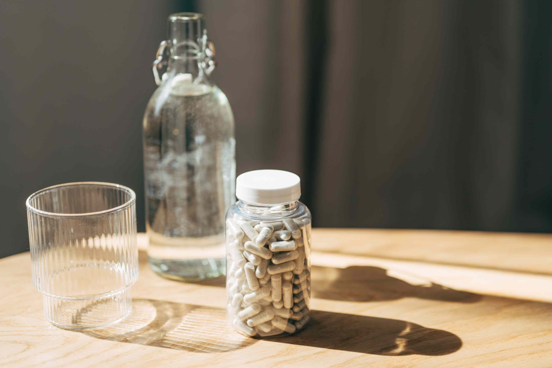
For three months, I took 5 grams (g) of creatine monohydrate (the most-studied form) every day, in either gummy or capsule form. I kept my diet the same and stuck to my regular regimen of two days of strength training a week, one for legs and one for arms and back.

Most of the research on creatine has focused on athletes and serious lifters, so I was especially curious to see if the supplement would make a difference for someone who doesn't live at the gym. Here's how my body changed.

1. My Muscles Actually Grew

Before starting creatine, I took baseline body measurements. When I took them again at the three-month mark, I was shocked at how drastic the changes were.

My glutes had grown a full inch. My thighs, calves, and biceps also grew by half an inch, while my abs and chest remained the same. I could see subtle differences in before-and-after photos, and noticed new muscle definition in places like my thighs and triceps.

2. I Could Lift More Weight

At the start of the experiment, I also noted the weights I used for my typical exercises. After three months, I was able to lift more weight for nearly every movement, while still performing three sets of 10 reps.

I saw the largest difference in my leg exercises, going from lifting 60 to 80 pounds on hip thrusts, for example. My arm and back movements saw smaller increases, such as going from 15 to 17.5 pounds in each hand for a shoulder press.

The ability to handle more weight was a change I expected to see. Creatine works by helping regenerate adenosine triphosphate (ATP), the primary energy source for muscles, allowing you to lift heavier and perform more reps before fatigue sets in. Over time, that added training volume can lead to muscle growth.

3. I Felt Less Sore After Workouts

Before creatine, my muscles always felt pretty sore the next day or two after a workout, even when I stuck to the same exercise routine. After starting creatine, I still felt a little sore, but it wasn’t nearly as intense.

Reduced soreness is a benefit of creatine that’s backed by research—and makes sense, given that creatine helps replenish muscles' energy source, enabling quicker repair of the micro-tears that cause soreness.

4. I Experienced One Side Effect

I did experience a common creatine side effect: increased thirst, which may have been related to water retention. Creatine draws water into muscle cells, which helps facilitate muscle growth, but can make you thirstier, especially early on. 

In my first two weeks on the supplement, I noticed I was constantly craving fluids. Fortunately, drinking more water helped, and my symptoms eventually subsided.

That was the only side effect I noticed, but the National Institutes of Health lists several more, including nausea, diarrhea, muscle cramps, muscle stiffness, and heat intolerance. These effects can occur, but they’re rare at typical doses, and a large body of research has demonstrated creatine's safety.

Other Factors To Consider

If you're thinking about starting your own creatine journey, here are a few more things to keep in mind:

  • Talk to your doctor first. Always check with your doctor before starting a new supplement, as these products can carry different risks for different people. My doctor said I was a good candidate for creatine (and revealed he was taking it too).
  • Choose a form that will work for you. For the first month of my experiment, I took creatine gummies. Then I switched to capsules, which were cheaper and sugar-free. For those reasons, many experts would probably point you toward pills or powder, but it’s also important to consider your own preferences and lifestyle. Above all, make sure your product is third-party tested.
  • Don't forget about rest and recovery. Strength training breaks down muscle fibers, but muscles actually grow during recovery—and that process works best with proper rest, sleep, and nutrition. While everyone can create an effective routine, habits like waiting at least a day or two before training the same muscle group and eating a 20-g protein bar after every strength workout have worked for me.
  • I didn't notice any cognitive benefits. Growing research suggests creatine may help with cognition, fatigue, and stress, especially in people who are sleep deprived. I can't say I noticed any benefits myself, but I was taking a lower dose than what’s been used in some studies. 
  • My "experiment" wasn't perfect. It probably goes without saying, but my creatine experiment was an anecdotal experience, not a perfectly controlled study. It's possible the placebo effect motivated me to lift heavier weights, influencing my gains. But with such stark results, I do believe creatine played at least some part.

My final take? Creatine has been a simple, affordable way to break out of my strength training rut. I highly recommend it for increasing strength and muscle mass—with a doctor's approval. 


Source link

Leave a Reply

Subscribe to Our Newsletter

Get our latest articles delivered straight to your inbox. No spam, we promise.

Recent Reviews


What is Power BI Visualization

Regularly our business produces more data on sales, the performance of marketing, interactions of customers, inventory levels, metrics production, levels of staffing, KPIs, costs, etc. Still, there is a problem with massive amounts of data shifting as it is tough to understand the content’s theme. It helps us convert our entire complex data as simple to understand and visually useful compelling information for business, present-day visualization tools, and permits us to maintain our KPIs as more simple and straightforward. It helps combine the data and use AI analytics to display relationships between the market, KPIs, and the world. When we observe the format of our presented data, connections, patterns and insights, it gives life to data to make us experts in the storytelling of hidden insights in our data; these visualizations help users develop business insights effectively with high speed.

Become a Power BI Certified professional by learning this HKR Power BI Online Training !

Why is Power BI visualizations

It is a powerful tool of data sharing and communicating, and it may be helpful in performance demonstration, trends communication, latest strategies impact and more. Its representations work like a practical collaboration tool and contacts and get more value for reports, apps, and journalism. With the help of the best insights, we can make decisions with confidence, and it empowers us to have the arms and knowledge with tools for the right decisions at the proper time. We need to decide to gather the information like the types of data we require and the insights we need.

Power BI Training

  • Master Your Craft
  • Lifetime LMS & Faculty Access
  • 24/7 online expert support
  • Real-world & Project Based Learning

Power BI visualizations types

Visualizations are nothing but the pictorial representation of our data; some general examples are maps, radial gauges, scatter charts, column charts, etc. The given below are some essential types of Power BI visualizations. 

1.Area charts:

These charts have support from online maps along with the area between line and axis. They highlight the change of magnitude and gains attention to the entire value. 

2.Bar and column charts:

These charts are known for the particular value in various categories.

3.Cards:

Cards expose the single fact and data point. It is essential to track our reports and dashboards of power BI like market share, total sale, and opportunities.

4.Combo charts:

These charts help to combine the line charts and column charts into one. It permits us to compare the data quickly. They can maintain two Y axes to look close. For correlation illustration between two measures, these combo charts are the best choice.

Unleash your data potential with Power BI Training in Hyderabad!

5.Decomposition tree:

The visuals of this tree allow us to expose our data across various dimensions. It generates the data automatically and drills it as our dimensions in the required order.

6.Doughnut charts:

They are like pie charts and display the parts’ relationship to the whole, but the main difference is it has space at the centre used for labels or icons.

7.Funnel charts:

They help the visualization process; it includes various items and stages randomly from one location to another.

8.Gauge charts:

They have the circular arc and expose the single value, which calculates the aim’s development. Its purpose is by line through shading, and the value represents the progress displayed as bold in the arc.

9.Key influencers chart:

This chart exposes the essential contributors to choose the value. It is an excellent selection to help us understand the factors that may affect the key metrics. It is like what attracts the users to put a second order and why sales are high in previous times.

10.KPIs:

It is a visual key that communicates the part of progress for measurable aim. The given below are two reasons to prove that KPIs are great.

  • They use it for progress measurements.
  • They are helpful for distance measurement towards the goal.

Top 50 frequently asked Power BI Interview Questions !

11.Line charts: They are used to emphasize the entire shape of the overall series of values.

12.Basic maps: These basic maps associate the quantitative data and category with the spatial location.

14.ArcGIS maps: It is an available choice for themes, locations types, symbol styles, base maps, and reference layers to design the informative map’s visuals. And it is the combination of data layers on a plan to display the deep knowledge of the information in our visual.

15.Choropleth: These charts are patterns used to expose how value varies in proportion in the region. It displays the differences through shading from dark to light. 

Business Intelligence & Analytics, power-bi-visualization-description-0, Business Intelligence & Analytics, power-bi-visualization-description-1

Subscribe to our YouTube channel to get new updates..!

16.Shape maps: they are used to compare the map regions through colour and shape, as shape maps cant display the precise data locations on the map. Its main aim is to display the parts Comparison on the map through various kinds of coding.

17.Matrix: it is a kind of table visual which gives support to a stepped layout; its report creators contain matrices in dashboards to provide users to choose multiple elements in a matrix on the report page.

18.Pie charts: it permits the users to display the relationship of the parts to the whole. It is used for report designers to design a Power App and turn it into the report of Power BI.

19.Q&A visual: they are similar to the experience of Q&A of dashboards. They permit us to ask questions regarding our information through natural language.

20.Ribbon charts: it displays the data according to ranking. They are very effective in rank, showing rank changes through the highest range on top of every period.

21.Scatter and dot plot charts: it always includes two axes’ values to display one numerical group of data, along with another numerical value, vertical axis, and horizontal axis. They show the intersecting points of x and y numerically. It units those two values as a single point. They may explore unevenly or evenly in the horizontal axis based on the data. The dot plot is similar to the scatter chart, but it can categorize the information with the x-axis.

22.Scatter high density: it permits users to design the visuals with high speed, helping for interactions. Its sampling uses an algorithm that removes the overlapping points and makes sure that the complete data set points to expose the visuals. 

Want to know more about Power BI,visit here Power BI Tutorial !

23.Slicers: these charts are standalone, which may be for other visuals filtering on the page. They are available in various formats and designed to permit to choose the single one or many as per the requirement. 

24.Innovative narrative: It is helpful to add the data to reports for the point out trend and essential takeaways and previous explanations. The data help customers to get an idea of data and recognize the crucial findings at high speed.

25.Standalone images: it is a kind of graphics that add to the dashboards.

26.Tables: it is a kind of grid map which includes the related information of logical series in rows and columns; it also maintains the headers along with table rows. They use quantitative comparison, which helps to look at various values in a single category, and the table exposes five multiple values for a single variety.

27.Treemaps: these are a kind of colour charts with rectangular shapes where the values display by size, the rectangles set in the central rectangles. Every rectangles space is allowed measured value and arranged in size from left to right.

28.Waterfall charts: they display the running of absolute added values. It helps understand how important the matter is through the changes that take place.

Power BI Training

Weekday / Weekend Batches

Conclusion: 

The visuals are the best guide for the Power BI; they are based on the data we require to expose. First, we need to understand that visuals’ vocabulary supports the graphics team of financial teams through Power BI. They are used to facilitate the graph’s selection to display the information. Visual language does not need prescribed graphs, but graphs required to  create to experience its benefits for choices to utilize them with data. Another issue with the graphical data representation with which the organizations create dashboards, they are not experts to display the complex data with a non-professional audience.

Related Article:


Source link