Medically reviewed by Kayla Girgen, RD
:max_bytes(150000):strip_icc():format(jpeg)/GettyImages-1487153873-4279d0ae271946648a906567a9c83cde.png "A glass jar with a smoothie next to protein powder on a wooden board.")
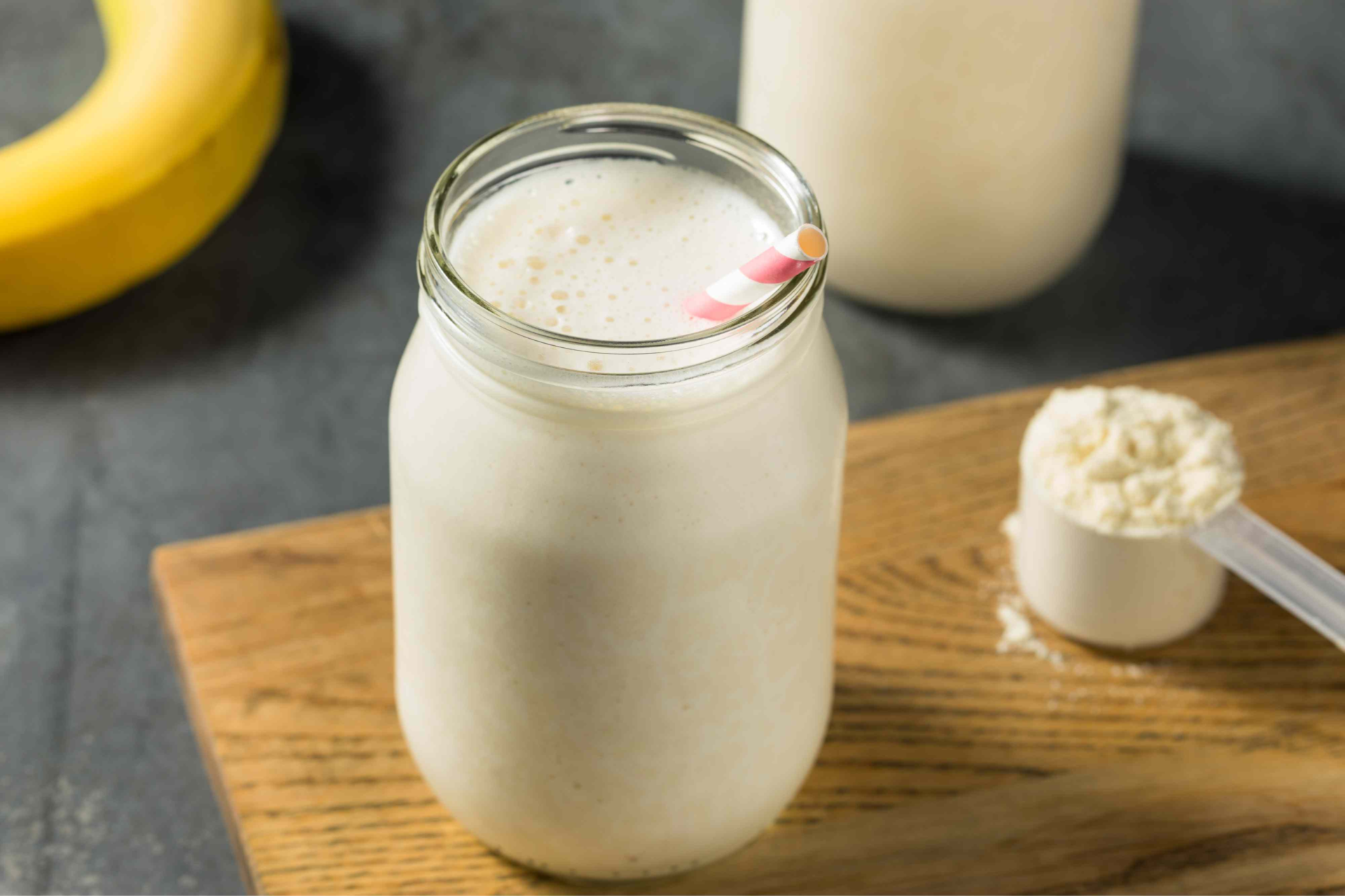
Credit: bhofack2 / Getty Images
- Protein is essential for muscle growth, tissue repair, immune function, and many more processes in the body.
- While protein shakes are a convenient source of protein, foods like cottage cheese, chicken breast, and edamame also offer substantial protein per serving.
- Aim to include whole foods with protein in each meal to hit your daily needs.
Protein shakes are a quick and easy way to boost your protein intake. Depending on the ingredients, premade and homemade shakes usually contain 15-20 grams of protein. However, many whole foods offer just as much protein—if not more—in addition to essential vitamins, minerals, and nutrients to boost your overall health.
1. Cottage Cheese

- Protein: 23.3 grams
- Serving size: 1 cup, large curd
Cottage cheese can be used as a high-protein snack or added to foods like eggs, pancakes, and dips to boost their protein content.
In addition to protein, cottage cheese is rich in vitamins and minerals, like B12, calcium, and selenium.
2. Canned Tuna

- Protein: 20.1 grams
- Serving size: 3 ounces
Canned tuna is shelf-stable and can be purchased in bulk, so you always have a high-protein option on hand for snacking and preparing easy meals.
Tuna is also low in carbohydrates, making it an excellent option for people following low-carb diets like the keto diet.
3. Chicken Breast

- Protein: 25.9 grams
- Serving size: 3 ounces
Chicken breast is one of the best sources of protein you can eat. It's also a good source of essential vitamins and minerals like B vitamins, zinc, and selenium.
Chicken breast can be made into high-protein snacks like chicken salad or used as a protein source for simple, high-protein lunch and dinner recipes.
4. Shrimp

- Protein: 20.4 grams
- Serving size: 3 ounces
Shrimp is high in nutrients like vitamin B12, selenium, and astaxanthin, a powerful antioxidant that protects against cellular damage.
It's a great low-carbohydrate, high-protein addition to salads and stir-fries.
5. Ground Turkey

- Protein: 23.3 grams
- Serving size: 3 ounces
Ground turkey is a good source of B vitamins, like B6, which is needed for more than 100 enzymatic reactions in the body. It also contains zinc, which plays an essential role in your immunity.
6. Canned Salmon

- Protein: 19.6 grams
- Serving size: 3 ounces
Salmon is rich in vitamins and minerals like B12, selenium, and potassium, as well as the omega-3 fats docosahexaenoic acid (DHA) and eicosapentaenoic acid (EPA). These help regulate inflammation and support your immunity.
Canned salmon is shelf-stable and more affordable than fresh salmon, making it a good choice for those on a budget.
7. Greek Yogurt

- Protein: 25 grams
- Serving size: 1 container (7 ounces), plain lowfat
Greek yogurt provides more than twice the amount of protein found in regular yogurt, making it a better choice when trying to increase your protein intake.
It's also packed with essential nutrients like calcium, which gives the bones and teeth structure and regulates nerve and muscle function, hormone secretion, and blood vessel dilation.
8. Edamame

- Protein: 18.4 grams
- Serving size: 1 cup
Edamame is an excellent option for those on plant-based diets who want an easy source of protein to add to meals and snacks.
It's also high in fiber, which supports and protects gut health, and folate, a B vitamin required for DNA synthesis, cellular division, and the maturation of red blood cells.
9. Seitan

- Protein: 15 grams
- Serving size: 3 ounces
Seitan is a plant-based protein source made from gluten, a group of proteins found in wheat. Its chewy, meat-like texture makes it a popular vegan-friendly meat substitute for stir-fries, sandwiches, and other dishes.
10. Navy Beans

- Protein: 15 grams
- Serving size: 1 cup, cooked
Navy beans are one of the best sources of plant-based proteins you can eat. They contain several vitamins and minerals but are especially high in folate, iron, selenium, and magnesium. Magnesium is a mineral needed for blood sugar and blood pressure regulation.
11. Tempeh

- Protein: 33.7 grams
- Serving size: 1 cup
Tempeh is a vegan-friendly protein source made from fermented soybeans. It's also a good source of B vitamins and minerals like iron, folate, and calcium.
Tempeh has a firm, meaty texture and can be used as a plant-based protein in vegetarian and vegan dishes.
12. Protein Bars

- Protein: 15–20 grams
- Serving size: 1 bar
Protein bars are portable, easy to eat, and can be enjoyed in place of protein shakes.
The protein content of protein bars varies, though most contain between 15 and 20 grams per serving. It's important to read nutrition labels to ensure you choose a bar with at least 10 grams of protein per serving.
13. Lentils

- Protein: 17.9 grams
- Serving size: 1 cup, cooked
Lentils are a nutritional powerhouse, offering fiber, B vitamins, and minerals like magnesium, zinc, iron, and potassium. Fiber is important for gastrointestinal and cardiovascular health.
14. Sardines

- Protein: 22.6 grams
- Serving size: 1 can (3.75 ounces)
Sardines are tiny fish that are exceptionally nutritious. They contain several essential vitamins and minerals, like vitamin E, iron, B12, and calcium.
Sardines can be enjoyed on their own as a protein-rich snack or added to salads, soups, pasta, or pizza for a boost of protein.
15. Chicken Liver

- Protein: 20.8 grams
- Serving size: 3 ounces
Organ meats, like chicken liver, are high in protein. Chicken liver also provides critical vitamins and minerals, like B12, vitamin A, iron, and folate.
Try adding chicken liver to salads and stir-fries, substituting it for more common protein sources like turkey, chicken, and steak.
16. Beef

- Protein: 25.8 grams
- Serving size: 3 ounces
Red meat, like beef, is one of the most protein-packed foods. Beef is also rich in vitamins and minerals, like iron.
You can incorporate it into many recipes, including burgers, pasta sauces, and sandwiches.
17. Cod

- Protein: 17.3 grams
- Serving size: 3 ounces
Cod is a mild-tasting fish that's high in protein. It also provides B vitamins and minerals like selenium and phosphorus, making it an all-around healthy choice.