Looker Data Visualization | Types of Looker Data Visualizations


Looker Data Visualization – Table of Content

What is Data Visualization?

Data Visualization means the graphical representation of information and data with the help of visual elements like graphs, maps, charts, and diagrams. Data Visualization tools will make us understand the data more easily and promptly, and it helps us to see and get a picture of new trends and patterns in data. With visual representation, it is easy to communicate information and can get our things faster. Data Visualization technologies and tools are essential in the fast-paced technological world to evaluate huge amounts of information.

This blog talks about Looker Data Visualization in great detail. It touches upon the basics of Looker as a Data Visualization tool, the different use cases of Looker Data Visualizations, and the steps involved in setting up a project in Looker. The article also covers the challenges faced by Looker Data Visualization.

What is Looker?

Looker is a popular cloud-based BI tool and an enterprise platform useful for data applications and Big Data analytics. It helps to explore, analyze, visualize, and share real-time business analytics to make better and informed business decisions. Moreover, using Looker, anyone can analyze business data and find valuable insights into the datasets much more quickly. Also, Looker uses DML language with a predefined framework. Further, we can use Looker to connect with different data sources and create customized dashboards, KPI dashboards, etc. 

We have the perfect professional Looker Training for you. Enroll now!

Types of Looker Data Visualizations 

Looker has many Visualizations which are used to describe your data. Every Visualization is different, and we can customise it according to our needs and styles. Data Visualizations make a huge impact on understanding data and help in making a clear decision. Looker Data Visualizations include bar charts, pie charts, line charts, tables, column histograms, heat maps, and box plots.

Looker has many Visualizations you can use to make sense of your data. Each type of Visualization has different settings that you can use to customise its appearance. The links below provide information about each Visualization and its settings.

Sunburst:

Sunburst charts are open-source tools used to showcase hierarchical data structures. They are visually fascinating charts, and the data is expressed in a good-looking way in the form of a radial representation.

Collapsible Tree Diagram: 

Collapsible Tree Diagram interactively visualises hierarchical data. It represents a tree and contains a root node with branches like other nodes, and nodes will enlarge and reduce according to our needs. It is an open-source tool. 

Liquid Fill Gauge: 

A Liquid Fill Gauge is an open-source tool used to determine the growth towards a goal. We can customise the font, gauge colour, animation of the waves and colour of the liquid. 

Chord Diagram: 

In a larger dataset, the connection between the two items can be efficiently visualised in the Chord Diagrams. It is also an open-source tool. In Chord Diagrams, we can characterise the movement from two different points. 

Looker Data Visualization

How to Set up a Visualization in Looker

Looker helps create various charts and graphs based on the query results. It holds the data like query results and visualization set up together. Also, it allows users to check the visualization and the relevant data while sharing the query. Let us know how to set up a visualization in Looker in detail. 

Data Visualization set up

1) To begin with, you must create and run a query.

2) Now, navigate to the “Visualization” tab and click on it to start configuring the visualization options. 

3) Then, choose the visualization type that better displays your data. 

4) Click on “Edit” at the end to configure the visual settings, such as naming charts, changing chart colour palettes, etc.  

Looker Data Visualizations Use Cases

Thanks to eCommerce data analytics, businesses now can access more data than ever. Looker comes equipped with powerful tools that help discover profitable insights and can create opportunities to grow your business.

Looker Data Visualization: eCommerce

Thanks to eCommerce data analytics, businesses now can access more data than ever. Looker comes equipped with powerful tools that help identify economical insights and can create opportunities to grow your business.

Looker provides tools to track eCommerce KPIs (key performance indicators) like shopping, conversion rates, revenue and customer values. Tools help optimise sales performance, increase online sales with predictive modelling, identify customer trends, and update prices depending on demand and supply.

  • Customer trends & behaviour

Looker Data Visualization helps customers create profiles about their order history and shopping nature and learn about their behaviour and interest. It identifies repeat purchase patterns and frames out new promotions and marketing approaches that drive the business.

  • Category & brand management

With category performance, you can easily find out the top performers in different product categories, utilise the information, and take advantage of it in purchasing decisions. With BI data, you can increase profits by making promotions depending on when and where to run. It improves inventory management and provides real-time insights about inventory. In that way, you can’t run out of stocks which are high in demand.

Looker Training

  • Master Your Craft
  • Lifetime LMS & Faculty Access
  • 24/7 online expert support
  • Real-world & Project Based Learning
Looker Data Visualization: Healthcare

With Looker, you can Analyse claims with healthcare stakeholders, doctors, insurance companies and patients and increase efficiency in the above categories. It supports HIPAA compliance. Looker has gained an advantage in creating better developments to tackle COVID -19 like diseases.

  • Efficient planning with Qventus:

Qventus is an AI-enabled platform which assists hospital teams in making better functional decisions in real-time. Looker with AI software has customised the ‘Post Acute Care Utilisation tool and PPE demand planner’ to provide the best planning and patient care.  

  • Effective and proactive monitoring by Commonwealth Care Alliance (CCA)

CCA is a non-profit, community-based healthcare organisation that provides healthcare for high-needs individuals by maintaining quality and health outcomes while reducing overall costs. CAA uses Looker and Google Big Query to check and help patients suffering from COVID-19. CCA helped their members by providing the latest facts and guidance.

  • Improved Digital Care with Force Therapeutics: 

Therapeutics, an episode-based patient engagement research network and platform, enhances care by simplifying and strengthening the relation between patients, physicians and Care Teams. By providing specialised and secure insights to patients, surgeons and administrators, they worked on modifying care and made it a more effective process. Looker is equipped with embedded analytics in its products to deliver scalable and secure insights and enhance patient care.

  • Transition to Value-Based Care: 

Alternative Payment Models (APM) are transforming healthcare, but we must analyse the metrics and their performance. Using Looker’s flexible data platform NewWave Telecom and Technologies, Inc. delivered metrics and dashboards for new APM in a short span of time. Doctors and administrators easily understand patient performance and detailed data with the help of the Centres For Medicare and Medicaid Services (CMS).  

If you want to Explore more about Looker? then read our updated article – Looker Tutorial

Looker Data Visualization: Gaming

Looker Data Visualization helps you to develop games and gain accurate insights. You can have this by understanding game analytics and boosting your revenue. 

  • Grow your gameplay metrics

With gaming analytics, you can track your KPIs, find important key insights, and be able to make better decisions. You can optimise campaigns and have a different look at campaigns in a creative way. The main key metric for gaming is Ad revenue, and automated bidding will optimise instals and increase your revenue. Find out the stability between retention and monetisation, which is required for better player engagement.

  • Gameplay Experience Optimisation

If you identify simple retention metrics like reducing churn will optimise gameplay and decrease quits. Monitor your KPIs for insights that balance difficulty and the game economy and content improve user experience in gameplay by analysing user behaviour and regularly updating the games.

Create sustainable growth by being outlandish in the market and finding your customer base. Mix up all the revenue sources and get a birds-eye view of every player’s lifetime value (LTV) at any point of their lifecycle. Prepare a cohort analysis which shows updated trends so that you can make changes in the game to improve the gameplay.

Related Article: Looker Analytics

Business Intelligence & Analytics, looker-data-visualization-description-2, Business Intelligence & Analytics, looker-data-visualization-description-3

Subscribe to our YouTube channel to get new updates..!

Looker Data Visualization: Retail

Looker is a Cloud-Native Enterprise BI Platform where retail relies on data to optimise their decision-making process. Data can affect inventory control, trend forecasting, and marketing strategy and influence customer behaviour mainly in the progressive digital space of eCom.

  • increase the customer lifetime value (LTV)

With the help of Looker’s customer support analytics, we can improve customer satisfaction by providing quality customer service, response time and results. Looker assists businesses in carefully forecasting and nullifying potential issues, ultimately decreasing service problems and improving brand loyalty. Retail analytics will identify losses and upsell opportunities.

  • Develop an omnichannel merchandising strategy

With Looker’s customer-centric platform, we can create a unified shopping experience, get a clear picture of customer behaviour, and improve the shopping experience. We can understand purchasing patterns in various channels. By using built-in technology in Looker, retailers can understand customer purchasing behaviour. We can maximise sales by making multiple data points across different channels into a centralised location and compiling them into actionable insights to drive business.

  • improve operations and supply chains

With Looker’s tracking merchandise movements, retailers can track their products from source to customer. You can gain operational efficiency by delving into minute-to-minute insights. By tying customer feedback with supply chain issues, you can enhance customer feedback and make profitability

Challenges of Building Visualizations in Looker

In the article, you have gained some basic knowledge of Looker’s Data Visualization in various sectors. Looker Data analytics and Business Intelligence tool has created a benchmark in the industry. Looker faces some challenges but has created its place; some of the challenges are:

  • It requires a lot of effort to maintain on-premise servers
  • Looker’s API face issues like authentication and is a complex tool to use
  • Datasets in Looker are huge and consume time while processing data.

Benefits of Data Visualization

The following are a few of the various benefits of using data visualization.

Draw Quick Insights

Sometimes the data may be much more complex to draw relevant insights from it. During that time, data visualization will be much helpful. It helps to simplify the complex insights of drawing from complex datasets. However, the visual data representation enables users to pull out various valuable insights from the data. These insights may be unnoticed or ignored in other formats.

Find patterns and trends Quickly.

Data visualization makes it easier to find various patterns and data trends quickly. It will be easier to find multiple trends when data is presented in a graphical format. It is used instead of resolving via text or spreadsheets. Thus, it will be much easier to discover various patterns and the latest trends through data visualization techniques. 

Quickly Establish Links Between Insights and Strategy

Visual graphics make it easier to build connections between data insights and strategy. Further, data visualization helps to reduce the gap between helpful insight and effective informed decisions. It helps companies understand the data and its connectivity with the issues. It allows organizations to identify the leading cause to connect with solutions to problems much faster.

Find Various Data Explanation Ways

You can quickly draw a story with the data using data visualization. Moreover, data visualization tools offer various graphical visuals such as pie charts, donut charts, heat maps, line charts, plots, etc. This help presents the combination, learning about different values, discovering anomalies, and comparing the relationships between different data sets. So, there are multiple ways of interpreting data through data visualization. 

 Top 30 frequently asked Looker Interview Questions !

Looker Training

Weekday / Weekend Batches

Conclusion:

Thus, you have gone through the Looker data visualization in detail. You learned how various industries leverage Looker to get more profitable and actionable insights to drive decision-making. The various data visualizations offered by Looker help to explore different data sets, extract relevant data from complex data sets, make data analysis, etc. Thus, using a powerful data visualization tool like Looker, you can easily create complete data analysis and make informed decisions quickly.

Other Related Articles: 


Source link

Leave a Reply

Subscribe to Our Newsletter

Get our latest articles delivered straight to your inbox. No spam, we promise.

Recent Reviews


Alteryx Competitors – Table of Content

What is Alteryx and why is it used? 

Alteryx is a data access, manipulation, analysis, and output software solution. This is performed once or on a recurrent (daily, weekly, monthly) basis (called a “workflow”). Alteryx creates workflows in such a way that they become a type of process documentation, allowing users to examine, collaborate on, support, and improve the workflow. Files, databases, and APIs can all be used for reading and writing data. Alteryx also has predictive analytics and geospatial analysis tools. 

Alteryx was founded on the ambition of three founders to create a company that provides a software platform that allows businesses to experience the excitement of searching for answers quickly. Alteryx was started in 1997 by Dean Stoecker, Olivia Duane Adams, and Ned Harding, and under their leadership and dedication, the company has revolutionized business through data science and analytics. Nowadays, Alteryx continues to distribute the commodities for IT, data scientists, data analysts, and business leaders by aiding them to collect deeper insights quickly and more efficiently than they could ever have imagined.

The platform of Alteryx is very robust and can be implemented by any industry or functional area. Alteryx is often used to perform and automate data operations more rapidly and efficiently. The processes vary in size and complexity and include the following features:

  • Using Spreadsheets to Combine and Manipulate Data.
  • Access to databases and SQL development as a supplement.
  • Accessibility for API, Cloud, and Hybrid locations.
  • Provides Data Science capabilities for publishing predictive models.
  • Ability to perform Geospatial Analysis for users.
  • Reports generation and Dashboards Visualizations.

Become a master of Alteryx Tools by going through this HKR Alteryx Training!

Alteryx Training

  • Master Your Craft
  • Lifetime LMS & Faculty Access
  • 24/7 online expert support
  • Real-world & Project Based Learning

Top 8 Competitors of Alteryx:

The following tools are the top 8 Alteryx competitors available in the market today.

1) Tableau

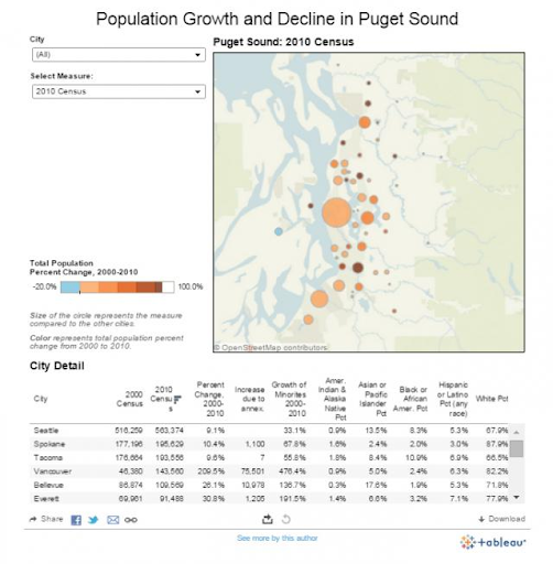
Tableau Software is an interactive data visualization software company based in the United States that focuses on business intelligence. It began in Mountain View, California, in 2003 and is now headquartered in Seattle, Washington. Tableau is a dashboard-based visual analytics engine that makes it easy to build interactive visual analytics. Non-technical analysts and end-users will find it easier to translate data into comprehensible, interactive graphics using these dashboards. Tableau makes it easy to combine data from public sources with your data, resulting in new and meaningful insights. Blending census data with your proprietary data, for instance, can provide normalized population results, which can provide new insights into activities.

Tableau visualization of census data

The following are some of the Tableau features:

  • Tableau Dashboards use visuals, visual objects, text, and other elements to provide you with a holistic picture of your data.
  • Tableau provides easy ways for users to collaborate and share data in real-time.
  • Tableau offers in-memory data access to both live data sources and data extraction from external data sources.
  • Tableau has a plethora of data source options from which you can connect and retrieve data.
  • Tableau comes with a lot of pre-installed map data, including cities, postal codes, administrative boundaries, and so on.

Tableau may be used to make forecasts, identify trends and outliers, produce maps, and more. Tableau employs drag-and-drop capabilities similar to Alteryx, but instead of imposing various transformations on data to clean it, you apply visualizations to data segments to see data in different ways in Tableau.

2) Microsoft

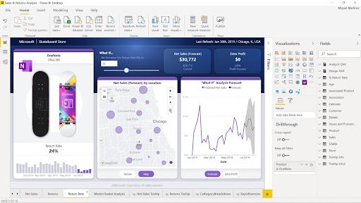
Microsoft Power BI was first released in July 2013 as part of Office 365. Microsoft Power BI is a broadly used application in a firm that deals with a vast amount of raw data and processes it for gathering actionable insights. It enables us to visualize dispersed and unfiltered data effectively and understandably. Most of the critical reports we create, both for external and internal usage, include data crunching, and all of them are created with Power BI.

Power BI Interactive Reports

The following are some of the Microsoft Power BI features:

  • It provides a diverse set of detailed and appealing visuals.
  • Users of Power BI can choose from a range of data sources using the Get Data feature.
  • Datasets can be filtered to create smaller subsets with only the most relevant facts and context.
  • Support for customizable dashboards.
  • Reports developed in Power BI can be shared with other users.

The best use of PowerBI is to create interactive dashboards. Alteryx will make it easier, quicker, and faster to create dashboards in PowerBI by allowing you to create visual workflows to modify data from different sources and produce powerful analytics models.

3) Qlik

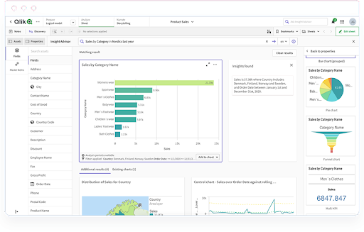
Qlik offers a platform for business analytics. The software firm was started in Lund, Sweden, in 1993 and is presently headquartered in King of Prussia, Pennsylvania. Qlik Sense Enterprise is a simple platform that allows you to design a variety of dashboards. The user experience is the same for both developers and end-users. It also helps us to organize the entire firm around strategic goals and provides cloud-based execution of its products. Developers may easily create a data model or code in the upload editor with Qlik on all main cloud platforms. It also combines data analysis and data discovery, with a wide choice of graphs and objects to show data in a user-friendly interface. The presentation is very clean, and you can design some attractive apps that present data neatly.

Dashboard Analytics in Qlik Sense

The following are some of the Qlik Sense features:

  • An associative model can be used in which the whole data that is loaded into Qlik Sense, from any data source, to be linked and associated.
  • Qlik Sense provides smart and powerful visualizations to help with data analysis.
  • Centralized Sharing and Collaboration of reports and applications.
  • Prepares data for loading to clean, transform, associate, and integrate it with other data sets being loaded.
  • Data security, monitoring, centralized management, and control are all ensured with Qlik Sense’s enterprise-class management services.

Alteryx licenses are based on a subscription model, which includes all product upgrades and customer support. Qlik Sense is a visual analytics and business intelligence (BI) platform that covers several analytic use cases.

Become a master of Alteryx Tools by going through this HKR Alteryx Training In Bangalore

4) IBM

Smart Cloud Enterprise, IBM’s public cloud product, was released on April 7, 2011. IBM Cloud® Paks are AI-powered tools that may assist enterprises in developing, modernizing, and managing apps securely across any cloud. They include containerized software that has been pre-certified and also core services that give customers common operations and integration frameworks. It provides a uniform experience for an infrastructure management control plane with AI, automation, and security. IBM® Cloud Pak for Data is a cloud-native solution that helps you to rapidly and efficiently put your data to work. Cloud Pak for Data boosts productivity by allowing users to search for existing data or request data access. The data fabric architecture offered by Cloud Pak for Data allows your firms to accelerate data analysis for better, faster insights.

Features of Cloud Pak for Data data fabric architecture include the following.

  • Without relocating data, data access can be simplified and automated access across several clouds and on-premises data sources.
  • Ensures that all data, regardless of source, is used safely.
  • Provide a self-service experience for locating and using data for business users.
  • Automate and orchestrate the data lifecycle using AI-powered capabilities.

If you want to Explore more about AlterYX? then read our updated article – AlterYX tutorial

Alteryx Competitors 3

Subscribe to our YouTube channel to get new updates..!

5) SAP 

SAP was founded in 1972 by five former IBM employees to develop standard software for real-time business operations. SAP (Systems Applications and Products in Data Processing) is an acronym for Systems Applications and Products in Data Processing. SAP Agile Data Preparation aids in the refinement of data gathered from different sources. The SAP Agile Data Preparation tool transforms the data before we can use it to build various Analytical Visualizations. The raw data contains a lot of unnecessary noise that can divert the end findings of Analytical Visualizations, thus we must process it properly.

SAP Agile Data Preparation

The following are features in SAP Agile Data Preparation:

  • SAP Agile Data Preparation is a self-service data preparation program that allows you to discover, integrate, and transform data.
  • The data can be transformed quickly into actionable, simple consumable information.
  • The tool can assist you in achieving greater success with analytics, MDM initiatives, and data migration
  • Data access and discovery are simplified and are more productive and agile.

6) Informatica

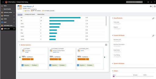
Informatica is an American software development company established in 1993. The core products of cloud Informatica comprises Enterprise Cloud Data Management and Data Integration. Informatica Enterprise Data Preparation assists you in making better decisions by allowing you to prepare data that can provide you with various deep and relevant insights. It’s simple to use and can connect to a wide range of various data sources. This product’s customer service team is quite helpful and responds to questions on time.

Informatica Enterprise Data Preparation

The following are features in Informatica Enterprise Data Preparation:

  • The Informatica CLAIRE® engine can be used to produce a dataset and recipe recommendations.
  • Perform quick data discovery, impact analysis, social curation, and collaboration.
  • Easily import, upload, or publish files on AWS S3 and Microsoft ADLS, including support for ADLS Gen2.
  • Support CSV file import, Avro, Apache Parquet; bring unstructured or structured data into pipelines.
  • Data can be processed at an enterprise scale using pre-built data integration transformations and aids with accuracy and consistency.
  • Record data preparation steps as reusable data pipeline mappings for easy execution using a user-friendly interface.

7) MicroStrategy

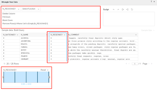
MicroStrategy was started in 1989 by Michael J. Saylor, Sanju Bansal, and Thomas Spahr. The company creates software for analyzing internal and external data and developing mobile apps. MicroStrategy offers a software development kit that allows you to customize the app and incorporate it with other apps. MicroStrategy has simplified access to every business resource, including mobile device management systems, cloud apps, databases, and a lot more. It supports a wide range of data formats and displays data in several ways. It comes with a reliable version that allows developers to hard code the dashboard to interact with input software. It allows businesses to make better decisions. The widgets are significant because of custom features and filters, and there are many widgets in the dashboard view.

Data wrangling in MicroStrategy

The following are a few features in MicroStrategy:

  • MicroStrategy’s data discovery feature enables it to connect to any data source and combine data from several sources.
  • With a broad set of built-in data wrangling and parsing capabilities, Data Wrangling aids with data transformation and modification.
  • The analytical capabilities incorporate third-party data mining tools. The Data Mining Services are used for building the predictive reports.
  • Includes the extensive library of analytical functions used for comprehending the relationships between data and creating metrics.
  • Offers the real-time dashboard for live data monitoring of the most existing information.

8) SAS

SAS is a statistical software suite for multivariate analysis, advanced analytics, data management, predictive analytics, criminal investigation, and business intelligence developed by SAS Institute. SAS was created at North Carolina State University between 1966 and 1976 when it was established as SAS Institute. SAS Data Preparation is the go-to tool for data preparation in any data analytics pipeline. SAS Data Prep provides advanced Exploratory Data Analysis (EDA) tools to help you assess whether and how much data preparation is needed. You can quickly uncover your data by looking for duplicates, basic statistics, and patterns. The technical and non-technical team members benefit from the point-and-click modern UI, which makes it intuitive and lengthens the learning curve.

SAS

The following are a few features in SAS:

  • Intuitive UI is used with embedded AI to access, profile, cleanse, and transform data.
  • Data can be accessed from multiple sources like flat files, relational data sources, data lakes, SAS data sets, Teradata, CSV or text files, etc.
  • The exploration, refinement, and transformation of data analytical readiness are aided by prebuilt transformations and data cleansing.
  • Create a seamless data discovery and data preparation user experience by automatically integrating prepared data into the analytics pipeline.
  • It is powered by SAS Viya, an architecture that is fully redesigned which is compact, cloud-native, and fast.

Explore Alteryx Sample Resumes Download & Edit, Get Noticed by Top Employers! 

Alteryx Training

Weekday / Weekend Batches

Conclusion:

Unlike many other products, Alteryx is simple to use for business customers who do not have an IT background. Alteryx is better in many aspects as compared with other competitors allowing teams to create processes that are more effective, repeatable, error-free, and risk-free. Alteryx is an excellent platform to choose for a digital transformation or automation endeavor because it can be used as a major building block.

Related Articles 


Source link