First look at Porter’s new Montreal Metropolitan Airport


Travelers have a convenient new way to fly to Montreal.

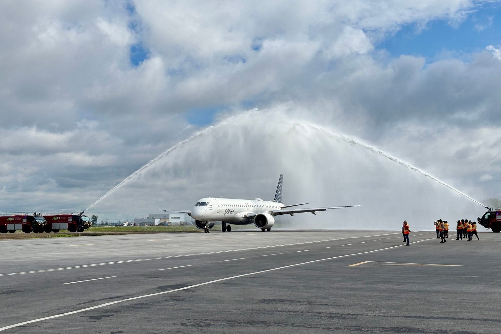
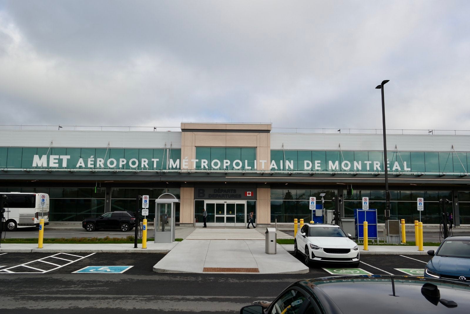
Porter Airlines and Canadian regional carrier Pascan Aviation on Monday inaugurated a new secondary airport in the Montreal area: the MET-Montreal Metropolitan Airport (YHU), located some 10 miles east of downtown Montreal.

Porter CEO Michael Deluce described the opening as a “significant milestone” for the Toronto-based carrier.

It should give travelers flying to and from Montreal a quieter alternative to the region’s largest gateway, Montreal-Trudeau International Airport (YUL).

The next Oneworld alliance airline? Canada’s Porter Airlines says it would be ‘obvious’ choice

Porter’s inaugurated the new Montreal Metropolitan Airport with a flight to Vancouver on June 15. EDWARD RUSSELL FOR THE POINTS GUY

“Being the first airline to serve two Montreal airports, Porter’s giving travelers greater flexibility,” Deluce said.

Read more: How North American airports are preparing for the 2026 World Cup

What to know about the new Montreal airport

The new airport will serve as a complement, of sorts, to the far larger Montreal-Trudeau airport, which is a major hub for Porter’s top competitor, Air Canada. This opening marks the first time in more than two decades that Canada’s second-largest city has had two commercial airports; some travelers may remember that commercial flights to the former Montreal Mirabel International Airport (YMX) ceased in 2004.
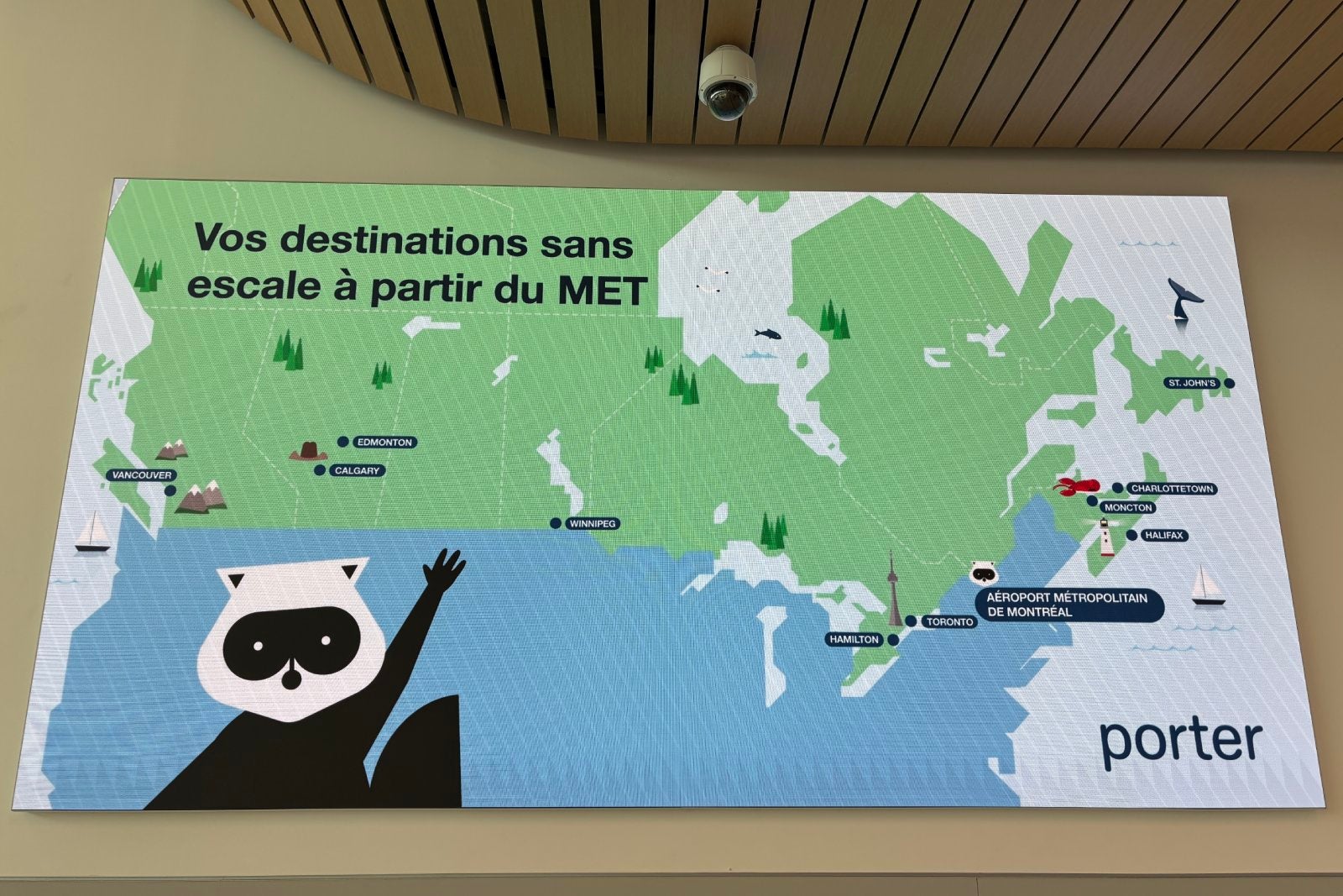
Routes from YHU

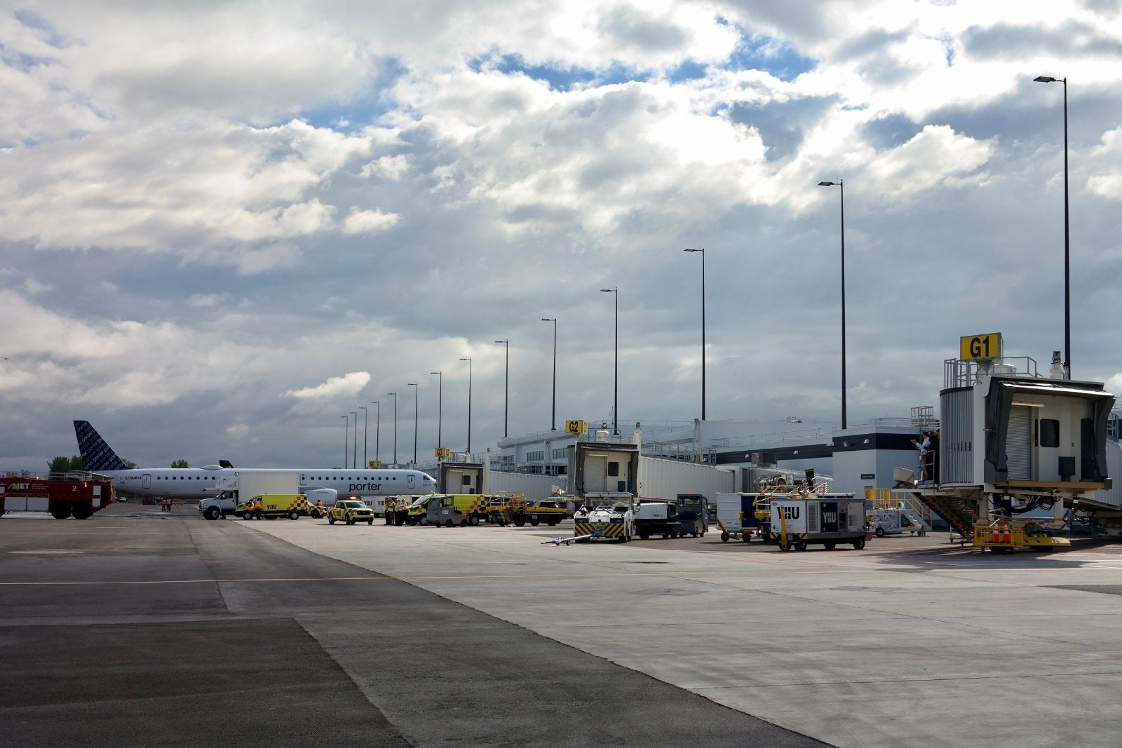
Porter will use a mix of De Havilland Canada Dash 8-Q400 and Embraer E195-E2 aircraft to offer nonstop flights to 11 destinations across Canada from YHU by June 22, schedule data from aviation analytics firm Cirium shows. Destination airports include:

Reward your inbox with the TPG Daily newsletter

Join over 700,000 readers for breaking news, in-depth guides and exclusive deals from TPG’s experts

  • Calgary International Airport (YYC)
  • Charlottetown Alexander B. Campbell Airport (YYG)
  • Edmonton International Airport (YEG)
  • Halifax Stanfield International Airport (YHZ)
  • John C. Munro Hamilton International Airport (YHM)
  • Greater Moncton Romeo LeBlanc International Airport (YQM)
  • St. John’s International Airport (YYT)
  • Billy Bishop Toronto City Airport (YTZ)
  • Toronto Pearson Airport (YYZ)
  • Vancouver International Airport (YVR)
  • Winnipeg James Armstrong Richardson International Airport (YWG)

Pascan, the Canadian regional carrier, serves another four destinations from YHU.

Porter’s destinations from the new Montreal Metropolitan Airport. EDWARD RUSSELL FOR THE POINTS GUY

No international flights at YHU

One thing that’s missing at the new airport? International flights.

As of now, the operator of Montreal’s main airport has an “exclusivity clause” in its lease that bars international flights from any nearby secondary airports — including YHU.

So, for now, don’t expect to see any nonstop flight from the U.S. to the new terminal.

But Porter and the operator of the new airport terminal want to see those restrictions changed in the future.

“As the community uses this airport — as it’s loved by the community — if local community politicians and [the airport operator] want us to look at international flights, it’s something we’ll look at very closely,” Deluce said.

Porter CEO Michael Deluce speaking at the opening of the new Montreal Metropolitan Airport. EDWARD RUSSELL FOR THE POINTS GUY

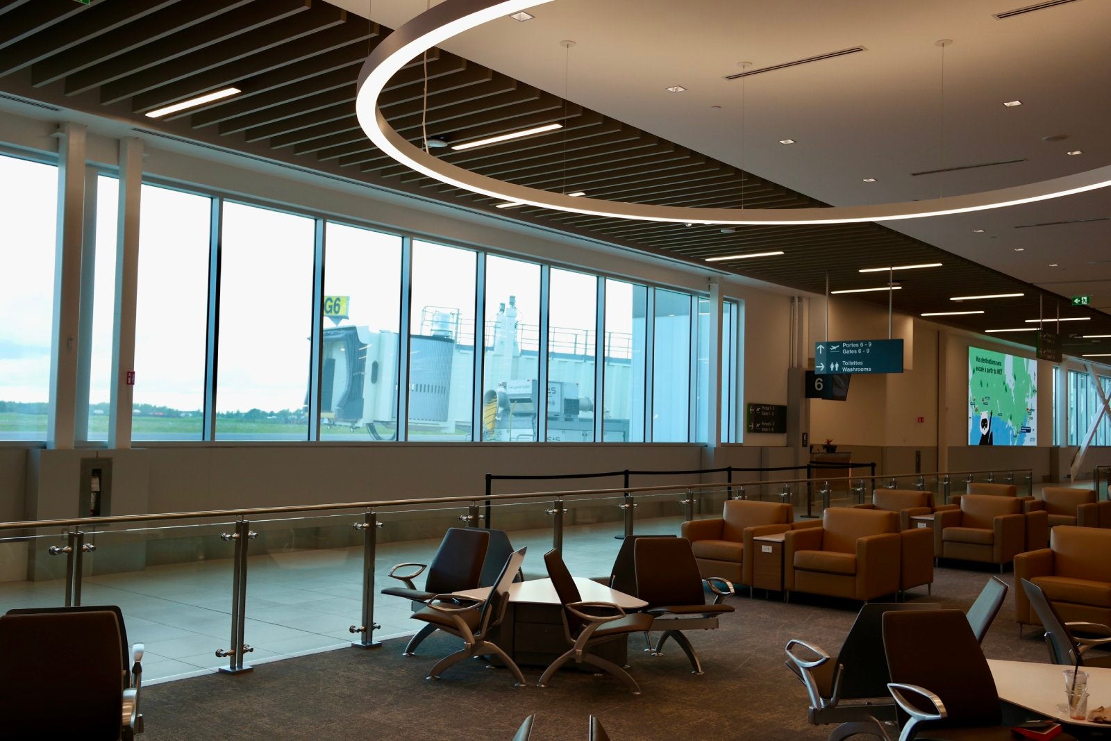
A lounge-like terminal

The highlight of YHU is its new terminal. The unassuming building is modern, spacious and bright — the opposite of YUL’s chaotic, crowded atmosphere.

EDWARD RUSSELL FOR THE POINTS GUY

The single-story building features an airy, double-height lobby where travelers can check-in and drop off bags. It is not a terminal that seeks a “grand gesture” like the soaring, jet-age main terminal at Dulles International Airport (IAD).

In the Washington, D.C. area, United Airlines has a hub at Dulles International Airport (IAD).
Dulles International Airport (IAD). SEAN CUDAHY/THE POINTS GUY

Rather, it’s intuitive and pleasant for travelers.

“A grand gesture just doesn’t come across,” David Scott, the principal-in-charge of design at Scott Associates Architects Inc. (which designed the terminal), said while sitting in the postsecurity departures lounge. “The terminal has to be simple and intuitive.”

The YHU terminal is simple and intuitive, yet subtle. From the check-in area, travelers have just one way to walk: toward security. The corridor then leads them to a giant image of the R-100 airship that flew from the U.K. to Montreal in 1930 and eventually into the departures lounge.

Both Deluce and Scott are clear in their messaging: The waiting area is a “lounge.” The large, open space is brightly lit and offers a variety of seating types and views of the ramp from which flights depart. And, as was repeatedly mentioned, the space has 900 power outlets so travelers can charge their devices before jetting off.

It’s similar to the terminal at Paine Field (PAE) north of Seattle, but with less of a granite-and-wood Pacific Northwest vibe and more of a contemporary airline lounge atmosphere.

The lounge space builds on and improves upon the idea Scott tested at Billy Bishop Toronto City Airport (YTZ) with the terminal he designed for Porter in 2010.

Related: Best credit cards for airport lounge access

EDWARD RUSSELL FOR THE POINTS GUY

Of course, unlike a true airport lounge, there are no complimentary food or drinks; a cafe is open, and a sit-down restaurant is under construction. There is also a newsstand with the basic sundries travelers may need for their trip.

Looking ahead

Montreal Metropolitan is designed to accommodate 4 million annual travelers — an ambitious number for an entirely new terminal. Still, as nice as it is, it lacks the convenience of Porter’s Billy Bishop base in Toronto, which itself was an experiment when the airline launched two decades ago.

EDWARD RUSSELL FOR THE POINTS GUY

Advocates of the new YHU highlighted how a city of Montreal’s size can surely support a second commercial airport, and noted that the airport is no further from downtown than YUL (just in the opposite direction).

Plus, YHU’s location on the south bank of the St. Lawrence River, officials noted, makes it more convenient to access for around half of the region’s population.

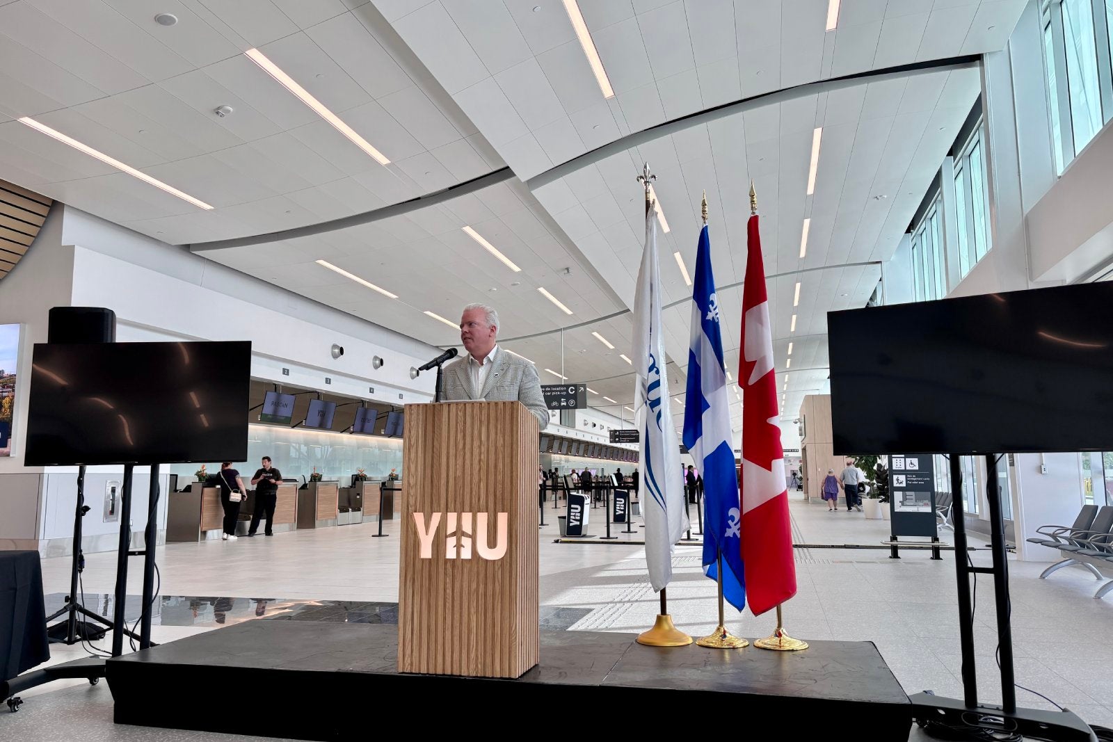
“For Montrealers and their visitors, [YHU] is a huge asset,” Simon-Pierre Diamond, the interim president of the YHU airport authority, said.

Related reading:


Source link

Leave a Reply

Subscribe to Our Newsletter

Get our latest articles delivered straight to your inbox. No spam, we promise.

Recent Reviews


Anaplan Dashboard – Table of Content

Introduction to Anaplan

Anaplan is the best business planning software company located in San Francisco, United States of America. Anaplan software sells subscriptions for cloud-based business planning software and also offers the data for decision-making tasks. The main purpose to develop Anaplan software is to build a platform to connect people around the world, data, and create an effective business plan. Anaplan software also delivers a unified real-time, cloud-based environment to optimize the planning, and also facilitate the decision-making capabilities to a different operational level.

To gain in-depth knowledge with practical experience, then explore HKR’S Anaplan Training!

Anaplan Dashboard

Anaplan dashboard is a combination of the grids, and charts used to design models, or business planning designs. This dashboard allows users to include n number of elements depending on their requirement. It’s very user-friendly and easy to use. The below diagram gives a simple glimpse of the Anaplan dashboard. 

Types of Anaplan dashboards

Below are the important dashboard types that are designed to direct a particular user guide. They are;

  • Landing dashboard: this is the first set of Anaplan dashboards, which is visible when you log in to the Software. This type of dashboard is very simple, concise, and also directs users about the tasks they need to undertake, and provides relevant information related to actions. 
  • Operational dashboards: this type of dashboard displays the data which illustrate the day-to-day business activities. The operational dashboard also allows users to include real-time data to perform business operations smoothly.
  • Strategic or executive dashboard: this type of Anaplan dashboard provide the executive with a high-level overview of the various business functions along with opportunities and ideas.
  • Analytical dashboard: this type of dashboard displays operational or strategic data in the form of drill-down and also helps users to explore slice and dice to reveal various data insights.

Get ahead in your career with our Anaplan Tutorial!

Anaplan Training

  • Master Your Craft
  • Lifetime LMS & Faculty Access
  • 24/7 online expert support
  • Real-world & Project Based Learning

Dashboard framework

There are three parts that are important to build a framework, they are;

Let us discuss them one by one:

    • The Header: this framework building block mainly focuses on navigation and global page sectors such as time, version, geographic locations, etc. With the help of the header section, you can also place the most used dimensions to the top left of the screen. The header enables you to read a screen in much the way they read a book.
    • The body: this body section contains grids and charts, also sometimes images. Always remember one thing: try not to add many elements on the dashboard and make sure that the grip elements are consistent for all the elements, keep column width consistent, brief the label width wherever it is required. The “simplicity” is a key to creating a dashboard and trying to create it by using four-quadrant approaches in the body of the dashboard.
    • The footer: this is an optional step and also offers pointers to the next activity or buttons to trigger the actions.

Dashboard layout

To improve the dashboard usability, follow the below guidelines or layout design.

  • The language which you select on the dashboard must reflect the language that includes jargon, or errors. More importantly, it should feel like an easy to use customized environment.
  • Decide on how you are going to access the dashboard using desktop, tablet, or mobile? While customizing the dashboard, you should have a clear idea of how you are going to use it, it’s good to use a screen resolution. 
  • Last but not least, think about how wide your audience is? Are they need any special requirements? Any color blindness?

As a designer, you must keep all these things in mind while designing a dashboard.

Important factors about Dashboard layout:

  • Don’t ever clutter the dashboard, try to keep it simple and more effective.
  • Consider building a landing dashboard in the four quadrants. This is one of the simplest layouts to create and is also quick to comprehend.
  • Think about splitting the models into inputs, calculations, and outputs. The more important thing is that the dashboard should effectively display the outputs.
  • Always try to build a dashboard in a top-down approach that should contain a dashboard summary at the top and a description at the bottom.
  • Set the height and width pixel settings to -1 to ensure that all the elements must automatically adjust to the screen size.

Using Anaplan features in the dashboard:

  • This enables synchronization where users can make use of real-time data.
  • Most importantly if there any conditional formatting statements need to be added to the data before any item will be added to the dashboard.
  • Make use of the dashboard element menu to narrow the focus on the data model, or filter the view of the grid. These modifications should reflect on the dashboard.
  • For a chart, users need to list out the multiple elements, and they need to reduce the view of the chart by clicking on a chart series to hide that series and rescale the chart axis.
  • Use the drill-down method to view important formulas and the grid details,( the navigation to add this option is as shown below:  go to the context menu -> right click then click on “drill-down”).
  • You should be aware of the currency format, and dont forget to define them if the dashboard refers to a single currency.
  • Are you using any decimal number, and be sure to define appropriate fixed numbers.
  • Remind your users about the search function with the help of two options, 

They are;      

a.context menu 

b.dashboard menu element.                                                                     

  Top 30 Anaplan Interview question & answers for 2020

HKR Trainings Logo
Subscribe to our YouTube channel to get new updates..!

Dashboard and data access

In contents, users view the modules and dashboard they have been using to access. These modules and dashboards are organized into functional areas (that means meaningful groups that are easy to navigate).
Assigning data access to a specific role, and also limiting access to particular modules and dashboards. To make this process robust, follow these steps to robust data access:

  • When creating roles, employ a need-to-know approach to the data processor. This ensures that the roles realistically represent the activities of user groups.
  • You need to dashboard that is targeted directly to the requirement of the role. It’s always good to have three simple dashboards, which are directed to three different roles, rather than one dashboard that displays the data with an appropriate user.

Dashboards -Selective access:

This is nothing but a combination of both selective access and menu option that offers an administrative workspace with a fine level of granularity to control user access to the dashboard.

 First, let’s start with selective access:

Anaplan dashboard respects the selective access set across model:

The navigation to follow:

  • Roles -> version dashboard elements only display the versions to which the user has access.
  • Roles -> Modules dashboard that is available to the user if they have read or write access to all of the module elements are published from.
  • Selective access on lists dashboard elements that only display list items to which the users have access.

Dashboard- menu option:

  • The administrator can set up user access for each dashboard grid element individually.  When an administrator selects a grid or chart element, the menu options are displayed in the dashboard designer properties panel.
  • The menu that is accessed from the dashboard element menu option provides the basis for the organization of menu options. For example, you can choose the pivot function from the view menu (this is also known as view-Pivot).
  • Similarly from the menu option, you can control whether the user can use the import function (this can be done using data-import).
  • The open source module controls whether a user can open the module that is the source of the grid or chart element.
  • To access the menu option, you can select the option that you want to make available to the end-users and clear the option that you want to hide from them.
Anaplan Training

Weekday / Weekend Batches

Final Words

There are a lot of different dashboards available on the market, but choosing the best one takes time and you can think that it is a big challenge. Anaplan dashboard has not only been developed to help IT people but also non-IT and business analyst professionals. The main purpose to use the Anaplan dashboard is to offer a subscription service for the cloud application/ software and also helps designers to create a business plan or customize the dashboard according to their requirements. In this Anaplan dashboard post, we have explained you the dashboard types, overview, framework, selective access, and menu options.


Related Article:


Source link