Sapphire Preferred: For a limited time, earn 100,000 bonus points after spending $5,000 on purchases in the first three months from account opening.
While comparing hotel prices through Chase’s Points Boost feature, which lets eligible cardholders redeem Ultimate Rewards points for more than the standard 1 cent apiece on select Chase Travel bookings, I discovered that the same hotel, on the same dates, sometimes costs fewer points and even carries a lower cash rate when booked through the Sapphire Preferred than through the Sapphire Reserve.
That surprised me enough that I started digging to see whether I’d stumbled across a one-off pricing quirk, or if this is something Sapphire cardholders should actually know about.
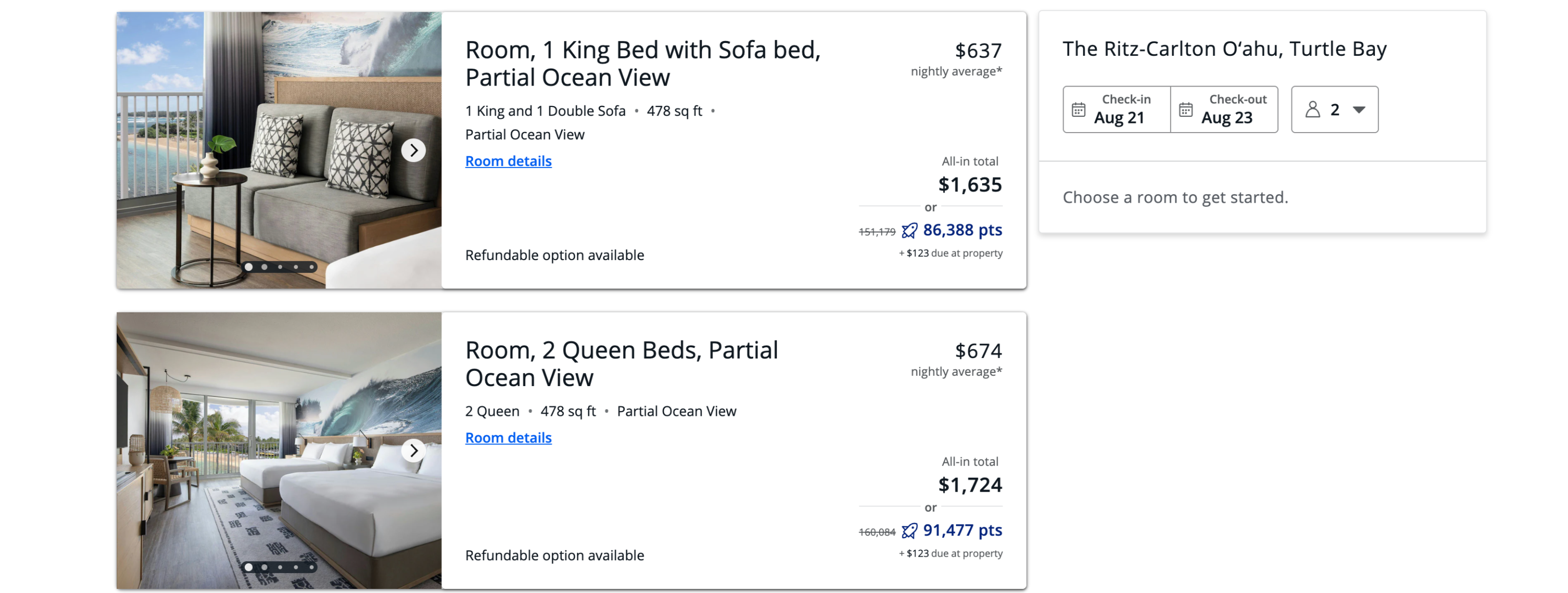
Specifically, the example used Aug. 21-23, when the property could be booked through Chase Travel for 86,388 points plus $123 due at the hotel using the Sapphire Preferred’s Points Boost benefit. The same stay carried a cash price of $1,695.
Booking that resort for around 43,000 points per night is an excellent deal.
Reward your inbox with the TPG Daily newsletter
Join over 700,000 readers for breaking news, in-depth guides and exclusive deals from TPG’s experts
In fact, it looked so good that I logged into my own Chase account to double-check the math. I assumed my Sapphire Reserve would show the same pricing or perhaps something even better.
There was no typo — it really was that good with the Sapphire Preferred.
CHASE
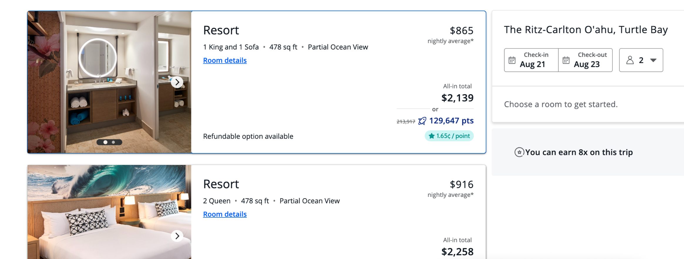
However, for the same dates, the least expensive room available to book via my Sapphire Reserve in Chase Travel was $2,139 or 129,647 points.
CHASE
That’s a return of 1.65 cents per point. So, not only were the cash rates a fair amount lower via the Sapphire Preferred, but the return per Chase point in this case was also better with the Sapphire Preferred than the Sapphire Reserve.
Sapphire Preferred
Sapphire Reserve
$1,635
$2,139
86,388 (+$123 on property)
129,647
1.75 cents
1.65 cents
Was this a one-off?
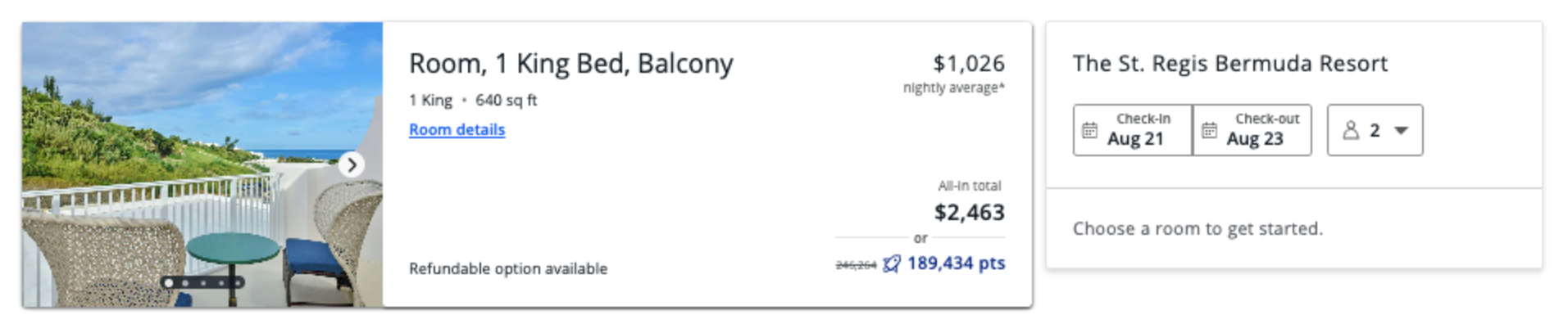
Determined to see if we had accidentally stumbled on a one-off fluke, the TPG team set out to find another example. We found one at the St. Regis Bermuda.
CHASE
On the same Aug. 21-23 stay:
Sapphire Preferred
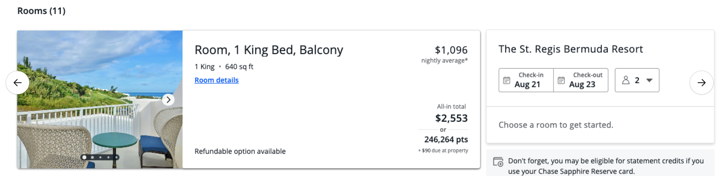
Sapphire Reserve
$2,463
$2,553
189,434 points
246,264 points (+$90 due on property)
1.30 cents
1 cent
CHASE
Two examples certainly don’t prove this happens everywhere, but they were enough to convince us that something interesting was going on.
Here’s why the prices can differ
Naturally, we asked Chase about the discrepancy.
A Chase spokesperson told TPG that the differences generally come down to the types of rates each card offers, such as refundable versus nonrefundable bookings.
“For the majority of hotels on Chase Travel, cardmembers won’t see a difference in pricing across cards. When a price does differ, it’s driven by differences in available rate types (for example, fully refundable rates versus other rate options). As a result, it’s possible to see different cash prices and points requirements for the same property and dates across cards. Of course, Points Boost offers are updated regularly. We encourage cardmembers to check back often for new offers from a variety of airline and hotel partners.”
That means Sapphire Reserve cardholders booking through the Edit would include a $100 property credit, daily breakfast for two, and other on-property benefits. You’d also be eligible to use one of the two Sapphire Reserve’s up to $250 statement credits for prepaid The Edit bookings of two nights or more.
However, even with all those caveats, I was still really surprised that base rates vary depending on which card you use and that your points can sometimes go further in Chase Travel bookings with the Sapphire Preferred than with the Sapphire Reserve.
Bottom line
This is a really good reminder that if you have both the Chase Sapphire Preferred and the Chase Sapphire Reserve, don’t assume the Reserve will always offer the better Chase Travel redemption.
While in my experience it often works out that way, I’ve now learned it doesn’t always. And in fact, this may be yet another reason some folks will actually benefit from having both the Sapphire Preferred and Sapphire Reserve.
Pricing can vary depending on the available rate types, and in some cases, the Sapphire Preferred may require significantly fewer Ultimate Rewards points for the exact same hotel stay.
With the Sapphire Preferred currently offering a 100,000-point welcome bonus after spending $5,000 on purchases in three months from account opening, it’s another reminder that the card delivers exceptional value well beyond what its modest $95 annual fee might suggest.
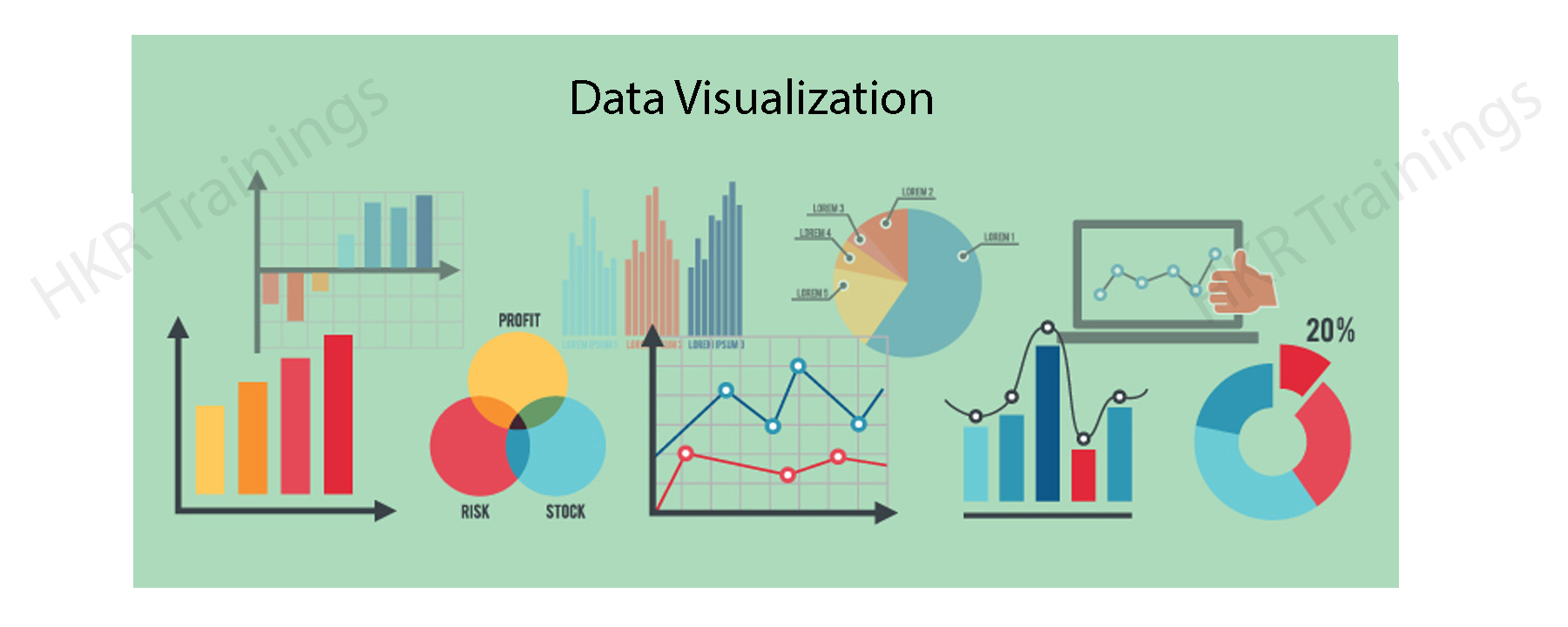
Data Visualization means the graphical representation of information and data with the help of visual elements like graphs, maps, charts, and diagrams. Data Visualization tools will make us understand the data more easily and promptly, and it helps us to see and get a picture of new trends and patterns in data. With visual representation, it is easy to communicate information and can get our things faster. Data Visualization technologies and tools are essential in the fast-paced technological world to evaluate huge amounts of information.
This blog talks about Looker Data Visualization in great detail. It touches upon the basics of Looker as a Data Visualization tool, the different use cases of Looker Data Visualizations, and the steps involved in setting up a project in Looker. The article also covers the challenges faced by Looker Data Visualization.
What is Looker?
Looker is a popular cloud-based BI tool and an enterprise platform useful for data applications and Big Data analytics. It helps to explore, analyze, visualize, and share real-time business analytics to make better and informed business decisions. Moreover, using Looker, anyone can analyze business data and find valuable insights into the datasets much more quickly. Also, Looker uses DML language with a predefined framework. Further, we can use Looker to connect with different data sources and create customized dashboards, KPI dashboards, etc.
We have the perfect professional Looker Training for you. Enroll now!
Types of Looker Data Visualizations
Looker has many Visualizations which are used to describe your data. Every Visualization is different, and we can customise it according to our needs and styles. Data Visualizations make a huge impact on understanding data and help in making a clear decision. Looker Data Visualizations include bar charts, pie charts, line charts, tables, column histograms, heat maps, and box plots.
Looker has many Visualizations you can use to make sense of your data. Each type of Visualization has different settings that you can use to customise its appearance. The links below provide information about each Visualization and its settings.
Sunburst:
Sunburst charts are open-source tools used to showcase hierarchical data structures. They are visually fascinating charts, and the data is expressed in a good-looking way in the form of a radial representation.
Collapsible Tree Diagram:
Collapsible Tree Diagram interactively visualises hierarchical data. It represents a tree and contains a root node with branches like other nodes, and nodes will enlarge and reduce according to our needs. It is an open-source tool.
Liquid Fill Gauge:
A Liquid Fill Gauge is an open-source tool used to determine the growth towards a goal. We can customise the font, gauge colour, animation of the waves and colour of the liquid.
Chord Diagram:
In a larger dataset, the connection between the two items can be efficiently visualised in the Chord Diagrams. It is also an open-source tool. In Chord Diagrams, we can characterise the movement from two different points.
How to Set up a Visualization in Looker
Looker helps create various charts and graphs based on the query results. It holds the data like query results and visualization set up together. Also, it allows users to check the visualization and the relevant data while sharing the query. Let us know how to set up a visualization in Looker in detail.
1) To begin with, you must create and run a query.
2) Now, navigate to the “Visualization” tab and click on it to start configuring the visualization options.
3) Then, choose the visualization type that better displays your data.
4) Click on “Edit” at the end to configure the visual settings, such as naming charts, changing chart colour palettes, etc.
Looker Data Visualizations Use Cases
Thanks to eCommerce data analytics, businesses now can access more data than ever. Looker comes equipped with powerful tools that help discover profitable insights and can create opportunities to grow your business.
Looker Data Visualization: eCommerce
Thanks to eCommerce data analytics, businesses now can access more data than ever. Looker comes equipped with powerful tools that help identify economical insights and can create opportunities to grow your business.
Looker provides tools to track eCommerce KPIs (key performance indicators) like shopping, conversion rates, revenue and customer values. Tools help optimise sales performance, increase online sales with predictive modelling, identify customer trends, and update prices depending on demand and supply.
Customer trends & behaviour
Looker Data Visualization helps customers create profiles about their order history and shopping nature and learn about their behaviour and interest. It identifies repeat purchase patterns and frames out new promotions and marketing approaches that drive the business.
Category & brand management
With category performance, you can easily find out the top performers in different product categories, utilise the information, and take advantage of it in purchasing decisions. With BI data, you can increase profits by making promotions depending on when and where to run. It improves inventory management and provides real-time insights about inventory. In that way, you can’t run out of stocks which are high in demand.
Looker Training
Master Your Craft
Lifetime LMS & Faculty Access
24/7 online expert support
Real-world & Project Based Learning
Looker Data Visualization: Healthcare
With Looker, you can Analyse claims with healthcare stakeholders, doctors, insurance companies and patients and increase efficiency in the above categories. It supports HIPAA compliance. Looker has gained an advantage in creating better developments to tackle COVID -19 like diseases.
Efficient planning with Qventus:
Qventus is an AI-enabled platform which assists hospital teams in making better functional decisions in real-time. Looker with AI software has customised the ‘Post Acute Care Utilisation tool and PPE demand planner’ to provide the best planning and patient care.
Effective and proactive monitoring by Commonwealth Care Alliance (CCA):
CCA is a non-profit, community-based healthcare organisation that provides healthcare for high-needs individuals by maintaining quality and health outcomes while reducing overall costs. CAA uses Looker and Google Big Query to check and help patients suffering from COVID-19. CCA helped their members by providing the latest facts and guidance.
Improved Digital Care with Force Therapeutics:
Therapeutics, an episode-based patient engagement research network and platform, enhances care by simplifying and strengthening the relation between patients, physicians and Care Teams. By providing specialised and secure insights to patients, surgeons and administrators, they worked on modifying care and made it a more effective process. Looker is equipped with embedded analytics in its products to deliver scalable and secure insights and enhance patient care.
Transition to Value-Based Care:
Alternative Payment Models (APM) are transforming healthcare, but we must analyse the metrics and their performance. Using Looker’s flexible data platform NewWave Telecom and Technologies, Inc. delivered metrics and dashboards for new APM in a short span of time. Doctors and administrators easily understand patient performance and detailed data with the help of the Centres For Medicare and Medicaid Services (CMS).
If you want to Explore more about Looker? then read our updated article –Looker Tutorial
Looker Data Visualization: Gaming
Looker Data Visualization helps you to develop games and gain accurate insights. You can have this by understanding game analytics and boosting your revenue.
Grow your gameplay metrics
With gaming analytics, you can track your KPIs, find important key insights, and be able to make better decisions. You can optimise campaigns and have a different look at campaigns in a creative way. The main key metric for gaming is Ad revenue, and automated bidding will optimise instals and increase your revenue. Find out the stability between retention and monetisation, which is required for better player engagement.
Gameplay Experience Optimisation
If you identify simple retention metrics like reducing churn will optimise gameplay and decrease quits. Monitor your KPIs for insights that balance difficulty and the game economy and content improve user experience in gameplay by analysing user behaviour and regularly updating the games.
Create sustainable growth by being outlandish in the market and finding your customer base. Mix up all the revenue sources and get a birds-eye view of every player’s lifetime value (LTV) at any point of their lifecycle. Prepare a cohort analysis which shows updated trends so that you can make changes in the game to improve the gameplay.
Subscribe to our YouTube channel to get new updates..!
Looker Data Visualization: Retail
Looker is a Cloud-Native Enterprise BI Platform where retail relies on data to optimise their decision-making process. Data can affect inventory control, trend forecasting, and marketing strategy and influence customer behaviour mainly in the progressive digital space of eCom.
increase the customer lifetime value (LTV)
With the help of Looker’s customer support analytics, we can improve customer satisfaction by providing quality customer service, response time and results. Looker assists businesses in carefully forecasting and nullifying potential issues, ultimately decreasing service problems and improving brand loyalty. Retail analytics will identify losses and upsell opportunities.
Develop an omnichannel merchandising strategy
With Looker’s customer-centric platform, we can create a unified shopping experience, get a clear picture of customer behaviour, and improve the shopping experience. We can understand purchasing patterns in various channels. By using built-in technology in Looker, retailers can understand customer purchasing behaviour. We can maximise sales by making multiple data points across different channels into a centralised location and compiling them into actionable insights to drive business.
improve operations and supply chains
With Looker’s tracking merchandise movements, retailers can track their products from source to customer. You can gain operational efficiency by delving into minute-to-minute insights. By tying customer feedback with supply chain issues, you can enhance customer feedback and make profitability
Challenges of Building Visualizations in Looker
In the article, you have gained some basic knowledge of Looker’s Data Visualization in various sectors. Looker Data analytics and Business Intelligence tool has created a benchmark in the industry. Looker faces some challenges but has created its place; some of the challenges are:
It requires a lot of effort to maintain on-premise servers
Looker’s API face issues like authentication and is a complex tool to use
Datasets in Looker are huge and consume time while processing data.
Benefits of Data Visualization
The following are a few of the various benefits of using data visualization.
Draw Quick Insights
Sometimes the data may be much more complex to draw relevant insights from it. During that time, data visualization will be much helpful. It helps to simplify the complex insights of drawing from complex datasets. However, the visual data representation enables users to pull out various valuable insights from the data. These insights may be unnoticed or ignored in other formats.
Find patterns and trends Quickly.
Data visualization makes it easier to find various patterns and data trends quickly. It will be easier to find multiple trends when data is presented in a graphical format. It is used instead of resolving via text or spreadsheets. Thus, it will be much easier to discover various patterns and the latest trends through data visualization techniques.
Quickly Establish Links Between Insights and Strategy
Visual graphics make it easier to build connections between data insights and strategy. Further, data visualization helps to reduce the gap between helpful insight and effective informed decisions. It helps companies understand the data and its connectivity with the issues. It allows organizations to identify the leading cause to connect with solutions to problems much faster.
Find Various Data Explanation Ways
You can quickly draw a story with the data using data visualization. Moreover, data visualization tools offer various graphical visuals such as pie charts, donut charts, heat maps, line charts, plots, etc. This help presents the combination, learning about different values, discovering anomalies, and comparing the relationships between different data sets. So, there are multiple ways of interpreting data through data visualization.
Thus, you have gone through the Looker data visualization in detail. You learned how various industries leverage Looker to get more profitable and actionable insights to drive decision-making. The various data visualizations offered by Looker help to explore different data sets, extract relevant data from complex data sets, make data analysis, etc. Thus, using a powerful data visualization tool like Looker, you can easily create complete data analysis and make informed decisions quickly.
To provide the best experiences, we use technologies like cookies to store and/or access device information. Consenting to these technologies will allow us to process data such as browsing behavior or unique IDs on this site. Not consenting or withdrawing consent, may adversely affect certain features and functions.
Functional
Always active
The technical storage or access is strictly necessary for the legitimate purpose of enabling the use of a specific service explicitly requested by the subscriber or user, or for the sole purpose of carrying out the transmission of a communication over an electronic communications network.
Preferences
The technical storage or access is necessary for the legitimate purpose of storing preferences that are not requested by the subscriber or user.
Statistics
The technical storage or access that is used exclusively for statistical purposes.The technical storage or access that is used exclusively for anonymous statistical purposes. Without a subpoena, voluntary compliance on the part of your Internet Service Provider, or additional records from a third party, information stored or retrieved for this purpose alone cannot usually be used to identify you.
Marketing
The technical storage or access is required to create user profiles to send advertising, or to track the user on a website or across several websites for similar marketing purposes.