Atmos Rewards program: Earn and redeem points, elite status and more


Alaska Airlines launched its much-anticipated joint loyalty program with Hawaiian Airlines, Atmos Rewards, in 2025.

The refresh kept the best features Alaska loyalists love, such as excellent partner redemptions and a global network, while uniquely letting members choose how they earn points and status. Alongside the launch, Atmos Rewards unveiled an exciting premium credit card that is geared toward Alaska and Oneworld loyalists who value perks.

Here’s what you need to know about earning, redeeming and maximizing with the Atmos Rewards program.


Atmos™ Rewards Ascent Visa Signature® credit card: Limited-time online offer to earn 80,000 bonus points and a $99 Companion Fare (plus taxes and fees from $23) after spending $4,000 on purchases in the first 120 days from account opening. Plus, receive a 50% flight discount code for a qualifying future flight after opening your new account.


Atmos Rewards airline partners

Atmos Rewards offers a suite of airline partners, including Oneworld airlines:

  • Alaska Airlines
  • American Airlines
  • British Airways
  • Cathay Pacific
  • Fiji Airways
  • Finnair
  • Iberia
  • Japan Airlines
  • Malaysia Airlines
  • Oman Air
  • Qantas
  • Qatar Airways
  • Royal Air Maroc
  • Royal Jordanian Airlines
  • SriLankan Airlines

Here’s the full list of other airline partners to earn and redeem Atmos Rewards points with:

  • Aer Lingus
  • Air Tahiti Nui
  • Aleutian Airways (earn only)
  • Bahamasair (earn only)
  • Cape Air (earn only)
  • Condor
  • Contour Airlines (earn only)
  • Hainan Airlines
  • Hawaiian Airlines (joining the Oneworld alliance April 22)
  • Icelandair
  • Kenmore Air (earn only)
  • Korean Air
  • Mokulele Airlines (earn only)
  • Philippine Airlines (earn only)
  • Porter Airlines
  • Singapore Airlines (earn only)
  • Southern Airways Express
  • Starlux Airlines

Related: Oneworld alliance guide: Learn about airlines, lounges and elite status

Reward your inbox with the TPG Daily newsletter

Join over 700,000 readers for breaking news, in-depth guides and exclusive deals from TPG’s experts

Atmos Rewards elite status: Tiers, thresholds and benefits

Alaska Airlines Lounge San Francisco
CLINT HENDERSON/THE POINTS GUY

Atmos Rewards offers four elite status tiers with various perks:

Atmos Rewards status tier Previous Mileage Plan/HawaiianMiles tier Status points required in 2026 (for 2027) Corresponding Oneworld tier

MVP/Pualani Gold

20,000 status points

Ruby

MVP Gold/Pualani Platinum

40,000 status points

Sapphire

MVP Gold 75K

80,000 status points

Emerald

MVP Gold 100K

135,000 status points

Emerald

To smooth the transition, Atmos Rewards Platinum and Titanium elite members will get a one-time head start on earning 2027 status:

  • 5,000 status points for Platinum members
  • 20,000 status points for Titanium members

Alaska says there’s no immediate change to core benefits right now, but several enhancements are coming, including space-available complimentary premium-cabin upgrades on Alaska and Hawaiian flights for Titanium elite members (expected in spring 2026).

Starting later in 2026, members can also opt in to Atmos Communities — a unique new membership layer within the Atmos Rewards program, with themed groups that offer bonus perks and curated partner offers. Announced communities include Culinary Journeys, Active Escapes, Families on the Go and Global Skies (for members outside the U.S.), plus two existing regional communities: Club 49 (Alaska residents) and Huakai by Hawaiian (Hawaii residents). Expect specific details of Atmos Communities to be announced closer to launch.

How to earn Atmos Rewards elite status

Later in 2026, Atmos Rewards members will be able to choose how to earn elite status. The three options are:

  • Distance-based: Earn 1 status point for every 1 mile flown (including award redemptions).
  • Spending-based: Earn 5 status points for every dollar spent on purchasing flights.
  • Segment-based: Earn 500 status points for each segment flown (including award redemptions).

You can also earn Atmos Rewards elite status via select credit cards:

You can also earn status points with select partners. Be sure to check out Atmos Rewards’ full list of partners to find out which airline, hotel and everyday brands earn status points.

Related: Alaska Airlines to outfit entire fleet with fast, free Starlink Wi-Fi service

How to earn Atmos Rewards points

A Hawaiian Airlines jet at Daniel K. Inouye International Airport
KEVIN CARTER/GETTY IMAGES

You can earn Atmos Rewards points on paid flights when flying with Alaska, Hawaiian and other airline partners. Atmos Rewards currently uses distance‑based points earning, but starting later in 2026, the program will shift to the same three ways members can earn status:

  • Distance-based: Earn 1 point for every 1 mile flown (including award redemptions).
  • Spending-based: Earn 5 points for every dollar spent on purchasing flights.
  • Segment-based: Earn 500 points for each segment flown (including award redemptions).

Note that you can change your preference just one time per calendar year; if you don’t choose, you’ll default to spending‑based. Once live, both redeemable points and status points will accrue as selected.

When the choice model launches, those selecting segment-based earning will earn based on the segments flown on partner tickets booked directly with the partner. If you choose distance- or spending-based earning, you will continue earning on partner tickets according to the current charts.

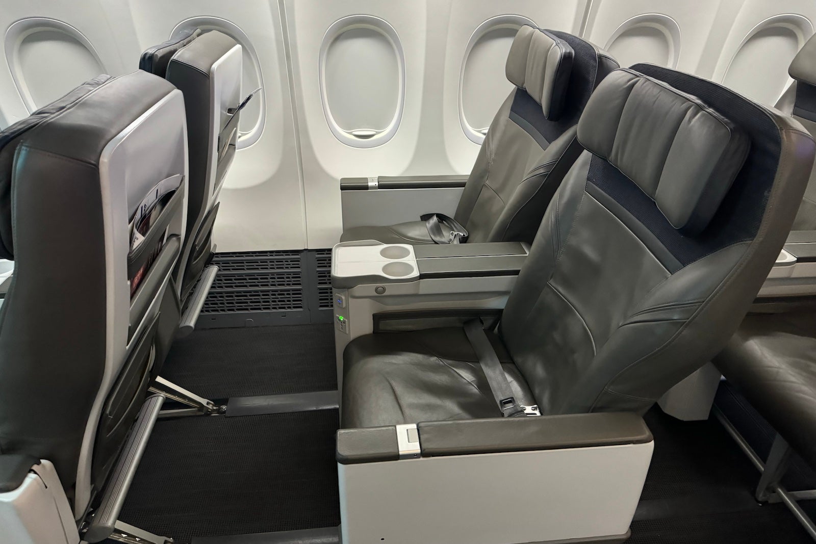
Related: Alaska Airlines unveils big cabin retrofits, adding premium seats to Boeing 737s

Hotel, cruise and car partners

The Atmos Rewards program offers a wide range of non-airline earning partners. Some notable partners are:

  • Avis and Budget: Earn up to 1,250 points per rental, plus discounts.
  • Best Western Rewards: Earn 250 points per stay on qualifying rates.
  • Choice Privileges: Earn 250 points per eligible stay.
  • IHG One Rewards: Earn up to 2 points per dollar (or local currency) spent or 500 points per qualifying stay.
  • Lyft: Earn 2 points for every dollar spent on everyday Lyft rides, and 3 points for every dollar spent on airport and elevated Lyft rides.
  • Marriott Bonvoy: Earn 2 points per dollar or 1 point per dollar spent on the room rate (depending on the hotel).
  • Rocketmiles: Earn 500 to 10,000 points per night.

Check out Alaska’s website for the full list of travel partners.

Everyday partners

You can also earn Atmos Rewards points with everyday partners. Partners include the following brands:

  • Atmos Rewards Dining: Earn up to 5 points per dollar spent; earn 500 bonus points after spending $30 in 30 days.
  • Atmos Rewards Shopping: Earn points with 1,100-plus retailers, including Nike, Apple and Sephora.
  • E-Rewards: Earn 250 points for the first survey, more for others.
  • Harry & David: Earn 25 points per dollar spent with promo code “AKA4.”

Check out Alaska’s website for the full list of everyday partners.

Related: Earn points, miles or cash back: How to maximize online shopping portals for your purchases

Earn points with Atmos Rewards credit cards

You can earn Atmos Rewards points with the following credit cards:

Card name Welcome offer Earning rate

Limited-time online offer: Earn 100,000 bonus points and a 25,000-point Global Companion Award after spending $6,500 on purchases within the first 90 days from account opening. Plus, receive a 50% flight discount code for a qualifying future flight after opening your new account.

  • 3 points per dollar spent on eligible dining, foreign purchases, and eligible Alaska Airlines and Hawaiian Airlines purchases
  • 1 point per dollar spent on all other purchases, plus a 10% rewards bonus on all points earned if you have an eligible Bank of America account

Limited-time online offer: Earn 80,000 bonus points and a $99 Companion Fare (plus taxes and fees from $23) after spending $4,000 on purchases within the first 120 days from account opening. Plus, receive a 50% flight discount code for a qualifying future flight after opening your new account.

  • 3 points per dollar spent on eligible Alaska Airlines and Hawaiian Airlines purchases
  • 2 points per dollar spent on eligible gas, EV charging, cable/streaming and local transit purchases (including ride-hailing services)
  • 1 point per dollar spent on all other purchases

Limited-time online offer: Earn 80,000 bonus points and a $99 Companion Fare (plus taxes and fees from $23) after spending $5,000 on purchases within the first 90 days from account opening.

  • 3 points per dollar spent on eligible Alaska Airlines and Hawaiian Airlines purchases
  • 2 points per dollar spent on eligible gas, EV charging stations, shipping and local transit purchases (including ride-hailing services)
  • 1 point per dollar spent on all other purchases

Related: Alaska Trifecta: Why I signed up for the premium Atmos Rewards Summit credit card

Transfer Bilt points

Bilt members can transfer Bilt Points to Atmos Rewards at a 1:1 ratio.

The Atmos Rewards Ascent Visa Signature credit card and Atmos Rewards Summit Visa Infinite credit card earn 3 Atmos Rewards points for every dollar spent on eligible rent when paying through Bilt, on up to $50,000 per calendar year; terms apply.

How to redeem Atmos Rewards points

alaska airlines first class
SEAN CUDAHY/THE POINTS GUY

One-way awards operated by Alaska Airlines start at just 4,500 Atmos Rewards points plus taxes and fees for short distances and scale upward depending on demand, distance and cabin. This is a terrific value and one of the lowest award prices among airline loyalty programs.

Redeem Atmos Rewards points for partner flights

Great value can be found by redeeming your Atmos Rewards points for premium-cabin flights with partner airlines, especially when you can add a free stopover on a one-way itinerary, including the following sweet spots:

  • American Airlines: Flights up to 700 miles start at only 4,500 Atmos Rewards points.
  • Japan Airlines: Business-class flights from the West Coast to Japan start at 60,000 points, or 75,000 points from the East Coast; first-class flights to Japan range from 90,000 to 110,000 points, depending on the origin.
  • Cathay Pacific: Business-class flights from the U.S. to Hong Kong start at 75,000 points.
  • Fiji Airways: One-way business-class seats on Fiji Airways start at 75,000 points. You could fly to New Zealand and Australia, with a stopover in Fiji, for just 10,000 more points.
  • Aer Lingus: Business-class flights to Ireland start at 45,000 points, a fantastic price for a transatlantic lie-flat seat.
  • Hawaiian Airlines: Fly from the West Coast to Hawaii in economy class from only 10,000 points.
  • Qantas: Business-class flights from the U.S. mainland to Australia start at 85,000 points; book flights within Australia of 1,500 miles or less for 7,500 points in economy.

Related: Cathay Pacific just launched its stunning Aria Suites in North America — and we got an inside look

Redeem Atmos Rewards points for experiences

Beyond flights, Atmos Rewards Unlocked curates access to events and travel experiences across 15-plus markets for members redeeming points.

Atmos Rewards Unlocked is a brand-new loyalty offering introduced under the Atmos Rewards umbrella in partnership with Way, a provider offering auctions and fixed-price curated and exclusive experiences that members can access using their Atmos Rewards points.

You can book (though some experiences require bids) excursions, food tours, Broadway shows and much more.

Transfer Atmos Rewards points to hotels and other members

With the Atmos Rewards Summit Visa Infinite credit card, you can transfer Atmos Rewards points to select hotel programs. Launch partners and ratios include Marriott Bonvoy (1:1 transfer rate), Wyndham Rewards (1:1), IHG One Rewards (1:1), Preferred Hotels & Resorts I Prefer Hotel Rewards (1:2) and Shangri‑La Circle (8:1), with more partners to come.

Summit Visa Infinite cardholders can also share their Atmos Rewards points with up to 10 other Atmos Rewards members with no transfer fee.

Related: Guide to transferring points and miles to airlines and hotels

Bottom line

The Atmos Rewards program kept the most valuable Mileage Plan features, like generous partner sweet spots, free stopovers on one-way awards and Oneworld access, while layering in modern updates like additional milestone rewards; personalized points- and status-earning structures (starting later in 2026); and a new premium credit card that will benefit Alaska Airlines, Hawaiian Airlines and general Oneworld travelers.

Overall, this unique and rewarding program will likely appeal to many travelers, even if they don’t set foot in Alaska.


Source link

Leave a Reply

Subscribe to Our Newsletter

Get our latest articles delivered straight to your inbox. No spam, we promise.

Recent Reviews


Power Bi Dashboard – Table of Content

What is Power BI?

Power BI is a Business Intelligence and Data Visualization tool that transforms information from diverse sources into visualisations and BI reports. Power BI suite includes a variety of software, connectors, and services, including Power BI desktop, SaaS-based Power BI service, and mobile Power BI apps for various platforms. Business users use this set of services to consume data and create BI reports. Power BI Desktop is used to create reports, Power BI Services (Software as a Service – SaaS) is used to publish reports, and Power BI mobile app is being used to view dashboards and reports. Power BI Desktop is available in 32-bit and 64-bit configurations.

Become a Power BI Certified professional by learning this HKR Power BI Training !

What is a Power BI Dashboard?

A Power BI dashboard is a single-page visualisation that uses multiple charts and graphs to tell a storey. This one-page dashboard visualisation is also known as a Canvas. The Power BI dashboard is accessible only in Power BI Service. Because a Power BI dashboard is only one page long, it only encompasses the features of a storey. Power BI Desktop does not support the creation of dashboards. A Power BI dashboard is a single sheet, also known as a canvas, that uses visualisations to tell a storey. A well-designed dashboard includes only the features of that storey since it is restricted to one page. Readers can get more information by viewing related reports.

Power BI Dashboards

Power BI Dashboard on Power BI Service

In a dashboard, representations are produced from reports, and each report depends on one dataset. The representations present on the dashboard are called tiles, and report creators pin these tiles to the dashboard.

Dashboard

Advantages of a Power BI dashboard : 

Dashboards are a magnificent method for observing your business and seeing each of your most significant measurements initially. The perceptions on a dashboard can emerge out of one basic dataset or many, and from one basic report or many. A dashboard joins on-premises and cloud information, giving a united view paying little heed to where the information resides.

• A Power BI dashboard empowers clients to examine reports and view exceptionally significant measurements initially

• Utilizing a Power BI dashboard, clients can make perceptions from numerous datasets or various reports

• You can alter dashboards to meet the necessities of any venture

• Power BI dashboards can be inserted into applications to give a brought together client experience

• You can immediately impart a dashboard to different partners in your association

How to Create a Dashboard in Power BI?
Building reports in the dashboard provides details regarding Power BI Desktop and distributing them to Power BI Service is probably the most ideal way to see how a Power BI dashboard functions.
For our demo, we’ll be taking a gander at a deals dataset that contains item deals data all through the United States. The dataset contains different client related subtleties, including client names, request and shipment dates, item names, item classes and subcategories, benefit made, etc. This dataset is normally known as a Sample Superstore dataset. We’ll investigate this dataset to analyze deals and benefit from each section, year, and quarter.
We’ll likewise make a guide to show the deals across various states in the USA.
Coming up next is the dataset that we’ll use to make the dashboard:

Fig: Sales Data

sales-data

To begin, we will make three different vouchers to evaluate total sales, profit, and amount of sales. Click “card” in the visualisation committee on the power to make a vacant card.

Drag the sales column onto the fields to see the total amount of sales for all products. The user  can change the font size and colour of the sales value on this card. The user  can also give this card a headline. Correspondingly, by having to drag corresponding columns onto disciplines, you can generate 2 more cards for net income and total amount of sales.

Then, in our visualisation, we’ll add a slicer to slice the data based on the “Order Date” column. This will allow us to screen the data as well as visualise it as needed.

Fig: Cards and Slicers

sales-dashboard

Assume you are hoping to picture and investigate deals and benefit over a specific number of years. To do this, you’ll make a line and stacked segment diagram. Select the line and stacked segment graph from the representation board and drag the “Request Date” section on to “Shared Axis.” Put “Deals” under “Segment” values, and addition the “Benefit” segment into “Line” values. That will create the chart. You can alter the shade of the bars and the line under the organization tab.

cards-slicers

In the outline over, the bars address the deals, and the line addresses the benefit. The chart uncovers that the most noteworthy measure of deals and benefits happened in 2017. Power BI Desktop gives an amazing component to dive into the information and picture the chart as far as each quarter, month, and day. This choice is accessible at the top when you explore a particular outline.

sales profit by month

Fig: Sales and profit by each month

You can likewise add the names to the diagram by tapping the “Organization” tab and turning on the information marks.

adding-labels

Fig: Adding labels to the graph

Presently, we should make a bunched segment diagram by dissecting yearly and quarterly deals.

From the Visualizations menu, select the “Grouped Column Chart.” Add the “Year” segment to the pivot. Take the “Quarter” sections under “Legend,” and add the “Business” segments to “Worth.”

clustered-bar-chart

Fig: The clustered bar chart

The diagram above shows that the principal quarter of each year had the most minimal marketing projections, while the final quarter was reliably the most elevated. You additionally have the choice to change the shadings on your diagram to make it all the more outwardly engaging.

Presently, how about we examine the deals for each state in the US. To do this, we’ll utilize a filled guide. Select a filled guide from the representations board. Add the “State” section to “Area.” Drag the “Deals” segment onto “Tooltips.” To alter the shadings, click on the “Configuration” tab, and pick “Information Colors.” Select the contingent arranging choice and add the scope of tones that you’d like.

formatting-colors

Fig: Formatting colors based on the sales

Our colour has been described for the smallest, medium, and greatest sales values. The green-colored states had the smallest sales. California, Texas, and New York, which are highlighted in orange or red, had the highest sales. Correspondingly, you can create a map to see the profit and number of units sold in each nation.

sales-state

Fig: Sales by each State

So far, our report appears to be as follows. We’ve covered how to make cards, slicers, line and stacked column charts, clustered bar charts, and packed maps.

sales-report

Fig: Sales report

Following that, we’ll take a glance at how to make a donut chart to evaluate revenue and profit by section.

Select the pie chart from the visualizations menu. Add the section column to the legend. Drag the “Sales” column to the “Values” column and the “Profit” column to the “Tooltips” column.

donut-chart

Fig: Donut chart for Sales and Profit

According to the pie chart given above, the customer group had the most revenue and profit, while the head office segment had the least. To make the visualisation more visually appealing, you can format it as needed.

We will now create a pie chart to visualize the sales for each product category. Move the “Category” column to the “Legend” column and add the “Profit” column to the “Values” column. Drag the “Sales” column to the “Tooltips” section.

pie-chart

Fig: Pie Chart for Profit and Sales

The new tech classification produced the most sales and profit, while furniture generated the least. To change the colours and make any necessary changes, go to the “format” tab.

The following is an example of the the last total sales report:

overall-sales-report

Fig: Overall Sales Report

Allow us now to picture our information at a more granular level by examining deals, benefit, and units sold at territorial and state levels.

In the first place, we’ll make three slicers to channel our information. Click on the slicer from the representations board and add the “Area” segment on to “Field” to make a local slicer. Additionally, you can make a state and year slicer. You likewise have the choice to alter the slicers to change the text dimension, increment the size of the text, and add a foundation tone.

slicers-filter-data

Fig: Slicers to filter data

We’ll presently make a table to check the sum and the advantage made in each city. Under the “Insights” tab, select “Table”. Add the “City” fragment under “Values,” followed by sum and the “Advantage” area. Add an establishment tone to the fragment headers and addition the size of the printed style. You can channel the data by picking the things from all of the slicers.

Under, we have picked the central region and picked the region of Minnesota. In the table, you can see all of the metropolitan regions in the area of Minnesota, the sum sold, and the advantage they made.

creating-a-table

Fig: Creating a Table in Power BI 

Orchestrating a table is another limit that Power BI Desktop maintains. This gives clients the decision to sort the segment in a table in their solicitation for tendency.

By and by, could we create a clustered reference diagram to separate the arrangements for each thing class across different states? Select the gathered bar layout from the discernments board. Take the “State” area on the center point, “Characterization “portions on to the legend, and “Arrangements” on to “Worth.”

cluster-bar-2

Fig: Clustered Bar Chart

Among the three classes of things, the region of California made the most critical arrangements for all orders.

Then, at that point, we should check the yearly advantage by grouping using an area diagram. Select the area chart from discernments and drag the “Year” segment on to the turn, the “Class” fragment on to the legend, and “Advantage” on to “Values.”

area-chart

Fig: Area chart using Power BI

You can separate the advantage and sum that each thing class and subcategory sold. You can moreover make a line. Clients can research their various decisions through the dashboard.

region-state-report

Fig: Region and State Level Report

To go comprehensively and make a more granular level report, you can do that by making a report considering the things’ orders and subcategories, as shown in the report underneath. You can use class and subcategory as your slicers and make different line traces, bubble outlines, treemaps, and pie charts to imagine the data.

category-level-report

Fig: Category and subcategory Level Report

We’ll as of now disperse our overall business diagram on Power BI Service and make a dashboard. Save your reports on Power BI Desktop. Then, click on the home menu and select the “Convey” tab.

sales%20and%20profit

Fig: Publishing report on to Power BI Service

You can in like manner make another workspace or disperse the report to a current workspace in Power BI Service.

publishing-powerbi

Fig; Publishing to Power BI successfully.

Power BI Training

  • Master Your Craft
  • Lifetime LMS & Faculty Access
  • 24/7 online expert support
  • Real-world & Project Based Learning

Reports in Power BI :

A Power BI report is a multi-perspective look at a dataset, with visual effects representing various information and results from that set of data. A report may contain a single visual or possibly multiple pages of visual elements. Based on your work, you may be in charge of creating reports.

Power BI reports v Dashboards : 

Pages- Dashboards are not permitted to span more than one page; all essential reports are displayed on a single page.

Data sources- Dashboards are founded on the basis of multiple data tables that are linked to one another in one or more contexts. Reports are typically generated from a solitary table of data with no relationships to other tables.

Available in Power BI Desktop- Both the features are available in Power BI desktop

Pinning- Dashboards are fastened to the page so that the viewer can simply read through the data. Reports are built with various filters and shredders to allow the user to communicate with the set of data.

Subscribe- Reports can be published on the web and subscribed to via email. Dashboards have the same features as reports, but they can only be exported to a limited number of formats, so they are used to visualise important data rather than analyse it, which is only possible with reports.

Filtering- Power BI dashboards don’t at present have filter channels though reports are made with any sort of channels and slicers so the client can cooperate with the informational index. Dashboards are stuck to the page even the report proprietor.

Set alerts- With a dashboard, you can set up alarms for when a tile arrives at a specific limit. Thusly, you will not need to continue to return on the dashboard to check whether the tile has arrived at that limit. Sadly, it is absolutely impossible to set up a caution for a report. Thus, you should continue to inquire on the report to check whether the measurements you are following have arrived at a specific limit.

Modify/change visualization type- Dashboards contain an assortment of outlines and tables on a scope of related points though reports contain diagrams and tables on a solitary theme. Accordingly, dashboards regularly offer an undeniable level outline of a subject, and reports will generally be more granular and smaller in center.

Click here to learn Power BI Tutorial

HKR Trainings Logo

Subscribe to our YouTube channel to get new updates..!

Features of Power BI : 

Range of Attractive Visualizations :

Visualizations, or the visual representation of data, are important in Power BI. It provides a wide variety of detailed and appealing visualisations.

Get Data Feature :

The Get Data feature in Power BI permits the users to choose from a variety of data sources. The data sources can range from on-premise to cloud-based, unstructured to structured. Every month, new data sources are added.

Datasets Filtration :

A dataset is a single set of data created by combining data from multiple sources. You can use the datasets to create various types of visualisations.

Customizable Dashboards :

Dashboards are a grouping of visualisations that provide useful information or insights into data. Power BI dashboards are typically made up of multiple visualisations as tiles.

Flexible Tiles :

In a Power BI dashboard, a tile is a single block that contains a visualisation. Tiles properly separate each informative visualisation to provide a clearer view.

Click here to get latest Power BI Interview Questions and Answers

Power BI Training

Weekday / Weekend Batches

Conclusion :

Power BI dashboard is a wonderful storytelling tool that can be really helpful to develop actionable business insights. In addition to this, we have also illustrated the differences between the Power BI dashboard and the reports. If you have any questions let us know in the comments section.

Related Article :


Source link