How to get your grill ready for the outdoor season


If you’re like me, you’ve absolutely had enough of winter and you’re hoping warm weather is right around the corner. When it’s finally more enjoyable to spend time outside, you’re likely going to be cooking on the grill, so now is a great time to give everything a deep clean to prepare for your upcoming culinary adventures.

I don’t blame you if you opted to let your grill hibernate during the winter months, but if that’s the case, it’ll probably need a tune-up before spring arrives. If you did keep the grill in working order over the last few months, this is a good time for a scrub and polish before warmer temperatures inspire heavy use. Here are a few tips and tricks that will hopefully make things easier.

Disassemble, scrub, reassemble

One large metal deflector sends grease to the bottom of the Searwood.

Billy Steele for Engadget

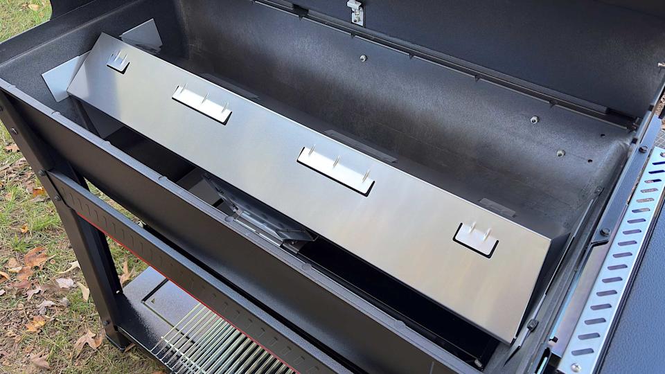
A good rule of thumb when it comes to cleaning anything you haven’t used in a while is to take it apart as much as you feel comfortable and give it a thorough wipe down. For grills, this means removing the grates and any bars or burner covers – basically, anything you can take out that’s not the heating element. This gives you a chance to inspect the burners of your gas grill or the fire pot of a pellet model for any unsightly wear and tear. If those components are worn out or overly rusted, most companies offer replacements that you can easily swap out with a few basic tools.

Once all the pieces are out, start by scraping excess debris off all sides of the interior – with the help of some cleaner if needed. For a gas grill, this likely means pushing everything out through the grease trap. On a pellet grill, you’ll want to scrape the grease chute clear and out into the catch can, but you’ll also need to vacuum the interior with a shop vac – just like you would after every few hours of use. And while you’re at it, go ahead and empty the hopper of any old pellets that have been sitting since Labor Day. Fuel that’s been sitting in the grill for months won’t give you the best results when it comes time to cook so you might as well start fresh.

Thankfully, pellet grill companies have made easy cleaning a key part of their designs. Weber’s Searwood, for example, has minimal internal parts that need to be removed to open up the bottom of the chamber. This is also a design feature of the company’s gas grills. Simply vacuum or push the debris out the grease chute. The catch pan where all of the garbage ends up is also easy to access from the front of the grill, and you can remove the aluminum liner and replace it with a new one in seconds.

Traeger’s most recent pellet grills were also redesigned to improve cleaning. Most notably, grease and ash end up in the same “keg” that’s easy to detach from the front of the grill. The company also allows you to quickly remove all of the interior components, though they’re larger than what you find on the SmokeFire. Lastly, Traeger moved the pellet chute to the front of the Timberline and Ironwood, making it a lot more convenient to swap out wood varieties or empty an old supply.

You’ll want to get as much of the food leftovers out of your grill as possible for a few reasons. First, that stuff is old and lots of build-up over time can hinder cooking performance and might impact flavor. The last thing you want is old food or grease burning off right under an expensive ribeye. Second, in the case of pellet grills, not properly clearing out grease and dust can be dangerous. It’s easy for grease fires to start at searing temperatures and if there’s enough pellet dust in the bottom of your grill, it can actually ignite or explode. That’s why companies tell you to vacuum it out after every few hours of use.

Weber's first pellet grill has potential to be a backyard powerhouse, but the smart features need work.

All of that dust, grease and debris should be removed before you fire the grill back up. (Billy Steele/Engadget)

To actually clean the surfaces, you’ll want to get an all-natural grill cleaner. There are tons of options here, and it may take some time to find one you like. I typically use Traeger’s formula since it’s readily available at the places I buy pellets and I’ve found it works well cutting through stuck-on muck. You want an all-natural grill cleaner over a regular household product as it’s safe to use on surfaces that will touch your food. They’re also safe to use on the exterior of your grill without doing any damage to chrome, stainless steel or any other materials.

Spray down the inside and give things a few minutes to work. Wipe it all clean and go back over any super dirty spots as needed. Ditto for the grates, bars and any other pieces you removed. I like to lay these out on a yard waste trash bag (they’re bigger than kitchen bags) so all the stuff I scrape or clean off doesn’t get all over my deck. You can use shop towels if you want to recycle or paper towels if not, but just know whatever you choose will be covered in nasty black grime so you won’t want to just toss them in the clothes washer when you’re done. A pre-wash in a bucket or sink is needed to make sure you don’t transfer gunk from your grill to your business casuals.

In terms of tools, you don’t need much. I’ve tried that grill robot that claims to do the job for you, but I’ve found sticking to the basics is more efficient. And honestly, when you get the hang of it, it doesn’t take all that long. It’s a good idea to have a wire brush specifically for the grates that you don’t use to clean anything else. After all, this will be touching the same surfaces you put food on. I recommend another, smaller wire brush – the ones that look like big toothbrushes – for cleaning the burners on a gas grill. If you notice the flame isn’t firing through one of the holes, you can use this to clean the pathway. Lastly, plastic is the way to go for a scraper, anything else and you risk scratching the surfaces of your grill. Sure, any damage done would be on the inside, but it’s still not a great feeling to knick up your previous investment.

Check for updates before your first cook

Traeger App

Traeger

If you have a smart grill from the likes of Traeger, Weber or another company, you’ll want to plug it in and check for software updates well in advance of your first grilling session. Chances are you haven’t cooked much since last fall, which means companies have had months to push updates to their devices. Trust me, there’s nothing worse than spending an hour trimming and seasoning a brisket only to walk outside to start the grill and it immediately launches into the update process. This could extend the whole cooking time significantly depending on the extent of the firmware additions and strength of your WiFi.

Thankfully, checking for updates is quick and easy. All you need to do is turn on your grill and open up the company’s app on your phone. If there’s a download ready for your model, the mobile software will let you know and it’s usually quite prominent. If there’s not a pop-up alert that displays immediately, you can check the settings menu just to make sure. Sometimes for smaller updates, a company might not beat you over the head to refresh. However, starting a fresh slate of firmware is always a safe bet and will ensure your grill is running at its best when it comes time to cook.

For a good time every time, clean after each use

Overall, the Traeger Woodridge performs like a much more expensive grill.

Billy Steele for Engadget

I’ll be the first to admit I don’t adhere to my own advice here, but it’s nice to have goals. I will also be the first to tell you every single time I smoke a Boston Butt or some other super fatty cut of meat that I wish I would’ve done at least a quick cleaning right after the meal. Grease buildup is not only highly flammable but it’s much harder to clean once it cools and solidifies. Ditto for stuck-on sauce or cheese that’s left on your grates after chicken or burgers. It’s best to attack these things while the grill is still warm, but cooled down from the cook.

You don’t necessarily have to break out the shop vac each time for your pellet grill or empty the grease bin. But you’ll want to make sure that stuff is away from the main cooking area for safety and so any burn off won’t impact the flavor of your food. A few cups of hot water can cleanse the grease run-off while that wire brush I mentioned is best for the grates. It also doesn’t hurt to do a light wipe down with an all-natural cleaner so everything is ready to go when you want to cook again.

New grills for 2026

If you’re looking for something brand new this spring, Weber is the only big grill company that has announced its 2026 lineup thus far. That collection of new models includes the Performer Smart Charcoal Grill, the company’s first Wi-Fi-enabled charcoal grill, that offers automatic temperature control and remote monitoring via the Weber Connect app. There are two options which vary based on how big of a cart/storage space you need. The company will also sell non-smart versions that are more in line with previous Performer offerings.

If you already have a Weber Kettle, the upcoming Kettle Smart Ring adds a touch of Wi-Fi and automation for $280. It too works with the Weber Connect app and supports two food probes. Plus, there’s the basic LCD display and knob-based navigation for ease of use. Lastly, both the Genesis and Spirit gas grill lines have been updated with the display from the Weber Slate Griddle and side shelves that accommodate handy Weber Works accessories.

Notable smart grills that debuted late last year include the X-Fire Pro and Flagship 1600 from Recteq. The former is a dual-mode pellet grill with options for smoking and searing. It functions like a traditional pellet grill for low-and-slow cooking and then the controls are more like a gas grill for high-heat grilling. The Flagship 1600 is an updated version of “the grill that built the brand” with 1,667 square inches of cooking space. Both models sync with the Recteq app for monitoring and controls. I should have a full review of the X-Fire Pro in the coming weeks.

Both Kamado Joe and Masterbuilt won’t be unveiling any new models this year. Traeger hasn’t announced anything new for 2026 yet either, but the company is currently facing both a financial crisis and a class-action lawsuit from former brand ambassadors over employment terms. As part of the so-called Project Gravity restructuring, Traeger no longer hosts its roadshow program at Costco and points would-be buyers to retail partners (Ace Hardware, etc.) rather than facilitating direct sales through its website.

Check out more from our spring cleaning guide.


Source link

Leave a Reply

Subscribe to Our Newsletter

Get our latest articles delivered straight to your inbox. No spam, we promise.

Recent Reviews


Power Bi Dashboard – Table of Content

What is Power BI?

Power BI is a Business Intelligence and Data Visualization tool that transforms information from diverse sources into visualisations and BI reports. Power BI suite includes a variety of software, connectors, and services, including Power BI desktop, SaaS-based Power BI service, and mobile Power BI apps for various platforms. Business users use this set of services to consume data and create BI reports. Power BI Desktop is used to create reports, Power BI Services (Software as a Service – SaaS) is used to publish reports, and Power BI mobile app is being used to view dashboards and reports. Power BI Desktop is available in 32-bit and 64-bit configurations.

Become a Power BI Certified professional by learning this HKR Power BI Training !

What is a Power BI Dashboard?

A Power BI dashboard is a single-page visualisation that uses multiple charts and graphs to tell a storey. This one-page dashboard visualisation is also known as a Canvas. The Power BI dashboard is accessible only in Power BI Service. Because a Power BI dashboard is only one page long, it only encompasses the features of a storey. Power BI Desktop does not support the creation of dashboards. A Power BI dashboard is a single sheet, also known as a canvas, that uses visualisations to tell a storey. A well-designed dashboard includes only the features of that storey since it is restricted to one page. Readers can get more information by viewing related reports.

Power BI Dashboards

Power BI Dashboard on Power BI Service

In a dashboard, representations are produced from reports, and each report depends on one dataset. The representations present on the dashboard are called tiles, and report creators pin these tiles to the dashboard.

Dashboard

Advantages of a Power BI dashboard : 

Dashboards are a magnificent method for observing your business and seeing each of your most significant measurements initially. The perceptions on a dashboard can emerge out of one basic dataset or many, and from one basic report or many. A dashboard joins on-premises and cloud information, giving a united view paying little heed to where the information resides.

• A Power BI dashboard empowers clients to examine reports and view exceptionally significant measurements initially

• Utilizing a Power BI dashboard, clients can make perceptions from numerous datasets or various reports

• You can alter dashboards to meet the necessities of any venture

• Power BI dashboards can be inserted into applications to give a brought together client experience

• You can immediately impart a dashboard to different partners in your association

How to Create a Dashboard in Power BI?
Building reports in the dashboard provides details regarding Power BI Desktop and distributing them to Power BI Service is probably the most ideal way to see how a Power BI dashboard functions.
For our demo, we’ll be taking a gander at a deals dataset that contains item deals data all through the United States. The dataset contains different client related subtleties, including client names, request and shipment dates, item names, item classes and subcategories, benefit made, etc. This dataset is normally known as a Sample Superstore dataset. We’ll investigate this dataset to analyze deals and benefit from each section, year, and quarter.
We’ll likewise make a guide to show the deals across various states in the USA.
Coming up next is the dataset that we’ll use to make the dashboard:

Fig: Sales Data

sales-data

To begin, we will make three different vouchers to evaluate total sales, profit, and amount of sales. Click “card” in the visualisation committee on the power to make a vacant card.

Drag the sales column onto the fields to see the total amount of sales for all products. The user  can change the font size and colour of the sales value on this card. The user  can also give this card a headline. Correspondingly, by having to drag corresponding columns onto disciplines, you can generate 2 more cards for net income and total amount of sales.

Then, in our visualisation, we’ll add a slicer to slice the data based on the “Order Date” column. This will allow us to screen the data as well as visualise it as needed.

Fig: Cards and Slicers

sales-dashboard

Assume you are hoping to picture and investigate deals and benefit over a specific number of years. To do this, you’ll make a line and stacked segment diagram. Select the line and stacked segment graph from the representation board and drag the “Request Date” section on to “Shared Axis.” Put “Deals” under “Segment” values, and addition the “Benefit” segment into “Line” values. That will create the chart. You can alter the shade of the bars and the line under the organization tab.

cards-slicers

In the outline over, the bars address the deals, and the line addresses the benefit. The chart uncovers that the most noteworthy measure of deals and benefits happened in 2017. Power BI Desktop gives an amazing component to dive into the information and picture the chart as far as each quarter, month, and day. This choice is accessible at the top when you explore a particular outline.

sales profit by month

Fig: Sales and profit by each month

You can likewise add the names to the diagram by tapping the “Organization” tab and turning on the information marks.

adding-labels

Fig: Adding labels to the graph

Presently, we should make a bunched segment diagram by dissecting yearly and quarterly deals.

From the Visualizations menu, select the “Grouped Column Chart.” Add the “Year” segment to the pivot. Take the “Quarter” sections under “Legend,” and add the “Business” segments to “Worth.”

clustered-bar-chart

Fig: The clustered bar chart

The diagram above shows that the principal quarter of each year had the most minimal marketing projections, while the final quarter was reliably the most elevated. You additionally have the choice to change the shadings on your diagram to make it all the more outwardly engaging.

Presently, how about we examine the deals for each state in the US. To do this, we’ll utilize a filled guide. Select a filled guide from the representations board. Add the “State” section to “Area.” Drag the “Deals” segment onto “Tooltips.” To alter the shadings, click on the “Configuration” tab, and pick “Information Colors.” Select the contingent arranging choice and add the scope of tones that you’d like.

formatting-colors

Fig: Formatting colors based on the sales

Our colour has been described for the smallest, medium, and greatest sales values. The green-colored states had the smallest sales. California, Texas, and New York, which are highlighted in orange or red, had the highest sales. Correspondingly, you can create a map to see the profit and number of units sold in each nation.

sales-state

Fig: Sales by each State

So far, our report appears to be as follows. We’ve covered how to make cards, slicers, line and stacked column charts, clustered bar charts, and packed maps.

sales-report

Fig: Sales report

Following that, we’ll take a glance at how to make a donut chart to evaluate revenue and profit by section.

Select the pie chart from the visualizations menu. Add the section column to the legend. Drag the “Sales” column to the “Values” column and the “Profit” column to the “Tooltips” column.

donut-chart

Fig: Donut chart for Sales and Profit

According to the pie chart given above, the customer group had the most revenue and profit, while the head office segment had the least. To make the visualisation more visually appealing, you can format it as needed.

We will now create a pie chart to visualize the sales for each product category. Move the “Category” column to the “Legend” column and add the “Profit” column to the “Values” column. Drag the “Sales” column to the “Tooltips” section.

pie-chart

Fig: Pie Chart for Profit and Sales

The new tech classification produced the most sales and profit, while furniture generated the least. To change the colours and make any necessary changes, go to the “format” tab.

The following is an example of the the last total sales report:

overall-sales-report

Fig: Overall Sales Report

Allow us now to picture our information at a more granular level by examining deals, benefit, and units sold at territorial and state levels.

In the first place, we’ll make three slicers to channel our information. Click on the slicer from the representations board and add the “Area” segment on to “Field” to make a local slicer. Additionally, you can make a state and year slicer. You likewise have the choice to alter the slicers to change the text dimension, increment the size of the text, and add a foundation tone.

slicers-filter-data

Fig: Slicers to filter data

We’ll presently make a table to check the sum and the advantage made in each city. Under the “Insights” tab, select “Table”. Add the “City” fragment under “Values,” followed by sum and the “Advantage” area. Add an establishment tone to the fragment headers and addition the size of the printed style. You can channel the data by picking the things from all of the slicers.

Under, we have picked the central region and picked the region of Minnesota. In the table, you can see all of the metropolitan regions in the area of Minnesota, the sum sold, and the advantage they made.

creating-a-table

Fig: Creating a Table in Power BI 

Orchestrating a table is another limit that Power BI Desktop maintains. This gives clients the decision to sort the segment in a table in their solicitation for tendency.

By and by, could we create a clustered reference diagram to separate the arrangements for each thing class across different states? Select the gathered bar layout from the discernments board. Take the “State” area on the center point, “Characterization “portions on to the legend, and “Arrangements” on to “Worth.”

cluster-bar-2

Fig: Clustered Bar Chart

Among the three classes of things, the region of California made the most critical arrangements for all orders.

Then, at that point, we should check the yearly advantage by grouping using an area diagram. Select the area chart from discernments and drag the “Year” segment on to the turn, the “Class” fragment on to the legend, and “Advantage” on to “Values.”

area-chart

Fig: Area chart using Power BI

You can separate the advantage and sum that each thing class and subcategory sold. You can moreover make a line. Clients can research their various decisions through the dashboard.

region-state-report

Fig: Region and State Level Report

To go comprehensively and make a more granular level report, you can do that by making a report considering the things’ orders and subcategories, as shown in the report underneath. You can use class and subcategory as your slicers and make different line traces, bubble outlines, treemaps, and pie charts to imagine the data.

category-level-report

Fig: Category and subcategory Level Report

We’ll as of now disperse our overall business diagram on Power BI Service and make a dashboard. Save your reports on Power BI Desktop. Then, click on the home menu and select the “Convey” tab.

sales%20and%20profit

Fig: Publishing report on to Power BI Service

You can in like manner make another workspace or disperse the report to a current workspace in Power BI Service.

publishing-powerbi

Fig; Publishing to Power BI successfully.

Power BI Training

  • Master Your Craft
  • Lifetime LMS & Faculty Access
  • 24/7 online expert support
  • Real-world & Project Based Learning

Reports in Power BI :

A Power BI report is a multi-perspective look at a dataset, with visual effects representing various information and results from that set of data. A report may contain a single visual or possibly multiple pages of visual elements. Based on your work, you may be in charge of creating reports.

Power BI reports v Dashboards : 

Pages- Dashboards are not permitted to span more than one page; all essential reports are displayed on a single page.

Data sources- Dashboards are founded on the basis of multiple data tables that are linked to one another in one or more contexts. Reports are typically generated from a solitary table of data with no relationships to other tables.

Available in Power BI Desktop- Both the features are available in Power BI desktop

Pinning- Dashboards are fastened to the page so that the viewer can simply read through the data. Reports are built with various filters and shredders to allow the user to communicate with the set of data.

Subscribe- Reports can be published on the web and subscribed to via email. Dashboards have the same features as reports, but they can only be exported to a limited number of formats, so they are used to visualise important data rather than analyse it, which is only possible with reports.

Filtering- Power BI dashboards don’t at present have filter channels though reports are made with any sort of channels and slicers so the client can cooperate with the informational index. Dashboards are stuck to the page even the report proprietor.

Set alerts- With a dashboard, you can set up alarms for when a tile arrives at a specific limit. Thusly, you will not need to continue to return on the dashboard to check whether the tile has arrived at that limit. Sadly, it is absolutely impossible to set up a caution for a report. Thus, you should continue to inquire on the report to check whether the measurements you are following have arrived at a specific limit.

Modify/change visualization type- Dashboards contain an assortment of outlines and tables on a scope of related points though reports contain diagrams and tables on a solitary theme. Accordingly, dashboards regularly offer an undeniable level outline of a subject, and reports will generally be more granular and smaller in center.

Click here to learn Power BI Tutorial

HKR Trainings Logo

Subscribe to our YouTube channel to get new updates..!

Features of Power BI : 

Range of Attractive Visualizations :

Visualizations, or the visual representation of data, are important in Power BI. It provides a wide variety of detailed and appealing visualisations.

Get Data Feature :

The Get Data feature in Power BI permits the users to choose from a variety of data sources. The data sources can range from on-premise to cloud-based, unstructured to structured. Every month, new data sources are added.

Datasets Filtration :

A dataset is a single set of data created by combining data from multiple sources. You can use the datasets to create various types of visualisations.

Customizable Dashboards :

Dashboards are a grouping of visualisations that provide useful information or insights into data. Power BI dashboards are typically made up of multiple visualisations as tiles.

Flexible Tiles :

In a Power BI dashboard, a tile is a single block that contains a visualisation. Tiles properly separate each informative visualisation to provide a clearer view.

Click here to get latest Power BI Interview Questions and Answers

Power BI Training

Weekday / Weekend Batches

Conclusion :

Power BI dashboard is a wonderful storytelling tool that can be really helpful to develop actionable business insights. In addition to this, we have also illustrated the differences between the Power BI dashboard and the reports. If you have any questions let us know in the comments section.

Related Article :


Source link