

Their backgrounds stand out. And not in a good way.
Two bankruptcies and six law enforcement jobs in three years. An allegation of lying in a police report to justify a felony charge against an innocent woman — an incident that led to a $75,000 settlement and criticism of his integrity. A third job candidate once failed to graduate from a police academy, then lasted only three weeks in his only job as a police officer.
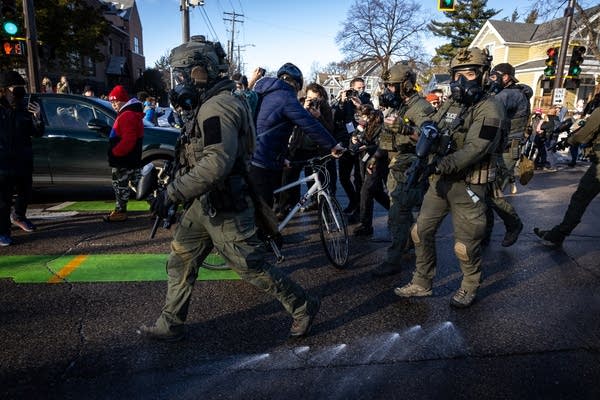
Their common bond: All were hired recently by U.S. Immigration and Customs Enforcement during an unprecedented hiring spree — 12,000 new officers and special agents to double its force — after the agency received a $75 billion windfall from Congress to enact President Donald Trump's mass deportation campaign.
The president put a premium on swift action, and for ICE that meant rapid-fire recruitment and hiring, which in turn led to new employees with questionable qualifications. Their backgrounds and training have come under scrutiny after numerous high-profile incidents in which ICE agents used excessive force.
“If vetting is not done well and it’s done too quickly, you have higher risk of increased liability to the agency because of bad actions, abuse of power and the lack of ability to properly carry out the mission because people don’t know what they are doing,” said Claire Trickler-McNulty, who served as an ICE official during the Obama, first Trump and Biden administrations.
The agency has said the majority of new hires are police and military veterans. But evidence is mounting that applicants with questionable histories were either not fully vetted before they were brought on or were hired in spite of their past, an investigation by The Associated Press found.
ICE’s acting director, Todd Lyons, said during a congressional hearing in February that he was proud of the hiring campaign, which drew more than 220,000 applications. “This expansion of a well-trained and well-vetted workforce will help further ICE’s ability to execute the president’s and secretary’s bold agenda,” he said.
AP finds legal issues in new ICE hires’ backgrounds
Unlike many local law enforcement agencies, ICE said it shields the identity of employees to protect them from harassment, making a full accounting of the new hires impossible.
The AP focused on more than 40 officers who recently made public their new jobs as ICE officers on LinkedIn pages, using public records to check their backgrounds. All but one were male.
While most of them had conventional qualifications as former correctional officers, security guards, military veterans and police officers, it's unclear how many should have potentially been disqualified because AP did not have access to their full personnel files. But several had histories of unpaid debts that resulted in legal action, two had filed for bankruptcy and three others had faced lawsuits that alleged misconduct in prior law enforcement jobs, the AP found.
Marshall Jones, an expert on police recruiting at the Florida Institute of Technology, said it's hard to get a full picture of ICE's new employee pool without more data. But he said ICE has likely hired some “less than ideal candidates” who meet minimum requirements but would be passed over in a normal hiring cycle.
“If you’re hiring hundreds or thousands of people, even with the best of background processes, there are going to be outliers,” he said. “The question is, are these normal outliers from human beings doing things, or is there a systemic challenge in properly vetting folks if there are issues?”
DHS says ‘vetting is an ongoing process’
The Department of Homeland Security, ICE’s parent agency, did not answer questions about specific hiring decisions. But it acknowledged some applicants received “tentative selection letters” and offers to begin working on a temporary status before they had been subjected to full background checks.
“ICE is committed to ensuring its law enforcement personnel are held to the highest standards and rigorously vets them throughout the hiring process,” the department said. “Vetting is an ongoing process, not a one-time occurrence.”
The process includes reviewing their criminal histories and credit scores and conducting background investigations that include interviewing prior employers and other associates, which can take weeks. But the deluge of hires has strained the agency, which promised signing bonuses of up to $50,000 and advertised that college degrees were not required.
An internal memo, first reported by Reuters in February, told ICE supervisors that if they receive “derogatory information about a newly hired employee’s conduct” they should refer the allegations to an internal affairs unit for investigation. Such information could include the employees’ termination or forced resignations, the memo said.
Two bankruptcies, six jobs before ICE hired him
Among the new hires is Carmine Gurliacci, 46, who resigned as a police officer in Richmond Hill, Georgia, to join ICE in Atlanta in December, according to a resignation letter obtained by AP.
He filed for bankruptcy in 2022, saying he had no income and had been unemployed for two years after moving from New York to Georgia, court filings show. He said he was living with a friend and doing chores in exchange for housing, listing tens of thousands of dollars of unpaid loans, bills, child support and other debts. He also had filed for bankruptcy in 2013 in New York, when he listed $95,000 in liabilities, records show.
Serious financial problems are “a pretty big red flag” because they might make employees susceptible to bribes or extortion, which have been problems at ICE, Trickler-McNulty said.
After his 2022 bankruptcy petition was approved, Gurliacci rejoined the work force, hopping to six Georgia law enforcement agencies within three years, each time resigning before moving on, records obtained by AP show.
He left one campus security job in 2023, citing “unforeseen personal issues that render me unable to fulfill my duties,” a resignation letter shows. But he then began working for the Butts County Sheriff's Office soon after.
He lasted months there before moving to the Chatham County Sheriff’s Office, where he quit after two months on the job, records show. The federal government recently obtained his Chatham County personnel file as part of a background check, two months after he started at ICE.
Reached by phone, Gurliacci told a reporter he would call back. He never did and did not respond to follow-up messages.
Critic says new ICE hire ‘abuses his power’
Another new hire is Andrew Penland, 29, who joined ICE after resigning in December as a sheriff’s deputy in Greenwood County, Kansas.
Penland had spent most of his career as a deputy in Bourbon County, Kansas, but left last year after facing a lawsuit alleging he arrested a woman on false allegations in 2022. The county’s insurer paid $75,000 to settle the case, the agreement shows.
The woman, June Bench, recounted in an interview what happened. One of her neighbors, a county official, claimed Bench had purposely made a wide turn and nearly hit him with her car.
Penland responded to the property. Body camera video shows he urged the neighbor to press charges and told the man Bench would go to jail but he would not have to testify in court because it would get resolved through a plea.
Bench denied the allegation and said it was part of a personal dispute. But Penland arrested her on a felony assault charge, took her to jail and seized her car. Penland wrote in a report that he watched surveillance video showing her neighbor jumping out of the way of her speeding car.
It took a week for Bench to get out of jail and more than a year to defeat the charge, which was dismissed for lack of evidence. When she obtained the video Penland cited as proof, it showed her car appearing to make a routine turn and no near-collision with the neighbor.
Bench said she was outraged to learn Penland had been hired by ICE.
“That’s scary to me. He abuses his power,” she said.
After being reached for comment, Penland deactivated his LinkedIn account and alerted ICE to the inquiry but did not respond to AP.
New hire struggled at police academy
A third new ICE hire, Antonio Barrett, initially failed to graduate from a Colorado law enforcement academy in 2020, one of two students who did not “complete portions of the academy” and received “an incomplete grade,” an email obtained by AP shows.
He finished the program after a community college arranged a special one-day training and test for him, and landed a job at the police department in La Junta, Colorado, in July 2020. But he only worked three weeks before resigning and never worked in local policing again.
Previously, Barrett worked as a corrections officer at a Colorado prison.
He was accused in a lawsuit of excessive force for inflicting pain on a handcuffed inmate when he and another colleague forcibly removed the man from a wheelchair in 2017. But state officials argued their actions were not excessive and a court agreed, dismissing the case.
Barrett didn't respond to a message seeking comment.
Ex-ICE instructor says training is inadequate
ICE has denied removing any training requirements, saying new recruits receive 56 days of training and 28 days of on-the-job training. The agency said that most of the new officers have already completed law enforcement academies.
But former ICE academy instructor Ryan Schwank testified in February that agency leaders cut training on the use of force, firearms safety and the rights of protesters. He said the new recruits include some as young as 18 who lack college degrees and whose primary language is not English.
“We’re not giving them the training to know when they’re being asked to do something that they’re not supposed to do, something illegal or wrong,” he said.