Closed: 73.99 x 88.12 x 15.69mm
with satin finish aluminum frame

Stephan is the sports journalist for the Maple Grove Report.

Stephan is the sports journalist for the Maple Grove Report.


Using AI assistants to generate text, images, audio, and more is just a common task today. But have you considered generating an important percentage chart with the power of AI? Well, that’s now possible!
Anthropic has now announced an upgrade to its AI assistant Claude (Claude 3.5 Sonnet), following its immense popularity and ranking as the Top free app on the App Store. Claude can now create interactive charts, diagrams, and visuals within the conversation. It’s making the chatbot by explaining concepts. The AI assistant can generate visuals when asked or even decide whether visuals would be helpful to users.
To help you better understand the newly launched visualization feature, we have put down all the details in the blog. Let’s begin!
The new visualization feature is Anthropic’s upgraded version of Claude, which marks a major shift from text-based content to interactive & visual-based communication. It can now generate graphs, charts, diagrams, and other visual outputs directly in the chat interface in real time.
This opens a new learning experience for users. The visuals support technologies such as HTML, JavaScript, CSS, and SVG, allowing them to perform certain actions. The visualization feature differs from the previous approach, Artifacts, which showcased the content in a separate side panel. However, users can now see everything in the chat interface or responses without downloading any external tools.
There are two scenarios: you can either ask Anthropic Claude AI to generate the diagram, chart, etc., with a prompt. Or Claude may suggest the best visuals when it understands that sharing a diagram can help clarify the concept.
The following are some of the best prompts users can ask:
After the results are created, users can ask:
The following are some of the examples mentioned by Anthropic Claude AI:
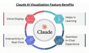
Inline Display: The visualizations are inline, not in the side panel. They are temporary and change as the conversation progresses.
Interactivity in Real-Time: In comparison to the static graphs, inputs can be changed, and results can be made more dynamic in real-time.

Helps in Learning: Visual representations have a greater impact than text and make it easier to explain a particular concept. Ideal for teachers, students, and more.
Seamless In-Chat Experience: Users get the desired results directly in the conversation, eliminating the need for additional design software.
The visualization feature is currently available to everyone across all the Claude plans. However, despite its availability, it’s in beta. So, users on free tiers can give it a try and generate charts, diagrams, or visuals with a simple prompt.
The new feature comes amid growing competition among AI players. This Tuesday, OpenAI launched dynamic visuals in ChatGPT, and Google unveiled interactive charts and simulations for Gemini Ultra subscribers.
Anthropic’s new update focuses on a significant push towards format-specific results. By introducing charts, diagrams, and maps directly into the conversation, Anthropic aims to make understanding easier with visuals rather than long-form text.
Don’t miss out on the recent technologies and innovations; check our blog section now!
FAQs
1. Does the feature work on mobile?
Answer: As of now, the feature is available in web versions but not in mobile applications.
2. Are the visualization capabilities available through the API?
Answer: Yes! The visualization capabilities can be accessed through the Claude API, Google Cloud’s Vertex A, and Amazon Bedrock.
You Might Like:
Introducing Voiceprint, A New Claude Code Plugin That Can Clone Your Writing Style
Stephan is the sports journalist for the Maple Grove Report.