Cuneflow’s E-Paper Writing Tablet Uses AI To Record And Transcribe Meetings


I recently reviewed reMarkable’s Paper Pure, an e-paper writing tablet designed to be used in business meetings. The company markets itself as an almost analog space to think, pushing against the use of AI and the distractions of the digital age. Think of Cuneflow, then, as a rebuke of that philosophy, as its namesake e-paper writing slate has a built-in voice recorder to transcribe and extract insights from those very same business meetings. Is that a big enough draw for you to plonk down your money when it launches on Kickstarter?

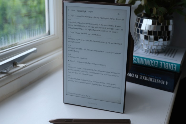
Cuneflow is an A5-sized e-paper writing tablet packing an 8.2-inch 1,920 x 1,440 E Ink Carta 1000 display. Magnetically attached to the side is a passive, pressure-sensitive Wacom EMR stylus, complete with button and eraser tip. Inside, you’ll find a 2 GHz dual-core ARM SoC with 4GB RAM and 128GB storage. There’s a 2,450mAh battery which is rated for 7-8 hours of continuous use, and a 24-level frontlight, enabling the slate to be used at any point of the day, which is key for a device like this.

In addition to a lock screen password, you can use the power button as a fingerprint scanner for one-touch unlocking. The aluminum unibody case weighs 230 grams (8.1 oz), making it a little heftier than the equivalent Kindle. But it’s also got a heavenly sturdiness that makes you feel like you’re holding an ultra-premium device. Between that and the brown faux-leather folio, I get the sense the tablet’s creators wanted Cuneflow to feel as capital-C classy as they could.
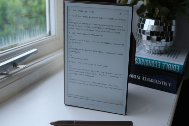
At the risk of sounding uncharitable, the operating system looks like someone pointed at a reMarkable and said “that, but let’s not get sued.” There’s a sortable two-column list of your notebooks, titled Meetings, and a separate tab for your Files. The latter is any PDF or EPUB file you wish to read on the slate, which you can transfer over via the company’s web client.

Each Meeting notebook is, as you might expect, a blank worksheet ready to accept your scrawls and doodles. The ceramic stylus nib is thin and scratchy, and there’s no sort of replacement tip in the packaging. I was surprised given the inherent risks of wear down, and that a nib that small could scratch the display cover (or just break).

As for the writing experience, it’s not bad, but you’re not going to forget you’re dragging a stylus on a screen. It’s tremendously responsive, and I don’t think I saw a single instance of lag or the display needing a refresh mid-way through writing a long paragraph. The persistent menu bar only has two options: pen or highlighter, the latter of which even on its lightest setting, makes it a lot harder to read your handwriting. If you want to tweak the weight of either, you’ll need to delve into a swipe-down-from-top-bezel menu, which is a little fussy. It’s nowhere near as polished and complete an experience as you’ll get using a reMarkable or even a Kindle Scribe.

Each notebook also has a microphone symbol that, when you tap it, will activate the slate’s recording mode which will offer a pretty instant transcription of the conversation. (You’ll also be able to see when the slate is recording, there’s a flashing red LED beside the USB port.) Once over, you’ll need to wait a minute or two for the AI-generated insights to populate on the next tab. Those include a summary, timeline and to-do list, as well as plenty of more niche options such as disagreements, key questions and potential risks.

To appease security-minded folks, the audio is encrypted and piped to the cloud but not stored (Cuneflow lists OpenAI and Gemini as tools it uses). Once the words have appeared on the screen, the actual recording of what was said is wiped, with the AI-generated transcript all that remains. On the Insight tab, you’ll be able to identify where each conclusion came from, so you can double check if the system hallucinated. You can edit the transcript once completed, but you’d likely need to do those checks while everything’s still fresh in the meeting participants memory.

I can see the logical argument for the approach, but it’s something that won’t fit into everyone’s workflow. Maybe because journalism requires you to double and triple check a quote and, if it was contentious, I’d like to make sure I had a recording of whatever they said as proof. That’s probably not a concern if you’re running meetings with comparatively lower stakes, of course.

As far as I’ve seen, the transcripts are reasonably reliable, but struggle with some less common phrases. With so many AI-infused products, you shouldn’t expect gospel truth or reliability from it — it successfully realized I was saying “Phoenix Corporation” once, but misspelled it as ‘Felix Corporation’ the second time.

One problem with the Cuneflow is that there’s lots of quite useful tools in here, but there’s no way to make them cohere. For instance, in the AI-generated meeting insights tab, there is a to-do list with tickboxes for each action item. But you can’t actually tick them off with the stylus or your finger, which seems a little silly. And there’s no way to easily pull text from the transcript or the Insights tab and put it in the notebook section for you to doodle, edit or highlight.

There’s a similar lack of joined-up thinking in Cunespace, the company’s web client where you can send files to the slate. You can look at your Meetings online, but you can’t interact with the transcripts or tick off the aforementioned to-do lists. Which means you’re left copypasting any material you need from your Cunespace to whatever document you’re using elsewhere.

I was overjoyed to learn you could connect a Bluetooth keyboard to the slate for ease of writing but, alas, my joy didn’t last long. Unfortunately, you need to open a text box inside the document and then expand it, a process which is deeply fiddly. And there’s no way for the box to grow to accommodate your text as you write more, unless you manually pull the handles wider. (Not to mention there’s no way to reorient the display to landscape, which is less than ideal.)

Part of this comes from being a young company with its first product, but also because of the limits of what these devices can do. After all, these sorts of distraction-free paper tablets are built to impose sometimes unnecessary roadblocks on our actions. Much like with reMarkable, once you’ve created a file on the slate, there’s no elegant way to pull that information out and work it in the traditional manner. Consequently, I’m not sure right now if it’s even possible to join the bifurcated use cases in a way that would make sense.

Unfortunately, there’s no word yet on how much Cuneflow will cost — the company says it’ll be “within the average market range,” with early backers getting a discount.


Source link

Leave a Reply

Subscribe to Our Newsletter

Get our latest articles delivered straight to your inbox. No spam, we promise.

Recent Reviews


Anaplan Dashboard – Table of Content

Introduction to Anaplan

Anaplan is the best business planning software company located in San Francisco, United States of America. Anaplan software sells subscriptions for cloud-based business planning software and also offers the data for decision-making tasks. The main purpose to develop Anaplan software is to build a platform to connect people around the world, data, and create an effective business plan. Anaplan software also delivers a unified real-time, cloud-based environment to optimize the planning, and also facilitate the decision-making capabilities to a different operational level.

To gain in-depth knowledge with practical experience, then explore HKR’S Anaplan Training!

Anaplan Dashboard

Anaplan dashboard is a combination of the grids, and charts used to design models, or business planning designs. This dashboard allows users to include n number of elements depending on their requirement. It’s very user-friendly and easy to use. The below diagram gives a simple glimpse of the Anaplan dashboard. 

Types of Anaplan dashboards

Below are the important dashboard types that are designed to direct a particular user guide. They are;

  • Landing dashboard: this is the first set of Anaplan dashboards, which is visible when you log in to the Software. This type of dashboard is very simple, concise, and also directs users about the tasks they need to undertake, and provides relevant information related to actions. 
  • Operational dashboards: this type of dashboard displays the data which illustrate the day-to-day business activities. The operational dashboard also allows users to include real-time data to perform business operations smoothly.
  • Strategic or executive dashboard: this type of Anaplan dashboard provide the executive with a high-level overview of the various business functions along with opportunities and ideas.
  • Analytical dashboard: this type of dashboard displays operational or strategic data in the form of drill-down and also helps users to explore slice and dice to reveal various data insights.

Get ahead in your career with our Anaplan Tutorial!

Anaplan Training

  • Master Your Craft
  • Lifetime LMS & Faculty Access
  • 24/7 online expert support
  • Real-world & Project Based Learning

Dashboard framework

There are three parts that are important to build a framework, they are;

Let us discuss them one by one:

    • The Header: this framework building block mainly focuses on navigation and global page sectors such as time, version, geographic locations, etc. With the help of the header section, you can also place the most used dimensions to the top left of the screen. The header enables you to read a screen in much the way they read a book.
    • The body: this body section contains grids and charts, also sometimes images. Always remember one thing: try not to add many elements on the dashboard and make sure that the grip elements are consistent for all the elements, keep column width consistent, brief the label width wherever it is required. The “simplicity” is a key to creating a dashboard and trying to create it by using four-quadrant approaches in the body of the dashboard.
    • The footer: this is an optional step and also offers pointers to the next activity or buttons to trigger the actions.

Dashboard layout

To improve the dashboard usability, follow the below guidelines or layout design.

  • The language which you select on the dashboard must reflect the language that includes jargon, or errors. More importantly, it should feel like an easy to use customized environment.
  • Decide on how you are going to access the dashboard using desktop, tablet, or mobile? While customizing the dashboard, you should have a clear idea of how you are going to use it, it’s good to use a screen resolution. 
  • Last but not least, think about how wide your audience is? Are they need any special requirements? Any color blindness?

As a designer, you must keep all these things in mind while designing a dashboard.

Important factors about Dashboard layout:

  • Don’t ever clutter the dashboard, try to keep it simple and more effective.
  • Consider building a landing dashboard in the four quadrants. This is one of the simplest layouts to create and is also quick to comprehend.
  • Think about splitting the models into inputs, calculations, and outputs. The more important thing is that the dashboard should effectively display the outputs.
  • Always try to build a dashboard in a top-down approach that should contain a dashboard summary at the top and a description at the bottom.
  • Set the height and width pixel settings to -1 to ensure that all the elements must automatically adjust to the screen size.

Using Anaplan features in the dashboard:

  • This enables synchronization where users can make use of real-time data.
  • Most importantly if there any conditional formatting statements need to be added to the data before any item will be added to the dashboard.
  • Make use of the dashboard element menu to narrow the focus on the data model, or filter the view of the grid. These modifications should reflect on the dashboard.
  • For a chart, users need to list out the multiple elements, and they need to reduce the view of the chart by clicking on a chart series to hide that series and rescale the chart axis.
  • Use the drill-down method to view important formulas and the grid details,( the navigation to add this option is as shown below:  go to the context menu -> right click then click on “drill-down”).
  • You should be aware of the currency format, and dont forget to define them if the dashboard refers to a single currency.
  • Are you using any decimal number, and be sure to define appropriate fixed numbers.
  • Remind your users about the search function with the help of two options, 

They are;      

a.context menu 

b.dashboard menu element.                                                                     

  Top 30 Anaplan Interview question & answers for 2020

HKR Trainings Logo
Subscribe to our YouTube channel to get new updates..!

Dashboard and data access

In contents, users view the modules and dashboard they have been using to access. These modules and dashboards are organized into functional areas (that means meaningful groups that are easy to navigate).
Assigning data access to a specific role, and also limiting access to particular modules and dashboards. To make this process robust, follow these steps to robust data access:

  • When creating roles, employ a need-to-know approach to the data processor. This ensures that the roles realistically represent the activities of user groups.
  • You need to dashboard that is targeted directly to the requirement of the role. It’s always good to have three simple dashboards, which are directed to three different roles, rather than one dashboard that displays the data with an appropriate user.

Dashboards -Selective access:

This is nothing but a combination of both selective access and menu option that offers an administrative workspace with a fine level of granularity to control user access to the dashboard.

 First, let’s start with selective access:

Anaplan dashboard respects the selective access set across model:

The navigation to follow:

  • Roles -> version dashboard elements only display the versions to which the user has access.
  • Roles -> Modules dashboard that is available to the user if they have read or write access to all of the module elements are published from.
  • Selective access on lists dashboard elements that only display list items to which the users have access.

Dashboard- menu option:

  • The administrator can set up user access for each dashboard grid element individually.  When an administrator selects a grid or chart element, the menu options are displayed in the dashboard designer properties panel.
  • The menu that is accessed from the dashboard element menu option provides the basis for the organization of menu options. For example, you can choose the pivot function from the view menu (this is also known as view-Pivot).
  • Similarly from the menu option, you can control whether the user can use the import function (this can be done using data-import).
  • The open source module controls whether a user can open the module that is the source of the grid or chart element.
  • To access the menu option, you can select the option that you want to make available to the end-users and clear the option that you want to hide from them.
Anaplan Training

Weekday / Weekend Batches

Final Words

There are a lot of different dashboards available on the market, but choosing the best one takes time and you can think that it is a big challenge. Anaplan dashboard has not only been developed to help IT people but also non-IT and business analyst professionals. The main purpose to use the Anaplan dashboard is to offer a subscription service for the cloud application/ software and also helps designers to create a business plan or customize the dashboard according to their requirements. In this Anaplan dashboard post, we have explained you the dashboard types, overview, framework, selective access, and menu options.


Related Article:


Source link