Vitamin B6 helps the body break down food into energy and supports mood through neurotransmitter production.
Foods like poultry, fish, bananas, and potatoes are good sources of vitamin B6.
Most people can meet vitamin B6 needs through food, while supplements are best for those with a deficiency.
Vitamin B6 is an essential nutrient that supports healthy metabolism by helping your body convert the food you eat into energy. Vitamin B6 also supports mood by helping produce neurotransmitters. Many everyday foods contain vitamin B6, including poultry, fish, bananas, and potatoes. Eating a variety of these foods can support normal metabolism and nervous system function.
1. Chicken Breast
Credit: Kseniya Ovchinnikova / Getty Images
Vitamin B6 content: 1.1 milligrams (mg) (62% of the Daily Value (DV))
Serving size: ~3 ounces
Chicken breast is one of the richest food sources of vitamin B6. It also provides protein, which supports lean muscle and helps you stay full between meals.
Add grilled chicken to salads, use shredded chicken in soups, or serve roasted chicken with rice and vegetables.
2. Beef
Credit: toddtaulman / Getty Images
Vitamin B6 content: 0.86 mg (51% DV)
Serving size: ~3 ounces
Beef provides vitamin B6, iron, and vitamin B12. Iron helps carry oxygen through the blood, while vitamin B12 supports nerve function and red blood cell production.
3. Ground Turkey
Credit: bhofack2 / Getty Images
Vitamin B6 content: 0.57 mg (34% DV)
Serving size: 3 ounces
In addition to vitamin B6, ground turkey is an excellent source of protein. It also contains tryptophan, an amino acid the body uses to help produce serotonin, which may further support mood and sleep regulation.
4. Salmon
Credit: SimpleImages / Getty Images
Vitamin B6 content: 0.54 mg (32 %DV)
Serving size: 3 ounces
Salmon provides vitamin B6 and omega-3 fatty acids, a type of fat linked to heart and brain health. Omega-3 fatty acids may support mood by helping to lower brain inflammation and influencing neurotransmitter production similar to vitamin B6.
5. Bell Peppers
Credit: apomares
Vitamin B6 content: 0.28 mg (16 %DV)
Serving size: 1 medium pepper
Bell peppers provide vitamin B6 and vitamin C, which support immune function and skin health. They also contain carotenoids, plant compounds that act as antioxidants, helping protect cells from damage.
Bananas provide vitamin B6, potassium, and carbohydrates. Carbohydrates provide glucose, which is the brain’s primary fuel source. Some research also suggests that carbohydrate intake may influence mood by increasing neurotransmitter activity in the brain.
8. Sunflower Seeds
Credit: MirageC / Getty Images
Vitamin B6 content: 0.23 mg (14% DV)
Serving size: ¼ cup
Sunflower seeds are a good source of vitamin B6, but also contain healthy fats and vitamin E. Vitamin E is an antioxidant that helps protect cells from damage and supports immune health.
9. Potatoes
Credit: HUIZENG HU / Getty Images
Vitamin B6 content: 0.23 mg (14% DV)
Serving size: ½ cup
Potatoes contain fiber (when eaten with the skin), which supports digestion and steadier blood sugar levels. Large fluctuations in blood sugar have been linked to mood changes and irritability.
10. Spinach
Credit: Westend61 / Getty Images
Vitamin B6 content: 0.18 mg (11% DV)
Serving size: 1 cup, uncooked
Leafy greens like spinach provide vitamin B6, folate, and fiber. Folate is an essential nutrient for cell growth, while fiber supports digestion and gut health. A healthy gut is linked to brain health through the gut-brain axis, the bidirectional connection between the digestive system and the brain.
Can Vitamin B6 Improve Mood or Energy?
Vitamin B6 helps support normal energy metabolism and brain function, but it does not directly boost metabolism or treat mood disorders. It helps by:
Acting as a coenzyme, which means it helps enzymes carry out chemical reactions in the body to break down and convert food into energy as part of normal metabolism.
Supporting neurotransmitters like serotonin and dopamine that play a role in mood and stress responses.
Taking more won’t speed metabolism or treat mental health conditions. Overall diet quality matters more than any single nutrient.
Vitamin B6 Recommended Intakes
The recommended dietary allowance (RDA) of vitamin B6 for most adults ages 19 to 50 is 1.3 milligrams per day, and needs increase slightly with age.
The upper intake level is 100 milligrams per day, but this is primarily based on supplements and not food alone.
Do You Need A Supplement?
Some people may need supplements due to certain medical conditions, such as kidney disease or heavy alcohol intake, but a deficiency is uncommon. Supplements may help correct a deficiency, but they won’t enhance metabolism or mood beyond normal levels.
High doses of supplemental vitamin B6 can lead to sensory neuropathy, a type of nerve damage that causes numbness or tingling in the hands and feet.
A healthcare provider can help you decide if supplements are necessary. For most people, the best approach is a healthy diet that includes foods that are naturally rich in vitamin B6.
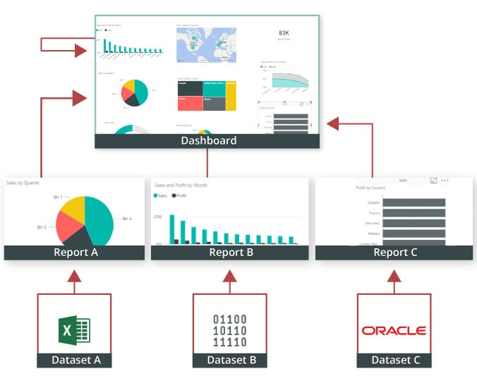
Power BI is a Business Intelligence and Data Visualization tool that transforms information from diverse sources into visualisations and BI reports. Power BI suite includes a variety of software, connectors, and services, including Power BI desktop, SaaS-based Power BI service, and mobile Power BI apps for various platforms. Business users use this set of services to consume data and create BI reports. Power BI Desktop is used to create reports, Power BI Services (Software as a Service – SaaS) is used to publish reports, and Power BI mobile app is being used to view dashboards and reports. Power BI Desktop is available in 32-bit and 64-bit configurations.
Become a Power BI Certified professional by learning this HKR Power BI Training !
What is a Power BI Dashboard?
A Power BI dashboard is a single-page visualisation that uses multiple charts and graphs to tell a storey. This one-page dashboard visualisation is also known as a Canvas. The Power BI dashboard is accessible only in Power BI Service. Because a Power BI dashboard is only one page long, it only encompasses the features of a storey. Power BI Desktop does not support the creation of dashboards. A Power BI dashboard is a single sheet, also known as a canvas, that uses visualisations to tell a storey. A well-designed dashboard includes only the features of that storey since it is restricted to one page. Readers can get more information by viewing related reports.
Power BI Dashboard on Power BI Service
In a dashboard, representations are produced from reports, and each report depends on one dataset. The representations present on the dashboard are called tiles, and report creators pin these tiles to the dashboard.
Advantages of a Power BI dashboard :
Dashboards are a magnificent method for observing your business and seeing each of your most significant measurements initially. The perceptions on a dashboard can emerge out of one basic dataset or many, and from one basic report or many. A dashboard joins on-premises and cloud information, giving a united view paying little heed to where the information resides.
• A Power BI dashboard empowers clients to examine reports and view exceptionally significant measurements initially
• Utilizing a Power BI dashboard, clients can make perceptions from numerous datasets or various reports
• You can alter dashboards to meet the necessities of any venture
• Power BI dashboards can be inserted into applications to give a brought together client experience
• You can immediately impart a dashboard to different partners in your association
How to Create a Dashboard in Power BI? Building reports in the dashboard provides details regarding Power BI Desktop and distributing them to Power BI Service is probably the most ideal way to see how a Power BI dashboard functions. For our demo, we’ll be taking a gander at a deals dataset that contains item deals data all through the United States. The dataset contains different client related subtleties, including client names, request and shipment dates, item names, item classes and subcategories, benefit made, etc. This dataset is normally known as a Sample Superstore dataset. We’ll investigate this dataset to analyze deals and benefit from each section, year, and quarter. We’ll likewise make a guide to show the deals across various states in the USA. Coming up next is the dataset that we’ll use to make the dashboard:
Fig: Sales Data
To begin, we will make three different vouchers to evaluate total sales, profit, and amount of sales. Click “card” in the visualisation committee on the power to make a vacant card.
Drag the sales column onto the fields to see the total amount of sales for all products. The user can change the font size and colour of the sales value on this card. The user can also give this card a headline. Correspondingly, by having to drag corresponding columns onto disciplines, you can generate 2 more cards for net income and total amount of sales.
Then, in our visualisation, we’ll add a slicer to slice the data based on the “Order Date” column. This will allow us to screen the data as well as visualise it as needed.
Fig: Cards and Slicers
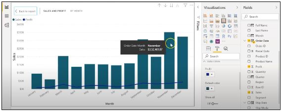
Assume you are hoping to picture and investigate deals and benefit over a specific number of years. To do this, you’ll make a line and stacked segment diagram. Select the line and stacked segment graph from the representation board and drag the “Request Date” section on to “Shared Axis.” Put “Deals” under “Segment” values, and addition the “Benefit” segment into “Line” values. That will create the chart. You can alter the shade of the bars and the line under the organization tab.
In the outline over, the bars address the deals, and the line addresses the benefit. The chart uncovers that the most noteworthy measure of deals and benefits happened in 2017. Power BI Desktop gives an amazing component to dive into the information and picture the chart as far as each quarter, month, and day. This choice is accessible at the top when you explore a particular outline.
Fig: Sales and profit by each month
You can likewise add the names to the diagram by tapping the “Organization” tab and turning on the information marks.
Fig: Adding labels to the graph
Presently, we should make a bunched segment diagram by dissecting yearly and quarterly deals.
From the Visualizations menu, select the “Grouped Column Chart.” Add the “Year” segment to the pivot. Take the “Quarter” sections under “Legend,” and add the “Business” segments to “Worth.”
Fig: The clustered bar chart
The diagram above shows that the principal quarter of each year had the most minimal marketing projections, while the final quarter was reliably the most elevated. You additionally have the choice to change the shadings on your diagram to make it all the more outwardly engaging.
Presently, how about we examine the deals for each state in the US. To do this, we’ll utilize a filled guide. Select a filled guide from the representations board. Add the “State” section to “Area.” Drag the “Deals” segment onto “Tooltips.” To alter the shadings, click on the “Configuration” tab, and pick “Information Colors.” Select the contingent arranging choice and add the scope of tones that you’d like.
Fig: Formatting colors based on the sales
Our colour has been described for the smallest, medium, and greatest sales values. The green-colored states had the smallest sales. California, Texas, and New York, which are highlighted in orange or red, had the highest sales. Correspondingly, you can create a map to see the profit and number of units sold in each nation.
Fig: Sales by each State
So far, our report appears to be as follows. We’ve covered how to make cards, slicers, line and stacked column charts, clustered bar charts, and packed maps.
Fig: Sales report
Following that, we’ll take a glance at how to make a donut chart to evaluate revenue and profit by section.
Select the pie chart from the visualizations menu. Add the section column to the legend. Drag the “Sales” column to the “Values” column and the “Profit” column to the “Tooltips” column.
Fig: Donut chart for Sales and Profit
According to the pie chart given above, the customer group had the most revenue and profit, while the head office segment had the least. To make the visualisation more visually appealing, you can format it as needed.
We will now create a pie chart to visualize the sales for each product category. Move the “Category” column to the “Legend” column and add the “Profit” column to the “Values” column. Drag the “Sales” column to the “Tooltips” section.
Fig: Pie Chart for Profit and Sales
The new tech classification produced the most sales and profit, while furniture generated the least. To change the colours and make any necessary changes, go to the “format” tab.
The following is an example of the the last total sales report:
Fig: Overall Sales Report
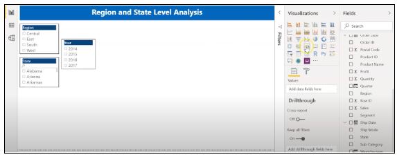
Allow us now to picture our information at a more granular level by examining deals, benefit, and units sold at territorial and state levels.
In the first place, we’ll make three slicers to channel our information. Click on the slicer from the representations board and add the “Area” segment on to “Field” to make a local slicer. Additionally, you can make a state and year slicer. You likewise have the choice to alter the slicers to change the text dimension, increment the size of the text, and add a foundation tone.
Fig: Slicers to filter data
We’ll presently make a table to check the sum and the advantage made in each city. Under the “Insights” tab, select “Table”. Add the “City” fragment under “Values,” followed by sum and the “Advantage” area. Add an establishment tone to the fragment headers and addition the size of the printed style. You can channel the data by picking the things from all of the slicers.
Under, we have picked the central region and picked the region of Minnesota. In the table, you can see all of the metropolitan regions in the area of Minnesota, the sum sold, and the advantage they made.
Fig: Creating a Table in Power BI
Orchestrating a table is another limit that Power BI Desktop maintains. This gives clients the decision to sort the segment in a table in their solicitation for tendency.
By and by, could we create a clustered reference diagram to separate the arrangements for each thing class across different states? Select the gathered bar layout from the discernments board. Take the “State” area on the center point, “Characterization “portions on to the legend, and “Arrangements” on to “Worth.”
Fig: Clustered Bar Chart
Among the three classes of things, the region of California made the most critical arrangements for all orders.
Then, at that point, we should check the yearly advantage by grouping using an area diagram. Select the area chart from discernments and drag the “Year” segment on to the turn, the “Class” fragment on to the legend, and “Advantage” on to “Values.”
Fig: Area chart using Power BI
You can separate the advantage and sum that each thing class and subcategory sold. You can moreover make a line. Clients can research their various decisions through the dashboard.
Fig: Region and State Level Report
To go comprehensively and make a more granular level report, you can do that by making a report considering the things’ orders and subcategories, as shown in the report underneath. You can use class and subcategory as your slicers and make different line traces, bubble outlines, treemaps, and pie charts to imagine the data.
Fig: Category and subcategory Level Report
We’ll as of now disperse our overall business diagram on Power BI Service and make a dashboard. Save your reports on Power BI Desktop. Then, click on the home menu and select the “Convey” tab.
Fig: Publishing report on to Power BI Service
You can in like manner make another workspace or disperse the report to a current workspace in Power BI Service.
Fig; Publishing to Power BI successfully.
Power BI Training
Master Your Craft
Lifetime LMS & Faculty Access
24/7 online expert support
Real-world & Project Based Learning
Reports in Power BI :
A Power BI report is a multi-perspective look at a dataset, with visual effects representing various information and results from that set of data. A report may contain a single visual or possibly multiple pages of visual elements. Based on your work, you may be in charge of creating reports.
Power BI reports v Dashboards :
Pages- Dashboards are not permitted to span more than one page; all essential reports are displayed on a single page.
Data sources- Dashboards are founded on the basis of multiple data tables that are linked to one another in one or more contexts. Reports are typically generated from a solitary table of data with no relationships to other tables.
Available in Power BI Desktop- Both the features are available in Power BI desktop
Pinning- Dashboards are fastened to the page so that the viewer can simply read through the data. Reports are built with various filters and shredders to allow the user to communicate with the set of data.
Subscribe- Reports can be published on the web and subscribed to via email. Dashboards have the same features as reports, but they can only be exported to a limited number of formats, so they are used to visualise important data rather than analyse it, which is only possible with reports.
Filtering- Power BI dashboards don’t at present have filter channels though reports are made with any sort of channels and slicers so the client can cooperate with the informational index. Dashboards are stuck to the page even the report proprietor.
Set alerts- With a dashboard, you can set up alarms for when a tile arrives at a specific limit. Thusly, you will not need to continue to return on the dashboard to check whether the tile has arrived at that limit. Sadly, it is absolutely impossible to set up a caution for a report. Thus, you should continue to inquire on the report to check whether the measurements you are following have arrived at a specific limit.
Modify/change visualization type- Dashboards contain an assortment of outlines and tables on a scope of related points though reports contain diagrams and tables on a solitary theme. Accordingly, dashboards regularly offer an undeniable level outline of a subject, and reports will generally be more granular and smaller in center.
Subscribe to our YouTube channel to get new updates..!
Features of Power BI :
Range of Attractive Visualizations :
Visualizations, or the visual representation of data, are important in Power BI. It provides a wide variety of detailed and appealing visualisations.
Get Data Feature :
The Get Data feature in Power BI permits the users to choose from a variety of data sources. The data sources can range from on-premise to cloud-based, unstructured to structured. Every month, new data sources are added.
Datasets Filtration :
A dataset is a single set of data created by combining data from multiple sources. You can use the datasets to create various types of visualisations.
Customizable Dashboards :
Dashboards are a grouping of visualisations that provide useful information or insights into data. Power BI dashboards are typically made up of multiple visualisations as tiles.
Flexible Tiles :
In a Power BI dashboard, a tile is a single block that contains a visualisation. Tiles properly separate each informative visualisation to provide a clearer view.
Power BI dashboard is a wonderful storytelling tool that can be really helpful to develop actionable business insights. In addition to this, we have also illustrated the differences between the Power BI dashboard and the reports. If you have any questions let us know in the comments section.
To provide the best experiences, we use technologies like cookies to store and/or access device information. Consenting to these technologies will allow us to process data such as browsing behavior or unique IDs on this site. Not consenting or withdrawing consent, may adversely affect certain features and functions.
Functional
Always active
The technical storage or access is strictly necessary for the legitimate purpose of enabling the use of a specific service explicitly requested by the subscriber or user, or for the sole purpose of carrying out the transmission of a communication over an electronic communications network.
Preferences
The technical storage or access is necessary for the legitimate purpose of storing preferences that are not requested by the subscriber or user.
Statistics
The technical storage or access that is used exclusively for statistical purposes.The technical storage or access that is used exclusively for anonymous statistical purposes. Without a subpoena, voluntary compliance on the part of your Internet Service Provider, or additional records from a third party, information stored or retrieved for this purpose alone cannot usually be used to identify you.
Marketing
The technical storage or access is required to create user profiles to send advertising, or to track the user on a website or across several websites for similar marketing purposes.


:max_bytes(150000):strip_icc():format(jpeg)/Health-GettyImages-B6Foods-d4b732c2b3cd46899ea1b540b56f0f0f.jpg "Woman hands holding fresh summer salad with raw vegetables cabbage, spinach, radish, parsley, greens in bowl for dinner or lunch.")