9 Ingredients in Korean Skincare That May Help Reduce Visible Signs of Aging


Fact checked by Nick Blackmer
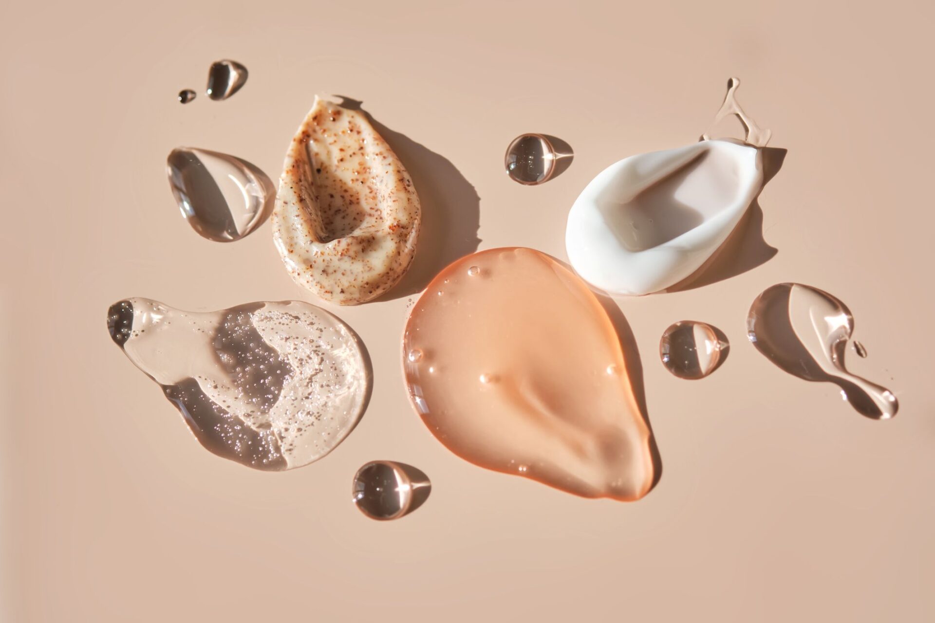
Credit: Mariyariya / Getty Images
  • Ginseng, peptides, and salmon DNA can support collagen production and help improve skin elasticity.
  • Snail mucin, propolis, and centella asiatica hydrate the skin and strengthen the skin barrier.
  • Niacinamide, fermented ingredients, and tranexamic acid help brighten skin and reduce discoloration.

Korean skincare is known in the U.S. for achieving a “glass skin” appearance or preventing aging. But do ingredients like snail mucin and salmon DNA actually help combat wrinkles, improve skin texture, and boost firmness? Here, board-certified dermatologists and skin care experts share what the research says.

1. Ginseng

Ginseng has a long history in traditional medicine. “It contains bioactive compounds known as ginsenosides that function as antioxidants and may support collagen production and skin elasticity,” Pooja Rambhia, MD, a cosmetic dermatologist at UnionDerm, told Health.

According to Rambhia, ginseng helps neutralize oxidative stress, a major driver of collagen breakdown and visible aging. Ginseng-based ingredients may help improve the appearance of dull or fatigued skin over time.

Ginseng is commonly added to serums, essences, and creams that target early signs of aging. “It is particularly useful when used in daytime routines under sunscreen to help support the skin against environmental stressors,” said Rambhia.

2. Snail Mucin

Snail mucin, also called snail secretion filtrate, is one of the most recognizable ingredients in Korean skincare. “It contains glycoproteins, peptides, hyaluronic acid-like molecules, and antioxidants that support hydration and help promote skin repair,” said Rambhia.

Research suggests these compounds may improve skin barrier function and support collagen, which can translate into smoother skin texture and modest improvements in fine lines with consistent use, according to Rambhia.

Snail mucin is good for people with dry, sensitive, or irritated skin who are looking for improved hydration and skin texture. “It is commonly found in essences, serums, and moisturizers and is typically applied after cleansing and toning but before heavier creams,” said Rambhia.

3. Fermented Ingredients

Fermented ingredients are a hallmark of Korean skincare. Fermented rice water helps brighten and smooth, and other probiotic-derived fermented extracts like bifida ferment lysate may support the skin barrier and help maintain a balanced microbiome. This can benefit people with dull, uneven skin without the risk of irritation associated with stronger active ingredients.

Fermented ingredients are most commonly used in essences, serums, and toners. “They are compatible with most active ingredients, pair particularly well with niacinamide, and individuals with sensitive skin may benefit from patch testing before regular use,” said Rambhia.

4. Niacinamide

Niacinamide is a form of vitamin B3 that is widely used in Korean skincare. “It supports the skin barrier by increasing ceramide production, reduces inflammation, and helps regulate sebum production,” said Rambhia.

Clinical studies have also shown that niacinamide can help reduce hyperpigmentation and uneven skin tone, minimize the appearance of pores, and strengthen the skin barrier. It’s useful for a wide range of skin types, including oily, acne-prone, and sensitive skin.

Niacinamide is found in toners, serums, and moisturizers. “It can be used both morning and night and pairs well with retinoids, sunscreen, and antioxidants,” said Rambhia. “Concentrations around 2% to 5% are typically well tolerated.”

5. Centella Asiatica

Centella asiatica (cica) is a botanical ingredient widely used in Korean skincare for its calming and reparative properties. “The active components of this plant have been shown in studies to promote fibroblast activity and support collagen synthesis while also reducing inflammation,” said Rambhia.

According to Michelle Lee, MD, a board-certified plastic surgeon and founder of PERK Plastic Surgery, it’s frequently found in products designed to calm irritated skin and support barrier repair, making it particularly helpful for individuals with redness or sensitive skin.

It is commonly found in serums, creams, and barrier-repair formulations and can be used alongside most active ingredients to improve tolerability.

6. Salmon DNA (PDRN)

PDRN (polydeoxyribonucleotide) is a regenerative ingredient derived from salmon DNA that has become a staple in Korean aesthetic medicine. According to Lee, it works by activating a receptor in your body called the adenosine A2A receptor. These receptors then cause certain skin cells to become more active and produce more collagen, which can help improve elasticity and promote healing.

“You’ll most commonly see it in serums, ampoules, and sheet masks, and it’s usually applied after cleansing and before moisturizer,” Whitney Hovenic, MD, a double board-certified dermatologist and Mohs surgeon, told Health. “It can be especially helpful for people with a compromised skin barrier, post-procedure skin, early signs of aging, or skin that’s recovering from inflammation like acne.”

In clinical practice, PDRN is often used post-procedure, such as after laser resurfacing or microneedling, to accelerate tissue repair, said Lee.

7. Peptides

Peptides are short chains of amino acids that act as signaling molecules for skin cells, Valerie Aparovich, a biochemist, certified cosmetologist, aesthetician, and science team lead at OnSkin, told Health.

According to Aparovich, signal peptides stimulate cells to produce more collagen, elastin, and other structural proteins in the dermal matrix.

Aparovich says peptides have a high safety profile, are non-drying and non-comedogenic, and are suitable for all skin types. “[It’s] generally recommended to introduce them as anti-ageing therapy starting at age 30 to 40,” she said. “Prioritize products that stay on the skin for longer periods, such as creams, and use them daily and consistently over time, usually for at least three months, so they can deliver visible results.”

8. Tranexamic Acid (TXA)

Tranexamic acid is typically found in products focused on brightening and treating discoloration. “You’ll often see it in serums paired with ingredients like niacinamide, licorice root, or vitamin C,” said Hovenic.

Tranexamic acid improves the appearance of photodamaged skin and hyperpigmentation, which are often linked to aging, says Aparovich. “It effectively reduces dark spots, sun-induced discoloration, and melasma by regulating pathways involved in excess melanin production, resulting in a more even complexion.” As with most pigment treatments, consistent use and daily sunscreen are key to achieving the best results, she added.

Tranexamic acid is generally considered safe and may cause only minor redness, which resolves within a few hours, said Aparovich.

9. Propolis Extract

Propolis is a resin-like substance produced by bees and is rich in flavonoids, polyphenols, and antioxidants, said Hovenic. “It offers antimicrobial and anti-inflammatory properties, which can help reduce acne-causing bacteria and calm irritated skin, while also supporting hydration and skin barrier function.”

According to Hovenic, some studies suggest propolis may promote wound healing and improve overall skin recovery, which can help smooth uneven texture and soften the appearance of fine lines over time.

It is typically found in ampoules, serums, essences, and masks, and fits well into layered hydration routines.


Source link

Leave a Reply

Subscribe to Our Newsletter

Get our latest articles delivered straight to your inbox. No spam, we promise.

Recent Reviews


What is Power BI Visualization

Regularly our business produces more data on sales, the performance of marketing, interactions of customers, inventory levels, metrics production, levels of staffing, KPIs, costs, etc. Still, there is a problem with massive amounts of data shifting as it is tough to understand the content’s theme. It helps us convert our entire complex data as simple to understand and visually useful compelling information for business, present-day visualization tools, and permits us to maintain our KPIs as more simple and straightforward. It helps combine the data and use AI analytics to display relationships between the market, KPIs, and the world. When we observe the format of our presented data, connections, patterns and insights, it gives life to data to make us experts in the storytelling of hidden insights in our data; these visualizations help users develop business insights effectively with high speed.

Become a Power BI Certified professional by learning this HKR Power BI Online Training !

Why is Power BI visualizations

It is a powerful tool of data sharing and communicating, and it may be helpful in performance demonstration, trends communication, latest strategies impact and more. Its representations work like a practical collaboration tool and contacts and get more value for reports, apps, and journalism. With the help of the best insights, we can make decisions with confidence, and it empowers us to have the arms and knowledge with tools for the right decisions at the proper time. We need to decide to gather the information like the types of data we require and the insights we need.

Power BI Training

  • Master Your Craft
  • Lifetime LMS & Faculty Access
  • 24/7 online expert support
  • Real-world & Project Based Learning

Power BI visualizations types

Visualizations are nothing but the pictorial representation of our data; some general examples are maps, radial gauges, scatter charts, column charts, etc. The given below are some essential types of Power BI visualizations. 

1.Area charts:

These charts have support from online maps along with the area between line and axis. They highlight the change of magnitude and gains attention to the entire value. 

2.Bar and column charts:

These charts are known for the particular value in various categories.

3.Cards:

Cards expose the single fact and data point. It is essential to track our reports and dashboards of power BI like market share, total sale, and opportunities.

4.Combo charts:

These charts help to combine the line charts and column charts into one. It permits us to compare the data quickly. They can maintain two Y axes to look close. For correlation illustration between two measures, these combo charts are the best choice.

Unleash your data potential with Power BI Training in Hyderabad!

5.Decomposition tree:

The visuals of this tree allow us to expose our data across various dimensions. It generates the data automatically and drills it as our dimensions in the required order.

6.Doughnut charts:

They are like pie charts and display the parts’ relationship to the whole, but the main difference is it has space at the centre used for labels or icons.

7.Funnel charts:

They help the visualization process; it includes various items and stages randomly from one location to another.

8.Gauge charts:

They have the circular arc and expose the single value, which calculates the aim’s development. Its purpose is by line through shading, and the value represents the progress displayed as bold in the arc.

9.Key influencers chart:

This chart exposes the essential contributors to choose the value. It is an excellent selection to help us understand the factors that may affect the key metrics. It is like what attracts the users to put a second order and why sales are high in previous times.

10.KPIs:

It is a visual key that communicates the part of progress for measurable aim. The given below are two reasons to prove that KPIs are great.

  • They use it for progress measurements.
  • They are helpful for distance measurement towards the goal.

Top 50 frequently asked Power BI Interview Questions !

11.Line charts: They are used to emphasize the entire shape of the overall series of values.

12.Basic maps: These basic maps associate the quantitative data and category with the spatial location.

14.ArcGIS maps: It is an available choice for themes, locations types, symbol styles, base maps, and reference layers to design the informative map’s visuals. And it is the combination of data layers on a plan to display the deep knowledge of the information in our visual.

15.Choropleth: These charts are patterns used to expose how value varies in proportion in the region. It displays the differences through shading from dark to light. 

Business Intelligence & Analytics, power-bi-visualization-description-0, Business Intelligence & Analytics, power-bi-visualization-description-1

Subscribe to our YouTube channel to get new updates..!

16.Shape maps: they are used to compare the map regions through colour and shape, as shape maps cant display the precise data locations on the map. Its main aim is to display the parts Comparison on the map through various kinds of coding.

17.Matrix: it is a kind of table visual which gives support to a stepped layout; its report creators contain matrices in dashboards to provide users to choose multiple elements in a matrix on the report page.

18.Pie charts: it permits the users to display the relationship of the parts to the whole. It is used for report designers to design a Power App and turn it into the report of Power BI.

19.Q&A visual: they are similar to the experience of Q&A of dashboards. They permit us to ask questions regarding our information through natural language.

20.Ribbon charts: it displays the data according to ranking. They are very effective in rank, showing rank changes through the highest range on top of every period.

21.Scatter and dot plot charts: it always includes two axes’ values to display one numerical group of data, along with another numerical value, vertical axis, and horizontal axis. They show the intersecting points of x and y numerically. It units those two values as a single point. They may explore unevenly or evenly in the horizontal axis based on the data. The dot plot is similar to the scatter chart, but it can categorize the information with the x-axis.

22.Scatter high density: it permits users to design the visuals with high speed, helping for interactions. Its sampling uses an algorithm that removes the overlapping points and makes sure that the complete data set points to expose the visuals. 

Want to know more about Power BI,visit here Power BI Tutorial !

23.Slicers: these charts are standalone, which may be for other visuals filtering on the page. They are available in various formats and designed to permit to choose the single one or many as per the requirement. 

24.Innovative narrative: It is helpful to add the data to reports for the point out trend and essential takeaways and previous explanations. The data help customers to get an idea of data and recognize the crucial findings at high speed.

25.Standalone images: it is a kind of graphics that add to the dashboards.

26.Tables: it is a kind of grid map which includes the related information of logical series in rows and columns; it also maintains the headers along with table rows. They use quantitative comparison, which helps to look at various values in a single category, and the table exposes five multiple values for a single variety.

27.Treemaps: these are a kind of colour charts with rectangular shapes where the values display by size, the rectangles set in the central rectangles. Every rectangles space is allowed measured value and arranged in size from left to right.

28.Waterfall charts: they display the running of absolute added values. It helps understand how important the matter is through the changes that take place.

Power BI Training

Weekday / Weekend Batches

Conclusion: 

The visuals are the best guide for the Power BI; they are based on the data we require to expose. First, we need to understand that visuals’ vocabulary supports the graphics team of financial teams through Power BI. They are used to facilitate the graph’s selection to display the information. Visual language does not need prescribed graphs, but graphs required to  create to experience its benefits for choices to utilize them with data. Another issue with the graphical data representation with which the organizations create dashboards, they are not experts to display the complex data with a non-professional audience.

Related Article:


Source link