How the Antigravity 360 Drone Will Change Your Travels


Antigravity 360 A1 drone on a table

Drones are huge. And, while there’s lots of restrictions around them, a lot of travelers take them on road because they produce some amazing sweeping aerial shots.

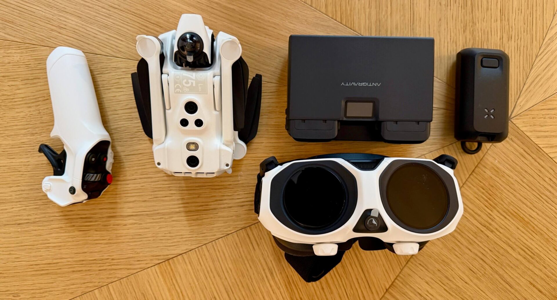
There’s lots of amazing brands out there but one that I think is super cool is the Antigravity A1. Released in late 2025, attempts to render the traditional gimbal obsolete for a vast segment of creators. By leveraging a dual-lens 360-degree capture system, the A1 records everything in every direction simultaneously. The result is a “fly now, frame later” experience that feels less like piloting a drone and more like directing a virtual camera in a pre-recorded digital environment.

I was sent one to use and want to share my experience and why I like this product so much.

Two Lenses = No Blind Spots

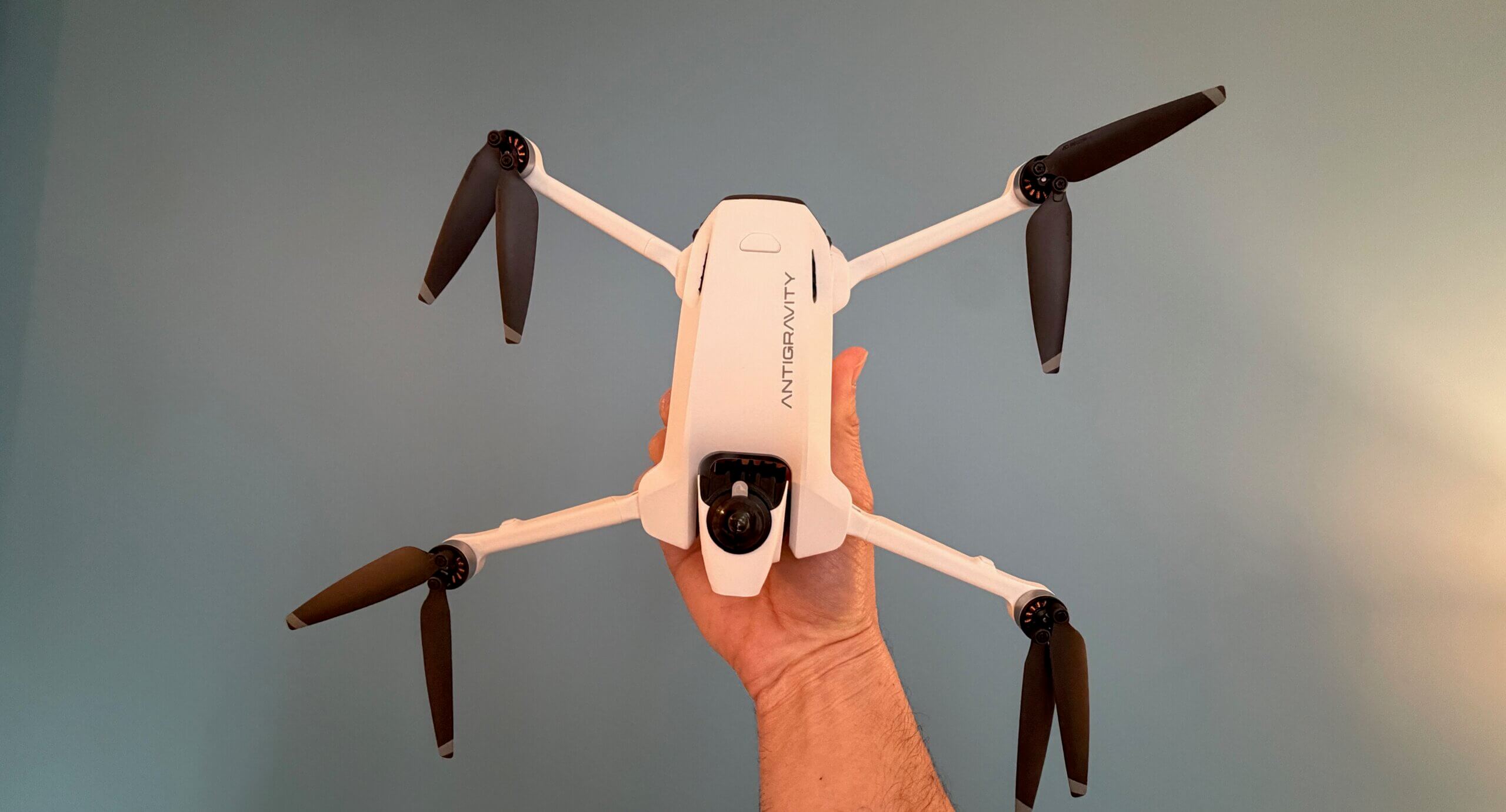
What make’s Antigravity 360’s so special is the two lenses. Most drones feature a single lens that points forward. However, the A1 features two ultra-wide-angle lenses positioned on the top and bottom of the central fuselage that each captures a 200-degree field of view. When those images are combines, they overlap to create a seamless 360-degree sphere.

And, in the final exported footage, the drone itself is digitally removed, creating the illusion of a camera floating in mid-air with no visible means of support.

The sensors themselves are 1/1.28-inch CMOS units. While smaller than the 1-inch sensors found on some “Pro” level photography drones, they are massive compared to typical 360 action cameras. This allows for significantly better low-light performance and a higher dynamic range, capturing details in the highlights and shadows that would typically be lost in the harsh contrast of a midday sun.

Most countries require drones weighing 250 grams or more to be registered and subject to stricter flight rules. Antigravity clearly understood the importance of this threshold because they made the A1 to weigh exactly 249 grams with its standard battery meaning it’s not considered a commercial drone so you don’t have to register it.

And the drone feels remarkably sturdy. It utilizes a high-grade carbon-fiber-reinforced polymer that offers a better strength-to-weight ratio than the standard ABS plastic found in cheaper models. The folding mechanism is satisfyingly tactile, clicking into place with a precision that suggests long-term durability. When folded, the drone is roughly the size of a large smartphone, though about three times as thick.

The Flight Experience

The Vision Goggles: These are sleek, lightweight, and feature dual 4K micro-OLED displays with a 120Hz refresh rate. The latency is nearly non-existent and they have integrated head tracking. Because the drone is recording in 360 degrees, you aren’t limited to seeing what is in front of the drone. When you turn your head to the left, the goggle feed pans to the left. If you look down, you see the ground passing beneath you. This provides a sense of presence and spatial awareness that is simply impossible with a traditional fixed-camera drone.

The drone uses a single-handed motion controller. You point the controller where you want to go and pull the trigger to accelerate. Tilt your wrist left to bank, or raise the nose of the controller to climb. It is an incredibly intuitive system that allows even a novice to fly through complex environments within minutes. For professional FPV pilots who prefer the precision of manual acrobatic flight, the A1 does support a traditional “Mode 2” stick controller, but the motion controls are so fluid that most users will likely never switch back.

Here’s a video of the drone in action:

Camera Performance

The marketing for the Antigravity 360 proudly displays “8K Resolution.” In a traditional camera, 8K means every pixel is packed into a 16:9 rectangle. In 360 video, those pixels are spread across a full sphere. When you “reframe” that 8K sphere into a standard flat video, you are looking at a “crop” of the total image.

The color science is noticeably improved over previous 360 cameras. The A1 features a “Vivid” profile for those who want punchy, social-media-ready colors, and a 10-bit “Log” profile for professional editors who need to match the footage to other cameras in a color-grading suite. The stabilization, powered by Antigravity’s “FlowState” algorithms, is nothing short of miraculous. You can fly in 20mph winds, and the footage remains as steady as if the camera were on a tripod.

The Editing App

The “Antigravity Studio” app allows you to download footage wirelessly (at speeds up to 80MB/s) and reframe your video using your phone’s gyroscope. You simply watch the video and move your phone around to “film” the scene in real-time. The app also features “Auto-Frame,” an AI tool that identifies subjects and automatically generates a cut that keeps them in focus. For a solo creator, this effectively provides a virtual camera crew that never misses a shot.

Battery Life

Battery technology remains the bottleneck for all small drones. The A1’s standard Intelligent Flight Battery provides a theoretical 24 minutes of flight. In real-world conditions with moderate wind and constant recording, expect closer to 19 or 20 minutes.

While 20 minutes sounds short, the “work per minute” is much higher than a traditional drone. Because you don’t need to re-fly a path to get different angles, a single 20-minute flight can yield the same amount of usable footage as three flights with a Mavic. For those who need more time, the “Pro Battery” (which pushes the weight over 250g) offers a staggering 39 minutes of flight time, though it does compromise the drone’s agility slightly.

In terms of flight dynamics, the A1 is a “cinewhoop” style flyer. It is stable and predictable rather than aggressive and twitchy. It has a top speed of roughly 36 mph, which is plenty for following bikes or cars, but it won’t keep up with a professional racing drone. The “Turtle Mode” is a life-saver; if you crash and end up upside down, the drone can flip itself over using its propellers, allowing you to take off again without a “walk of shame” to recover the aircraft.

Who is this for?

Antigravity 360 A1 drone on a table
The Antigravity 360 is a niche product that is rapidly becoming mainstream.

  • Extreme Sports Athletes: For skiers, mountain bikers, and surfers, the A1 is a game-changer. You can set it to “ActiveTrack” and just go. Because it’s 360, it will never lose you, even if you go under the drone or take a sharp turn.
  • Real Estate Videographers: The A1 is perfect for interior tours. It can fly through a house, and in post, you can look at the architecture, the floors, and the ceilings in one seamless take.
  • Travel Vloggers: The portability and the “invisible drone” effect make it the ultimate travel companion for those who want high-production-value shots without a full crew.

****

The Antigravity 360 (A1) is the most exciting drone I have tested. By removing the need for a gimbal and the stress of manual framing, it allows the pilot to focus on the one thing that truly matters: the story they are trying to tell.

While the image quality isn’t quite at the level of a high-end cinema drone, and the lenses are admittedly delicate, these are small prices to pay for the creative liberation the A1 provides. It bridges the gap between traditional cinematography and the immersive world of VR.

If you are a creator who is tired of the same old “drone shots” and want to push the boundaries of what is possible in the air, the Antigravity 360 is an essential addition to your toolkit.

How to Travel the World on $75 a Day

How to Travel the World on $75 a Day

My New York Times best-selling book to travel will teach you how to master the art of travel so that you’ll get off save money, always find deals, and have a deeper travel experience. It’s your A to Z planning guide that the BBC called the “bible for budget travelers.”

Click here to learn more and start reading it today!

Book Your Trip: Logistical Tips and Tricks

Book Your Flight
Find a cheap flight by using Skyscanner. It’s my favorite search engine because it searches websites and airlines around the globe so you always know no stone is being left unturned.

Book Your Accommodation
You can book your hostel with Hostelworld. If you want to stay somewhere other than a hostel, use Booking.com as it consistently returns the cheapest rates for guesthouses and hotels.

Don’t Forget Travel Insurance
Travel insurance will protect you against illness, injury, theft, and cancellations. It’s comprehensive protection in case anything goes wrong. I never go on a trip without it as I’ve had to use it many times in the past. My favorite companies that offer the best service and value are:

Want to Travel for Free?
Travel credit cards allow you to earn points that can be redeemed for free flights and accommodation — all without any extra spending. Check out my guide to picking the right card and my current favorites to get started and see the latest best deals.

Need a Rental Car?
Discover Cars is a budget-friendly international car rental website. No matter where you’re headed, they’ll be able to find the best — and cheapest — rental for your trip!

Need Help Finding Activities for Your Trip?
Get Your Guide is a huge online marketplace where you can find cool walking tours, fun excursions, skip-the-line tickets, private guides, and more.

Ready to Book Your Trip?
Check out my resource page for the best companies to use when you travel. I list all the ones I use when I travel. They are the best in class and you can’t go wrong using them on your trip.


Source link

Leave a Reply

Subscribe to Our Newsletter

Get our latest articles delivered straight to your inbox. No spam, we promise.

Recent Reviews


What is the Power BI Matrix?

The visual of the matrix is identical to that of a table. The data in a table is flat, which ensures that duplicate values are shown and not aggregated. A matrix supports a stepped structure, which makes it easier to view data meaningfully across multiple dimensions. The matrix aggregates the data for you and helps you to dig down into it. 

Power BI Matrix

Why Power BI Matrix?

The matrix aggregates the data automatically and allows for drill-down. In Power BI Desktop reports, you can create matrix visuals and highlight elements inside the matrix with other visuals on the same report page. You may, for instance, cross-highlight rows, columns, and even individual cells. Individual cells, as well as different cell selections, can be copied and pasted into other applications.

Understanding the Data: 

We will use the Matrix visual as an example to illustrate some interesting techniques. The example data is a list of numbers drawn from the Maltese lotto. Each record is one number from a drawing, and each drawing has five records, one for each of the five numbers.The numbers for each drawing can be displayed as a single line using the Matrix visualisation, as shown in this figure. 

single line using the Matrix visualisation

The goal is to have a slicer that filters rows based on the number or numbers selected. If you choose 5 and 10, for example, the rows that contain those numbers will be displayed:

 numbers selected

You can also use conditional formatting to make the selected numbers glow in a colour of your choosing.

 conditional formatting

Each row in the table represents a single number drawn in a single lotto drawing. Since each drawing has five numbers, the table includes five records for each drawing. Lotto is the name of the table, and the following fields are the most important in this example:

DrawNo: The number of the drawing

DrawOrder: The order of the drawn number

Number: The drawn number

Begin by creating a new Power BI dashboard and then importing the csv file. You can also use the MatrixSimpleStart.pbix file included in the zip file as a starting point.

Matrix Creation

There are three fields to configure in the Matrix visual: the field for the rows, the field for the columns, and the values’ field. A single drawing with the five numbers should be shown on each line of the visual. As a result, the DrawNo field will be used to aggregate the drawings on each row.

How do you show five records on each line when each drawing has five records, the five drawn numbers? The columns’ title will be decided by the content of the field you select as a column field. The best choice is easy: “DrawOrder”. Each row shows the “DrawNo”. Each column has the “DrawOrder” as a title and will show the drawn “Number” as a value in the column.

Follow a quick sequence of steps to configure the Matrix visual once you’ve opened the file MatrixSampleStart.pbix or imported the csv file. You’ll be working in Report view.

a. Add a “Matrix” visual to the report from the “Visualizations” pane.

Matrix

b. Drag the three fields, “DrawNo”, “DrawOrder”, and “Number”, to the appropriate slots in the “Fields Pane”.

DrawOrder

The Matrix will look like this after you’ve placed all of the fields in the correct spots:

correct spots

c. In the “Visualizations Pane”, with the matrix selected, click the “Format” button and disable the subtotals for rows and columns as they are not needed.

Visualizations Pane

Format

d. While still in the “Format” tab, under the “Style” option, change the style of the matrix. You can choose any available style; I suggest “Bold Header”.

 style of the matrix

Power BI Training

  • Master Your Craft
  • Lifetime LMS & Faculty Access
  • 24/7 online expert support
  • Real-world & Project Based Learning

e. Still in the “Format” tab, change the font size under these three different options: “Row Headers”, “Column Headers”, and “Values”. I like to use 12 as font size.

Row Headers

The completed Matrix should look like this:

 completed Matrix

Creating a Slicer and Filtering the Matrix

Since the matrix includes numbers from lotto drawings, filtering the drawn numbers and only displaying the drawings with the selected drawn numbers is the right choice for a slicer.

There are three possible approaches to create a slicer:

  • Build a slicer based on the table’s original fields (Lotto).
  • Build a slicer based on a new measured table by transforming the original table into a new one using a DAX expression.
  • Make a slicer based on a What-If condition.

Note that DAX is an expression language used in tabular models, such as the Power BI model, to allow for calculations to be done on the model.

The first two options maintain a connection to the original table (Lotto). Although this relationship does not affect the outcome, it does cause a minor bug. The slicer must be placed before the matrix on the page. Some slicer configurations will be unavailable if the slicer is inserted after the matrix. First, the slicer must be inserted.

Creating a Slicer from the Same Table

The simplest way to add a slicer is from a table field. Unfortunately, in this case, it does not quite provide the answer. To see how to add a slicer based on the table, follow these steps:
a. Drop the matrix.
b. In the “Fields Pane”, select the “Number” field in the Lotto table.
c. In the “Visualizations” Pane, change the visual to “Slicer”.

Slicer

d. Change the slicer format to “List” in the slicer style option within the slicer.

slicer style option

e. Select the slicer in the Visualizations Pane and press the “Format” button. Disable the “Single Select” option in the “Selection Control” options to enable multiple number selection.

Format

f. Repeat the steps in the “Create the Matrix” section to recreate the matrix.

Select two numbers in the slicer, such as 5 and 10, and look at the result in the matrix to evaluate this solution. You’ll note two issues:

  • Instead of showing all of the numbers from the chosen draws, the draws are filtered to display only the selected numbers. This isn’t the best outcome for this problem.
  • The multiple choices act as an OR rather than an AND. Only one of the two chosen numbers appears in the drawings.

Create the Matrix

Fixing the Selection

A different approach to this problem is needed to address the range. The model and visual engine in Power BI build the filter automatically, displaying only the selected numbers. To display all of the chosen draws’ numbers, you’ll need to disable the automatic filter and construct a DAX formula to decide which ones should be displayed.

This takes us back to the decision on how to design the slicer: building the slicer directly from the draws table (Lotto) establishes an inevitable relationship. The only slicer option that won’t work is this one. The relationship to the source table (Lotto) can be managed if you construct the slicer from a calculated table or What-If parameter, avoiding the filtering.

You can construct a DAX formula to filter the drawings if the slicer does not directly filter the matrix. The expression would compare the numbers on the current drawing row to the slicer’s chosen numbers to decide whether the row should be displayed.

Next, you’ll see two alternate ways to render the slicer, both of which include the use of a helper table. You have the choice of using either method.

Creating the Slicer – Calculated Table

An essential DAX expression can be used to build this table. A button named “New Table” can be found on the top menu, “Modeling” tab. After you click this button, space expands in which you can type in the DAX expression for this table.

Creating the Slicer – Calculated Table

Call the table “Selector”. The expression is very simple:

Selector = VALUES (Lotto[Number] )

Selector, the newly created table, would be unrelated to the original. The only impact would be the strange visual action that allows the slicer to be generated before the matrix, considering the fact that it was created from Lotto rows.

Lotto rows

Business Intelligence & Analytics, power-bi-matrix-description-10, Business Intelligence & Analytics, power-bi-matrix-description-19

Subscribe to our YouTube channel to get new updates..!

You must perform the following steps if you chose this choice for the “Selector” table:

  1. Drop the slicer.
  2. Drop the matrix.
  3. Create the slicer again using the steps from the “Creating a Slicer from the Same Table” section but use the “Number” field from the “Selector” table.
  4. Create the matrix again.

The slicer will not filter the data at this point. Please keep reading to figure out how to make it sort the matrix.

Creating the Slicer from the What-if Parameter

It would be best to create a “What-if” parameter instead of creating the “Selector” table based on the Lotto table. This is a new table with no relationship to the Lotto table. If you used the table in the previous section to build the Selector, delete it before proceeding.

a. Delete the matrix

b. To open the “What-if Parameter” window, go to the top menu, “Modeling” tab, and press the “Create Parameter” button.

Create Parameter

2. Click “OK” once the properties have been filled in.

DAX Formula

Behind the scenes, the following DAX formula is generated:

Selector = GENERATESERIES ( 1, 99, 1 )

In the Fields pane, you’ll find a new measure:


GENERATESERIES

As you can see in the image above, this option varies slightly from the previous one in that the area generated within the the “Selector” table is now called “Selector” rather than Number.

You should rename the “Selector” field to “Number” to make all options the same. It’s not necessary, but if you don’t, the following expressions would need to use Selector[Selector] instead of Selector[Number] to apply to this field.

The steps to rename this field:

  1. Click the ‘…’ (More Options) button in the “Fields” pane, next to the “Selector” field, under the “Selector” table.
  2. In the context menu that appears, select the “Rename” menu item.
  3. Change the name of the area to “Number”.

Follow these steps to complete the slicer

  1. To format the new slicer that will be automatically added to the report, repeat the formatting (steps 4 and 5 in “Creating a Slicer from the Same Table”).
  2. Recreate the matrix as described in the section “Creating the Matrix.”

Continue learning how to get the slicer to work filtering the matrix if you choose this method for the slicer.

Discriminating Measures and Calculated Columns

Before moving on, it’s essential to consider why you should build measures rather than calculated columns. DAX expressions are accepted in both measures and calculated columns. They do, though, vary in a few respects. Measures are used on aggregations row by row while the calculated column expression is analysed in the row context.

Another crucial distinction, and generally the most simple one to remember when making a decision, is when the calculation is performed. As the table is processed, the calculated column expressions are evaluated, and the result is preserved in the Power BI file. They can’t rely on any contact with the visuals because they’ve already been calculated.

This simplifies the decision: you’ll need steps that respond to the slicer range as the consumer makes it. Another explanation is that these measures would be calculated on each line of the matrix, essentially an aggregate of five records.

Creating the Measures for Filtering

To sort the rows depending on the chosen numbers, you’ll need to build a single measure to see if each row on the slicer has the specified numbers. It’s a boolean variable that can return true or false, but here’s the trick: Since boolean measurements for filtering don’t fit well in Power BI, you’ll need to build it as a numeric measure that returns 1 or 0.
Another problem with this formula is that it shows all rows while the slicer has no selection. In this case, the test should return 1 for all rows, implying that it is displayed.

This calculation will be determined for each row of the matrix, which is made up of five numbers. The slicer, on the other hand, would have a series of numbers that you don’t know how many there are.The result should be 1 (show the line) if any of the slicer’s numbers are contained in the drawing numbers in the row, otherwise 0.

You will use a DAX expression to build variables within the expression, which you can use to solve this problem. Here’s where the expression starts:

LineFilter =

VAR tab =   VALUES (Selector[Number] )

VAR tab2 =  VALUES ( Lotto[Number] )

VAR common =  INTERSECT ( tab, tab2 )

VAR rowsCommon =  COUNTROWS ( common )

VAR rowsSelected =  COUNTROWS ( tab )

It’s vital to consider the context in which this expression was processed. Since the expression will be analysed on each line of the matrix, the Values function over the Selector table will return either the numbers chosen on the slicer or all the numbers, while the Values function over the Lotto table will return only the numbers over the current drawing line.

If the rowsCommon variable is equal to the rowsSelected variable in the final part of the expression, all numbers selected on the slicer are on this drawing, and the result is 1.Otherwise, it will be 0.However, you should consider whether the slicer is filtered at all. You can use the ISFILTERED DAX function for this.

The full DAX expression is:

LineFilter =

VAR tab =   VALUES ( Selector[Number] )

VAR tab2 =  VALUES ( Lotto[Number] )

VAR common =  INTERSECT ( tab, tab2 )

VAR rowsCommon =  COUNTROWS ( common )

VAR rowsSelected =  COUNTROWS ( tab )

RETURN

    IF (

        OR ( rowsCommon = rowsSelected, 

          NOT ( ISFILTERED ( Selector[Number] ) ) );

        1,

        0

    )

The steps to use this expression are the following:

a. In the “Fields” pane, Click the ‘…’ (More Options) button close to the “Lotto” table.

b. Click the “New Measure” menu option in the context menu that will appear.

New Measure

a. Paste the entire expression, including the measure name, in the formula bar.

measure name

a. Drag the newly generated measure to the matrix configuration’s filter area.

b. Change the comparison expression Show items when the value to is

c. Fill the value expression with 1.

matrix configuration's

d. Click Apply Filter

The filter will be operational after you’ve finished these steps. When you use the slicer to choose multiple numbers, you’ll just see the draws that include all of the numbers you’ve chosen.

multiple numbers

Conditional Formatting

The conditional format is the “cherry on top” of this solution. You can not only filter the drawings, but you can also use a different color to highlight the numbers chosen on the slicer inside each line.

The slicer’s numbers can show in red or whatever color you choose. For conditional formatting, this is too complex. As a result, you’ll need a new metric that tells you whether or not each number in the drawing is chosen.

This calculation will be processed for each number rather than collections of numbers, so it will only be used for conditional filtering. However, since it’s a metric, you’ll need to use an aggregation function on the “Number” field, which can be as simple as SUM.

The final measure will look like this:

NumFilter =

VAR tab = VALUES (Selector[Number] )

RETURN

IF ( SUM ( Lotto[Number] ) IN tab, 1, 0 )

The steps to complete the conditional formatting are:

a. In the “Fields” pane, click the ‘…’ (More Options) button close to the Lotto table.

b. Click the “New Measure” menu option in the context menu that will appear.

c. Paste the entire expression, including the measure name, in the formula bar.

New Measure

b. In the “Visualizations” pane, with the matrix selected, click the “Format” button.

IMG27

Visualizations

a. In the “Visualizations” pane, open “Conditional formatting”.

b. Under the “Conditional Formatting” element, enable “Font color” option.

Conditional Formatting

a. Click on the “Advanced Controls” link that will appear below the “Font color” option.

b. In the “Font color” window, on the “Format by” dropdown box, select “Rules”.

Font color

On the “Based on field” dropdown box, select the measure, “NumFilter”.

Based on field

a. On the “If value” dropdown box select the “is” option.

If value

1. Type 1 in the textbox besides the previous dropdown.

2. Select “Red” in the color picker, if not selected already.

3. Click “Ok”.

Once you’ve finished the steps, the chosen numbers should light up in red or the colour you choose.

colour you choose

Power BI Training

88

Weekday / Weekend Batches

Conclusion: 

Each line of a matrix may be filtered according to a slicer using some sophisticated DAX expressions. Furthermore, the numbers chosen may be highlighted. By using the Matrix visual, you can apply the expressions presented here to  your challenges.

Related article:

Power BI for Mac

Power BI Visualization


Source link