Summer airfare rises: TPG’s tips to find the best deals


For weeks, travelers have seen headlines about surging oil and jet fuel costs as well as warnings about higher airfare.

New numbers show just how pricey it’s getting.

Domestic summer fares are currently trending nearly 15% higher than last year, according to data provided by our partners at Points Path.

In dollars and cents, that means a trip that might’ve cost $300 last summer could run you closer to $345 in 2026.

The outlook isn’t much better for travelers looking to redeem miles this summer.

And the numbers only get worse when you consider how U.S. airlines have raced to hike bag fees this past week and how a growing number of international carriers have tacked fuel surcharges onto tickets.

Delta Air Lines Boeing 737-900 tail at Seattle-Tacoma International Airport (SEA). SEAN CUDAHY/THE POINTS GUY

All told, it has made one thing clear: Consumers will pay more to travel in the coming months.

“If people waited this long to book their summer travel, then it may already be too late to lock in cheap fares,” said Kerry Tan, professor of economics at Loyola University Maryland, whose research focuses on airfare.

How expensive has airfare become?

Higher flight prices appear to be affecting travelers from the economy cabin to the front of the plane — including those hoping to redeem miles for their tickets.

Reward your inbox with the TPG Daily newsletter

Join over 700,000 readers for breaking news, in-depth guides and exclusive deals from TPG’s experts

Here is how summer 2026 domestic fares stack up against those of summer 2025:

Ticket type Average cash fares: 2026 vs. 2025 Award pricing: 2026 vs. 2025

Up 14.8%

Up 14.8% 

Premium (first-class, business-class and premium economy)

Up 15.7%

Up 17.9%

Based on Points Path data evaluating average domestic cash and award pricing from Memorial Day weekend through Labor Day.

International outlook

The sticker shock may be even worse for travelers flying internationally — depending on where they’re hoping to go.

Over the coming months, average fares to London are running over 30% higher than a year ago, according to search data from travel search engine Kayak.

An American Airlines Boeing 777-200ER at London’s Heathrow Airport (LHR) Terminal 3. SEAN CUDAHY/THE POINTS GUY

And travelers are seeing flight prices running at least 20% higher to a handful of additional destinations in Europe, from Amsterdam to Dublin to Paris.

TPG tip: Consider Lisbon, where fares are actually down slightly from last year, per Kayak. Airlines have added a ton of flights to Portugal in recent years.

Add-on fees and surcharges make matters worse

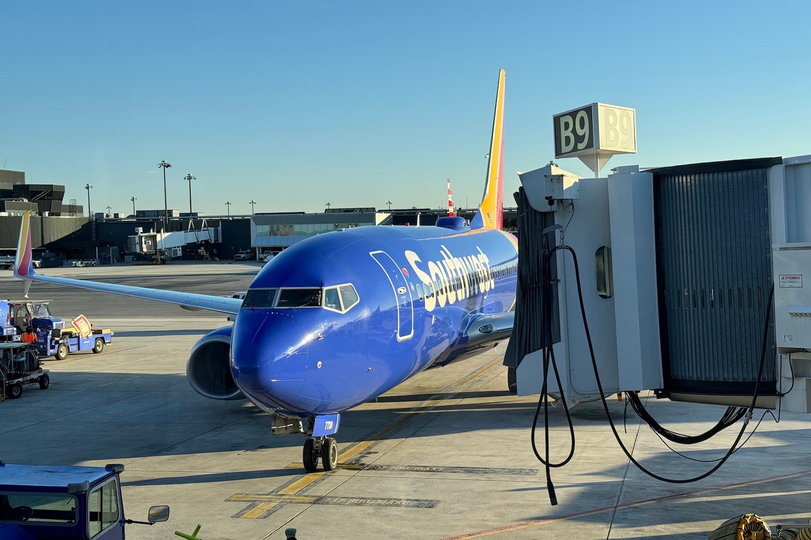
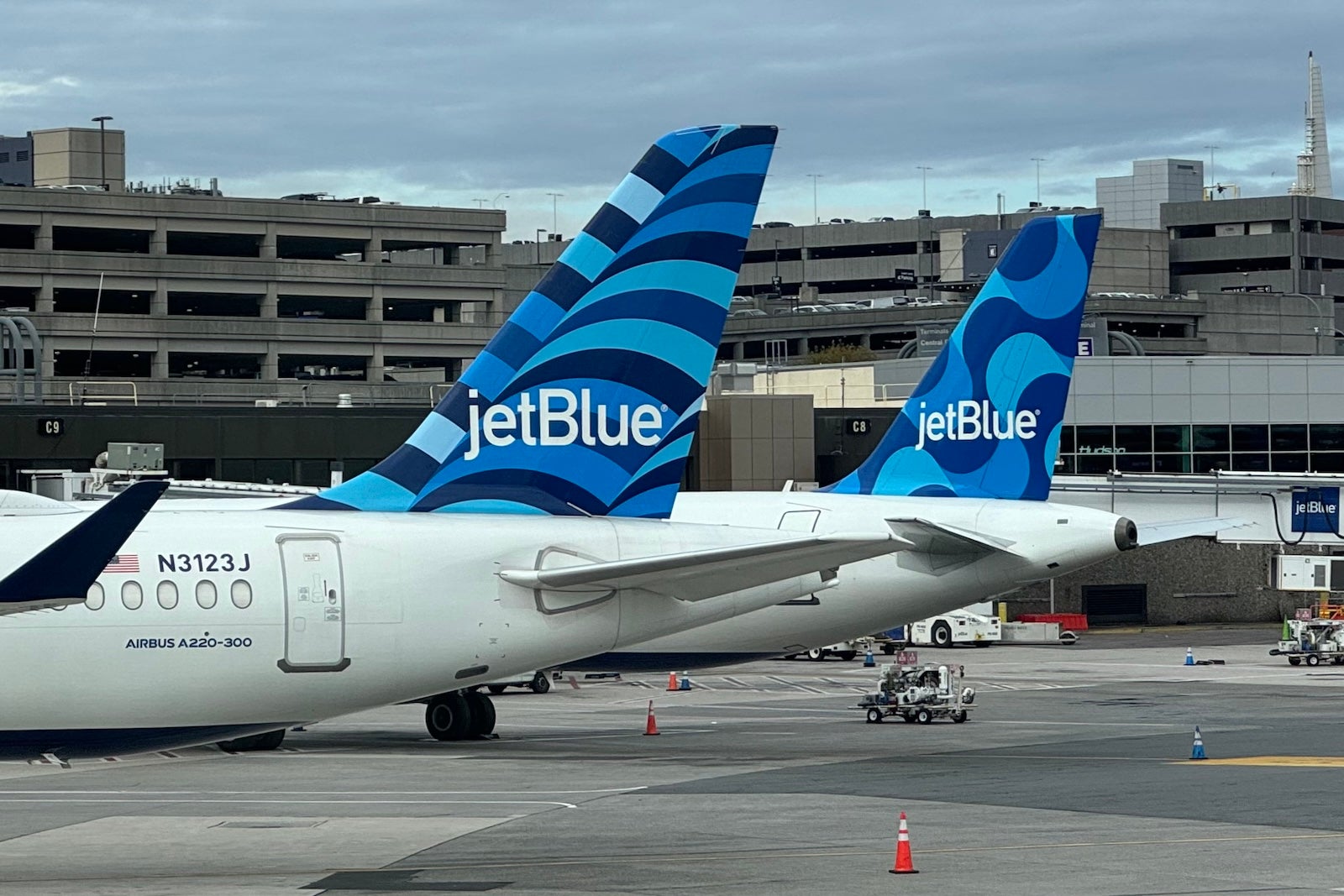
These fare spikes don’t even account for rising add-on fees. Just within the last week, Delta Air Lines, United Airlines, Southwest Airlines and JetBlue have hiked checked bag fees by 20% or more — and additional airlines are likely to follow.

On Delta, United and Southwest, your first checked bag now costs $45 one-way. That means a family of four taking a round-trip vacation would pay $360 in bag fees alone (though an airline credit card with free bag perks could cut their costs in a big way).

AL DRAGO/GETTY IMAGES

When will price hikes cool down?

Consumers trying to decide whether to book flights probably have a thousand questions: How high will fares climb? How far out should I book? Is it crazy to book Thanksgiving flights in April?

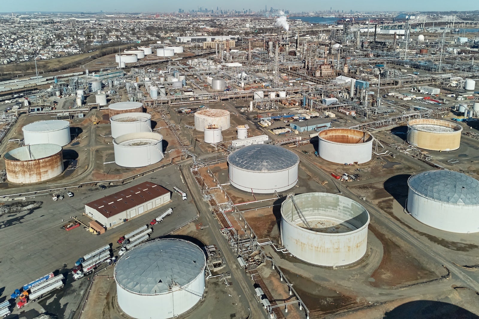
At this point, any prediction is hardly foolproof, since much hinges on how long the war in the Middle East lasts — especially amid discussion about reopening the Strait of Hormuz.

“Where jet fuel prices settle is anyone’s guess,” a report released Tuesday from Deutsche Bank noted.

That analysis found another $1-per-gallon surge in jet fuel prices could mean fares rise as much as $25, one-way. A $2-per-gallon spike, the report added, could mean fares jump as high as $50 one-way (or $100 round-trip).

Storage tanks at the Phillips 66 Bayway Refinery in Linden, New Jersey. BING GUAN/BLOOMBERG VIA GETTY IMAGES

Airlines have made no secret of their plan to pass on as much of those costs as consumers will stomach.

“I would only anticipate airlines strongly discount their airfares if the economy slips into a recession and there is a strong decrease in the demand for air travel,” Tan said.

Up until now, that hasn’t happened: Airlines haven’t had any problem filling seats on their planes.

In fact, several of the largest U.S. carriers had touted record bookings for the start of 2026. More recently, carriers have begun cutting flights on quieter travel days to save fuel and money — eliminating flights that, in some cases, may have had the cheapest seats.

TPG’s tips to save on air travel in 2026

With higher fares expected for the foreseeable future, here are some steps you can take to try and position yourself for the best deals.

A Southwest plane at BWI
A Southwest Airlines Boeing 737 at Baltimore/Washington International Thurgood Marshall Airport (BWI). SEAN CUDAHY/THE POINTS GUY

Widen your search

If you’re not finding a suitable fare for this summer, try casting a wider net as you search for flights.

The more open you can be to backup travel dates, alternative destinations and different airlines or airports, the better chance you’ll have of finding lower fares.

Tools like Google Flights can help you run price comparisons across a variety of destinations, airlines and dates. TPG staffers often use award search tools to find the best points prices.

Book now, change later

Book a fare now that you can change later if the price falls. As long as you don’t book basic economy, most of the major U.S. carriers allow fee-free ticket changes after booking.

And, remember that you can almost always cancel award tickets on U.S. airlines without forfeiting any miles or cash.

Repricing flights: What you need to know about canceling trips when you find a cheaper fare

Pick the cheapest day of the week to fly

Not all days are created equal when it comes to airfare.

According to Points Path, here are the cheapest days of the week to fly this summer:

Ranking, from cheapest to most expensive Day of week (domestic) Day of week (international)

Tuesday

Tuesday

Wednesday

Wednesday

Saturday

Monday

Friday

Thursday

Thursday

Sunday

Monday

Saturday

Sunday

Friday

Based on Points Path data of summer 2026 economy fares.

Plan your summer getaway for August

As in recent summers, there’s also a very distinct cheapest month to fly in summer 2026: August.

According to Points Path data, coach fares in August are roughly 14% cheaper than in July for domestic flights.

International fares, which peak in June, are about 13% cheaper in August.

Related: The best time to book flights for the cheapest airfare in 2026

How to save on bags

That brings us to the higher checked bag fees, which are quickly becoming a reality across the U.S. airline industry.

Be sure to prepay for your bag at least 24 hours before your flight, since many major carriers charge higher last-minute fees for checked bags.

Also, consider an airline credit card that has free baggage perks for you and your traveling companions. In many cases, a family traveling together could more than offset the card’s annual fee with one trip.

JetBlue planes at Boston Logan International Airport (BOS). SEAN CUDAHY/THE POINTS GUY

Beyond that, there’s always the option of bringing only a carry-on bag. Just remember that the contents of your bag must meet the TSA’s 3-1-1 liquids rules.

Could airfare eventually fall?

An overnight drop in oil prices could be an initial step in the right direction, though at this point it’s far from clear whether that will stick.

Beyond that, it seems like only weakening travel demand could pull fares down.

We should note that consumer sentiment dropped sharply in March, according to the University of Michigan’s latest monthly survey. This came as drivers began facing soaring gas prices, which have topped $4 per gallon nationally, per AAA, and are up nearly 40% since the start of the U.S.-Israel invasion of Iran.

Elsewhere, a TPG poll conducted with YouGov found that a growing number of travelers are reconsidering their trip plans.

Speaking to journalists late last month, United CEO Scott Kirby said the airline hadn’t yet seen customers pull back on booking travel but admitted it could happen if prices continue to rise.

“I think it’s entirely plausible,” Kirby said, “that higher oil prices have an impact on the economy, and that feeds through to lower demand.”


Source link

Leave a Reply

Subscribe to Our Newsletter

Get our latest articles delivered straight to your inbox. No spam, we promise.

Recent Reviews


What is Power BI Visualization

Regularly our business produces more data on sales, the performance of marketing, interactions of customers, inventory levels, metrics production, levels of staffing, KPIs, costs, etc. Still, there is a problem with massive amounts of data shifting as it is tough to understand the content’s theme. It helps us convert our entire complex data as simple to understand and visually useful compelling information for business, present-day visualization tools, and permits us to maintain our KPIs as more simple and straightforward. It helps combine the data and use AI analytics to display relationships between the market, KPIs, and the world. When we observe the format of our presented data, connections, patterns and insights, it gives life to data to make us experts in the storytelling of hidden insights in our data; these visualizations help users develop business insights effectively with high speed.

Become a Power BI Certified professional by learning this HKR Power BI Online Training !

Why is Power BI visualizations

It is a powerful tool of data sharing and communicating, and it may be helpful in performance demonstration, trends communication, latest strategies impact and more. Its representations work like a practical collaboration tool and contacts and get more value for reports, apps, and journalism. With the help of the best insights, we can make decisions with confidence, and it empowers us to have the arms and knowledge with tools for the right decisions at the proper time. We need to decide to gather the information like the types of data we require and the insights we need.

Power BI Training

  • Master Your Craft
  • Lifetime LMS & Faculty Access
  • 24/7 online expert support
  • Real-world & Project Based Learning

Power BI visualizations types

Visualizations are nothing but the pictorial representation of our data; some general examples are maps, radial gauges, scatter charts, column charts, etc. The given below are some essential types of Power BI visualizations. 

1.Area charts:

These charts have support from online maps along with the area between line and axis. They highlight the change of magnitude and gains attention to the entire value. 

2.Bar and column charts:

These charts are known for the particular value in various categories.

3.Cards:

Cards expose the single fact and data point. It is essential to track our reports and dashboards of power BI like market share, total sale, and opportunities.

4.Combo charts:

These charts help to combine the line charts and column charts into one. It permits us to compare the data quickly. They can maintain two Y axes to look close. For correlation illustration between two measures, these combo charts are the best choice.

Unleash your data potential with Power BI Training in Hyderabad!

5.Decomposition tree:

The visuals of this tree allow us to expose our data across various dimensions. It generates the data automatically and drills it as our dimensions in the required order.

6.Doughnut charts:

They are like pie charts and display the parts’ relationship to the whole, but the main difference is it has space at the centre used for labels or icons.

7.Funnel charts:

They help the visualization process; it includes various items and stages randomly from one location to another.

8.Gauge charts:

They have the circular arc and expose the single value, which calculates the aim’s development. Its purpose is by line through shading, and the value represents the progress displayed as bold in the arc.

9.Key influencers chart:

This chart exposes the essential contributors to choose the value. It is an excellent selection to help us understand the factors that may affect the key metrics. It is like what attracts the users to put a second order and why sales are high in previous times.

10.KPIs:

It is a visual key that communicates the part of progress for measurable aim. The given below are two reasons to prove that KPIs are great.

  • They use it for progress measurements.
  • They are helpful for distance measurement towards the goal.

Top 50 frequently asked Power BI Interview Questions !

11.Line charts: They are used to emphasize the entire shape of the overall series of values.

12.Basic maps: These basic maps associate the quantitative data and category with the spatial location.

14.ArcGIS maps: It is an available choice for themes, locations types, symbol styles, base maps, and reference layers to design the informative map’s visuals. And it is the combination of data layers on a plan to display the deep knowledge of the information in our visual.

15.Choropleth: These charts are patterns used to expose how value varies in proportion in the region. It displays the differences through shading from dark to light. 

Business Intelligence & Analytics, power-bi-visualization-description-0, Business Intelligence & Analytics, power-bi-visualization-description-1

Subscribe to our YouTube channel to get new updates..!

16.Shape maps: they are used to compare the map regions through colour and shape, as shape maps cant display the precise data locations on the map. Its main aim is to display the parts Comparison on the map through various kinds of coding.

17.Matrix: it is a kind of table visual which gives support to a stepped layout; its report creators contain matrices in dashboards to provide users to choose multiple elements in a matrix on the report page.

18.Pie charts: it permits the users to display the relationship of the parts to the whole. It is used for report designers to design a Power App and turn it into the report of Power BI.

19.Q&A visual: they are similar to the experience of Q&A of dashboards. They permit us to ask questions regarding our information through natural language.

20.Ribbon charts: it displays the data according to ranking. They are very effective in rank, showing rank changes through the highest range on top of every period.

21.Scatter and dot plot charts: it always includes two axes’ values to display one numerical group of data, along with another numerical value, vertical axis, and horizontal axis. They show the intersecting points of x and y numerically. It units those two values as a single point. They may explore unevenly or evenly in the horizontal axis based on the data. The dot plot is similar to the scatter chart, but it can categorize the information with the x-axis.

22.Scatter high density: it permits users to design the visuals with high speed, helping for interactions. Its sampling uses an algorithm that removes the overlapping points and makes sure that the complete data set points to expose the visuals. 

Want to know more about Power BI,visit here Power BI Tutorial !

23.Slicers: these charts are standalone, which may be for other visuals filtering on the page. They are available in various formats and designed to permit to choose the single one or many as per the requirement. 

24.Innovative narrative: It is helpful to add the data to reports for the point out trend and essential takeaways and previous explanations. The data help customers to get an idea of data and recognize the crucial findings at high speed.

25.Standalone images: it is a kind of graphics that add to the dashboards.

26.Tables: it is a kind of grid map which includes the related information of logical series in rows and columns; it also maintains the headers along with table rows. They use quantitative comparison, which helps to look at various values in a single category, and the table exposes five multiple values for a single variety.

27.Treemaps: these are a kind of colour charts with rectangular shapes where the values display by size, the rectangles set in the central rectangles. Every rectangles space is allowed measured value and arranged in size from left to right.

28.Waterfall charts: they display the running of absolute added values. It helps understand how important the matter is through the changes that take place.

Power BI Training

Weekday / Weekend Batches

Conclusion: 

The visuals are the best guide for the Power BI; they are based on the data we require to expose. First, we need to understand that visuals’ vocabulary supports the graphics team of financial teams through Power BI. They are used to facilitate the graph’s selection to display the information. Visual language does not need prescribed graphs, but graphs required to  create to experience its benefits for choices to utilize them with data. Another issue with the graphical data representation with which the organizations create dashboards, they are not experts to display the complex data with a non-professional audience.

Related Article:


Source link