What to do if your flight is canceled during the fuel crisis


Jet fuel prices continue to surge as the U.S.-Israel conflict with Iran drags into a third month and disruptions in the Strait of Hormuz continue to strain global oil shipments.

The International Air Transport Association reports jet fuel prices have more than doubled since the conflict began. As you can imagine, that makes many flights unprofitable for airlines, which spend as much as 30% of their operating expenses on fuel alone.

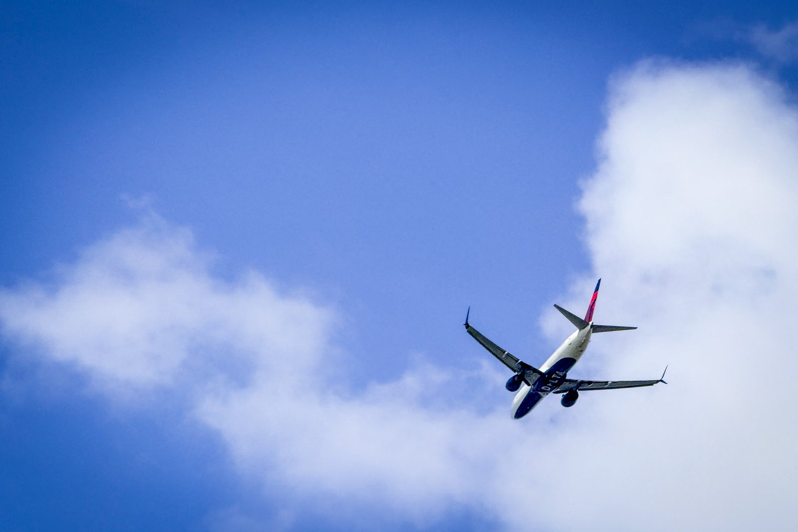
High fuel prices are leading airlines in the U.S. and around the world to cancel flights.

How fuel costs are affecting travel

Many airlines have cut flights from their schedules or reduced frequencies in order to scale back on spending.

For example, Reuters reported that Delta Air Lines is cutting capacity by approximately 3.5%. European carriers are also taking a step back, with Lufthansa announcing it’s cutting 20,000 short-haul flights this summer.

If jet fuel costs remain at this level, we could see even more flights and routes canceled.

Not to mention, flight cuts mean there will be fewer seats for sale without a corresponding drop in demand. More people chasing fewer seats is a recipe for higher airfare prices.

Airlines for Europe — the association representing many European carriers — says it doesn’t expect outright fuel shortages this summer; however, it warns that while supply is currently stable, there are concerns about potential challenges in the fall and winter as costs remain high and market conditions grow more restrictive.

It’s important to keep an eye on your flight reservation in case the airline makes any changes to your route.

Reward your inbox with the TPG Daily newsletter

Join over 700,000 readers for breaking news, in-depth guides and exclusive deals from TPG’s experts

Know your options in the event your flight is canceled

CLINT HENDERSON/THE POINTS GUY

If a U.S. airline cancels your flight and you decide not to fly, you are entitled by law to a full refund. You’re covered by the rules of the U.S. Department of Transportation, which apply to domestic flights, as well as international flights departing or arriving in the U.S.

Of course, if you still want to travel, you’ll need to find an alternate flight. Your original airline will work to put you on the next available flight. Sometimes, though, there may not be many reasonable options depending on the routing and the airline. In that case, it’s worth asking whether your airline can rebook you on another airline’s flight.

If you are flying to or from the U.K. or the European Union and the airline cancels your flight, you may be entitled to compensation via UK261 or EU261 rules. Those rules require airlines to compensate passengers for the inconvenience of a canceled (or severely delayed) flight. High fuel prices don’t count as “extraordinary circumstances” under EU261, so airlines will have to reimburse passengers in these cases.

Prepare ahead of time to avoid headaches later

Delta 767-400ER on the tarmac at Marrakech Airport. CLINT HENDERSON/THE POINTS GUY
CLINT HENDERSON/THE POINTS GUY

At TPG, we always tell folks to have a backup plan in case things go awry … whether that’s due to weather, labor issues or, in this case, potential fuel shortages.

“Water” your reservations. In other words, periodically check your hotel and flight bookings to make sure nothing has changed. Keep an eye on upcoming flights in case yours is canceled, so you can make alternate plans if needed.

At a minimum, when booking trips:

  • Know which other airlines fly the route you are taking and be prepared to rebook yourself.
  • Research alternative routes in advance. If you have to call the airline to rebook, it helps to have a specific flight in mind as an alternate.
  • Your stash of points and miles can come in handy in situations like this.
  • Consider taking a train or renting a car when possible.
  • Don’t be basic: Avoid booking basic economy tickets, as airlines will likely treat you as a lower priority and offer the least ideal backup plan.

Tips for booking trips right now amid high prices and cancellations

Westin Hapuna Beach Resort Mauna Kea Beach Hotel, Autograph Collection, Hawaii
Westin Hapuna Beach Resort, Mauna Kea Beach Hotel, Autograph Collection, Hawaii. CLINT HENDERSON/THE POINTS GUY

If you haven’t booked your summer trips yet, you may be in for a bit of sticker shock. According to data from our partners at Points Path, summer round-trip domestic fares are up a whopping 24% year over year. Award prices are up 22%, so there’s no escape from using points and miles, necessarily.

Related: Bust that travel myth: Booking on a Tuesday won’t help you save money, but here’s what will

Here are some of our best tips for saving on airfare this summer.

  • Set Google Flights price alerts. Google Flights will also tell you whether you are getting a good deal. Monitor prices.
  • There are new companies that will get you trip credits if the price drops, as long as you don’t book basic fares. We like pAiback and Junova. Here is a guide to using those new tools.
  • Add flexibility: Can you shift your travel dates by one or two days on either side of the trip? Can you choose a cheaper destination? Flexibility equals saving money.
  • Travel on Tuesday, Wednesday or Saturday for the best deals.
  • Use an airline vacation package to combine flights, hotels and rental cars for as much as 40% off.

Bottom line

We are now entering the busy summer travel season, and prices are much higher, in large part due to higher jet fuel prices. That means there is a possibility your flight could get canceled, so you should take some steps now to be prepared and know your rights.

Related reading:


Source link

Leave a Reply

Subscribe to Our Newsletter

Get our latest articles delivered straight to your inbox. No spam, we promise.

Recent Reviews


What is Power BI Visualization

Regularly our business produces more data on sales, the performance of marketing, interactions of customers, inventory levels, metrics production, levels of staffing, KPIs, costs, etc. Still, there is a problem with massive amounts of data shifting as it is tough to understand the content’s theme. It helps us convert our entire complex data as simple to understand and visually useful compelling information for business, present-day visualization tools, and permits us to maintain our KPIs as more simple and straightforward. It helps combine the data and use AI analytics to display relationships between the market, KPIs, and the world. When we observe the format of our presented data, connections, patterns and insights, it gives life to data to make us experts in the storytelling of hidden insights in our data; these visualizations help users develop business insights effectively with high speed.

Become a Power BI Certified professional by learning this HKR Power BI Online Training !

Why is Power BI visualizations

It is a powerful tool of data sharing and communicating, and it may be helpful in performance demonstration, trends communication, latest strategies impact and more. Its representations work like a practical collaboration tool and contacts and get more value for reports, apps, and journalism. With the help of the best insights, we can make decisions with confidence, and it empowers us to have the arms and knowledge with tools for the right decisions at the proper time. We need to decide to gather the information like the types of data we require and the insights we need.

Power BI Training

  • Master Your Craft
  • Lifetime LMS & Faculty Access
  • 24/7 online expert support
  • Real-world & Project Based Learning

Power BI visualizations types

Visualizations are nothing but the pictorial representation of our data; some general examples are maps, radial gauges, scatter charts, column charts, etc. The given below are some essential types of Power BI visualizations. 

1.Area charts:

These charts have support from online maps along with the area between line and axis. They highlight the change of magnitude and gains attention to the entire value. 

2.Bar and column charts:

These charts are known for the particular value in various categories.

3.Cards:

Cards expose the single fact and data point. It is essential to track our reports and dashboards of power BI like market share, total sale, and opportunities.

4.Combo charts:

These charts help to combine the line charts and column charts into one. It permits us to compare the data quickly. They can maintain two Y axes to look close. For correlation illustration between two measures, these combo charts are the best choice.

Unleash your data potential with Power BI Training in Hyderabad!

5.Decomposition tree:

The visuals of this tree allow us to expose our data across various dimensions. It generates the data automatically and drills it as our dimensions in the required order.

6.Doughnut charts:

They are like pie charts and display the parts’ relationship to the whole, but the main difference is it has space at the centre used for labels or icons.

7.Funnel charts:

They help the visualization process; it includes various items and stages randomly from one location to another.

8.Gauge charts:

They have the circular arc and expose the single value, which calculates the aim’s development. Its purpose is by line through shading, and the value represents the progress displayed as bold in the arc.

9.Key influencers chart:

This chart exposes the essential contributors to choose the value. It is an excellent selection to help us understand the factors that may affect the key metrics. It is like what attracts the users to put a second order and why sales are high in previous times.

10.KPIs:

It is a visual key that communicates the part of progress for measurable aim. The given below are two reasons to prove that KPIs are great.

  • They use it for progress measurements.
  • They are helpful for distance measurement towards the goal.

Top 50 frequently asked Power BI Interview Questions !

11.Line charts: They are used to emphasize the entire shape of the overall series of values.

12.Basic maps: These basic maps associate the quantitative data and category with the spatial location.

14.ArcGIS maps: It is an available choice for themes, locations types, symbol styles, base maps, and reference layers to design the informative map’s visuals. And it is the combination of data layers on a plan to display the deep knowledge of the information in our visual.

15.Choropleth: These charts are patterns used to expose how value varies in proportion in the region. It displays the differences through shading from dark to light. 

Business Intelligence & Analytics, power-bi-visualization-description-0, Business Intelligence & Analytics, power-bi-visualization-description-1

Subscribe to our YouTube channel to get new updates..!

16.Shape maps: they are used to compare the map regions through colour and shape, as shape maps cant display the precise data locations on the map. Its main aim is to display the parts Comparison on the map through various kinds of coding.

17.Matrix: it is a kind of table visual which gives support to a stepped layout; its report creators contain matrices in dashboards to provide users to choose multiple elements in a matrix on the report page.

18.Pie charts: it permits the users to display the relationship of the parts to the whole. It is used for report designers to design a Power App and turn it into the report of Power BI.

19.Q&A visual: they are similar to the experience of Q&A of dashboards. They permit us to ask questions regarding our information through natural language.

20.Ribbon charts: it displays the data according to ranking. They are very effective in rank, showing rank changes through the highest range on top of every period.

21.Scatter and dot plot charts: it always includes two axes’ values to display one numerical group of data, along with another numerical value, vertical axis, and horizontal axis. They show the intersecting points of x and y numerically. It units those two values as a single point. They may explore unevenly or evenly in the horizontal axis based on the data. The dot plot is similar to the scatter chart, but it can categorize the information with the x-axis.

22.Scatter high density: it permits users to design the visuals with high speed, helping for interactions. Its sampling uses an algorithm that removes the overlapping points and makes sure that the complete data set points to expose the visuals. 

Want to know more about Power BI,visit here Power BI Tutorial !

23.Slicers: these charts are standalone, which may be for other visuals filtering on the page. They are available in various formats and designed to permit to choose the single one or many as per the requirement. 

24.Innovative narrative: It is helpful to add the data to reports for the point out trend and essential takeaways and previous explanations. The data help customers to get an idea of data and recognize the crucial findings at high speed.

25.Standalone images: it is a kind of graphics that add to the dashboards.

26.Tables: it is a kind of grid map which includes the related information of logical series in rows and columns; it also maintains the headers along with table rows. They use quantitative comparison, which helps to look at various values in a single category, and the table exposes five multiple values for a single variety.

27.Treemaps: these are a kind of colour charts with rectangular shapes where the values display by size, the rectangles set in the central rectangles. Every rectangles space is allowed measured value and arranged in size from left to right.

28.Waterfall charts: they display the running of absolute added values. It helps understand how important the matter is through the changes that take place.

Power BI Training

Weekday / Weekend Batches

Conclusion: 

The visuals are the best guide for the Power BI; they are based on the data we require to expose. First, we need to understand that visuals’ vocabulary supports the graphics team of financial teams through Power BI. They are used to facilitate the graph’s selection to display the information. Visual language does not need prescribed graphs, but graphs required to  create to experience its benefits for choices to utilize them with data. Another issue with the graphical data representation with which the organizations create dashboards, they are not experts to display the complex data with a non-professional audience.

Related Article:


Source link